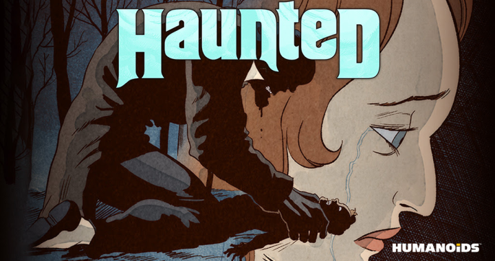
REVIEW: When I Lay My Vengeance Upon Thee #1
 A striking debut, this comic blends haunting visuals with a compelling supernatural mystery. With a bold use of color, heavy textures, and an intriguing twist on the exorcist genre, it sets the stage for an atmospheric and gripping series. While the action is sparse, the mood, character work, and storytelling more than make up for it.
Right from the start, the story pulls you in with its eerie detective-style take on exorcism. It’s reminiscent of Constantine, but with a stronger religious foundation that makes the themes hit differently. There’s a slow, creeping sense of dread as the mystery unfolds, culminating in a great twist where the priest, rather than the girl, turns out to be the one possessed. That’s the kind of unexpected storytelling that keeps things fresh. The pacing is methodical, building tension effectively, though for a first issue, it might have benefitted from a bit more immediate action to really hook readers who need that extra punch.
One of the coolest touches is the use of Spanish dialogue right from the beginning. It immediately sets the tone and tells us we’re dealing with Spanish priests, probably somewhere in Europe. It adds authenticity and a sense of place without having to spell it out, which is a great storytelling choice.
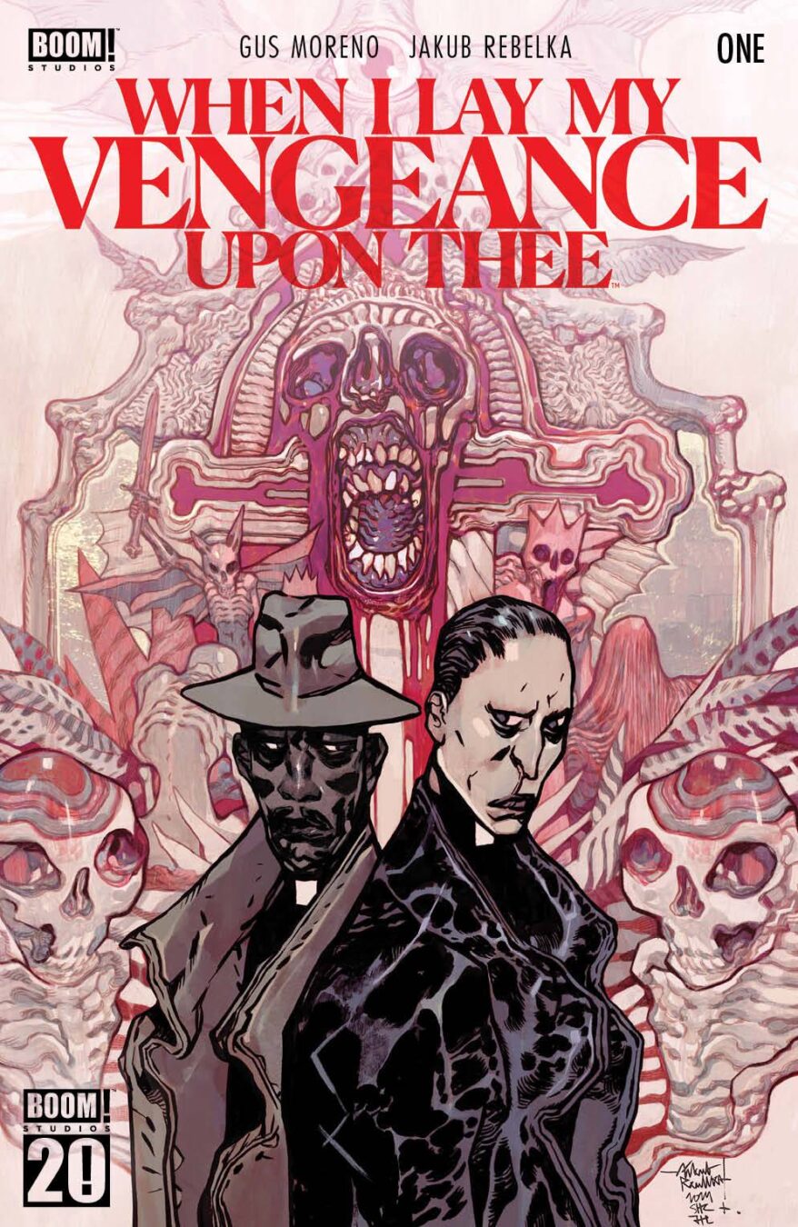
Visually, this comic delivers in a big way. The cover alone is stunning, with bold spotted blacks that make the priest stand out against a beautiful watercolor background. The reds, dark crimsons, and skull imagery create a haunting atmosphere that perfectly complements the tone. The title text pops beautifully, fitting seamlessly into the overall aesthetic. The credit page is another nice detail, with a gold border that looks great on top of a leather-like texture. However, the texture itself seems like a low-res image pulled from the internet, which is a bit of a letdown. A higher-quality photo of real leather would have added that extra level of authenticity.
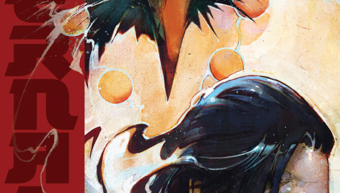
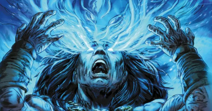
The interior art is just as strong. It has a rough, textured style that feels like a mix between old newspaper comics and expressive traditional painting. The heavy use of textures gives it an organic, hand-crafted quality, which is refreshing in a medium that sometimes leans too heavily on digital polish. It’s unclear whether these textures are digital overlays or from traditional media that’s been scanned and refined, but either way, it looks fantastic. The character designs are slightly exaggerated in a way that makes them feel distinct and stylized, adding personality without going too far into caricature.
The backgrounds are a standout element. They’re moody, abstract, and painted in a way that feels almost surreal. There’s an unsettling energy to them, bringing to mind The Scream by Edvard Munch, with its swirling chaos and emotional weight. The color choices throughout the comic are equally deliberate and impactful, shifting with each scene to enhance the atmosphere. It’s clear that a lot of thought went into making sure every palette serves the story.
Lettering is another area where this comic gets things mostly right. The word balloons have thin outlines that blend nicely with the sharp character designs and textured backgrounds. There aren’t any sound effects, but in this case, that works to the story’s advantage. It has a somber, mysterious vibe that might have been disrupted by flashy SFX. That said, if they had been used, they would have needed to be carefully integrated to match the hand-drawn aesthetic.
Unfortunately, there’s one glaring issue that sticks out like a sore thumb. There’s a scene where the priest is reading torn papers on a wall, and the text is clearly done with a basic digital font. It completely clashes with the organic, textured style of the rest of the comic. It’s an immersion-breaking moment that could have been easily avoided by hand-tracing the letters to make them blend better. Ending the issue on that note is disappointing, especially when everything else feels so meticulously crafted.
Despite that little hiccup, I really enjoyed this comic. It’s visually rich, narratively intriguing, and full of atmosphere. The protagonist is a brooding, aloof priest with a cynical edge, which makes him immediately compelling. The twist at the end was genuinely surprising, and the way the mystery unfolds keeps you engaged. The only real downside is that it might have benefitted from more action in this first issue. While the slow-burn pacing works well for building tension, a bit more dynamic movement could have given it an extra layer of excitement.
For fans of supernatural detective stories, dark aesthetics, and brooding protagonists, this is absolutely worth picking up. It feels like something special is brewing within these pages, and I’m excited to see where it goes next. The minor issues—like the font choice in that one scene and the slightly underwhelming texture on the credit page—don’t take away from the overall experience. If you’re someone who appreciates strong atmosphere, bold artistic choices, and a story that’s willing to take its time, this is a series you’ll want to follow.
Writing: 4 Stars
Art: 5 Stars
Colors: 5 Stars
Overall: 4 Stars
Author Profile
Latest entries
 ColumnsMay 6, 2025Primordios: Enchanting Creations and Heartfelt Moments at Puerto Rico Comic Con 2025
 Comic BooksApril 17, 2025REVIEW: Sister Imperator #1
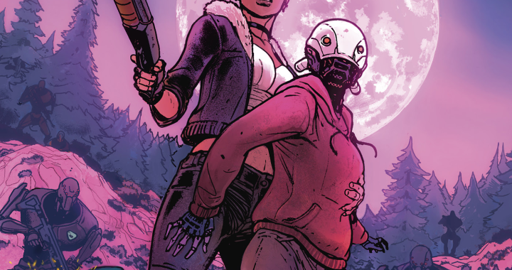
 Comic BooksFebruary 25, 2025REVIEW: Cruel Kingdom #2
 Comic BooksFebruary 24, 2025REVIEW: Godzilla Heist #1