Kickstarter Alert & Review: The Worth and The Cost
 At the very core, Kickstarters let creators tell their stories how they want to, without the need for pesky things like editorial interference or worrying about brand values or some such. In many ways, it is probably the most freeing way to make a comic book. The risk is that the pledge makers may have back a nag instead of a steeple chaser. The hope therefore is that the project in question needs to find an audience and at quick time too!
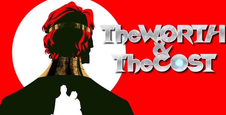
There is no such worry with The Worth and The Cost, a one shot from Resistance Comics which is currently 700% funded. As the name implies, Resistance Comics’ brand is the “celebrating those that come off the sidelines to take up the fight!” This sci-fi based one-shot features a world under the oppressive rule of Emperor Penryck. Under Penryck’s watch, the planets valuable resources have been both squandered and stolen, leaving an almost “let them eat cake” mentality; if only there were cake! Up steps Windym, a some what idealistic bureaucrat, who thinks she can solve the problem. The final column to the trio of main characters is Martyn, the palace guard who is prodded, pushed and shot at to make the right choices.
First time writer John Luzar is the driving force behind this book. Reading through it, you have to admire that Luzar writes with a passion for what he believes. There are obvious metaphors in place, the French Revolution being one and the the state of our planet at the moment being the other. Additionally, there are some Flash Gordon vibes in play, especially with the single mindedness of Penryck seemingly a more idiotic version of Ming the Merciless. The characters are quite well crafted, if a little wooden at times, in both intent and direction. The flip of that is that each character has a clarity of purpose, whether you like them or not.
The art is supplied by Beth Varni who has a very easy style that has a Disney vibe in the way it is presented. Varni does well with some of the staging panels, though there are a couple of times where she falls into the indie art trap regarding camera angles; there are big panels, with characters positioned in the corner with a blank back ground. Also, there is a scene where Penryck is running up stairs but his body lines and perspective are a little off. Still, the character’s faces are expressive which helps alleviate some of the more wooden elements of the pacing and over the top, at times, dialogue. Varni’s colors are bright, which i don’t mind, though it does feel like there is only one setting. Textures would help set the context of parts of the book. Letters are provided by Toben Racicot whose font is a little larger than I expected. and I am not sure about the “regal “font used in some of the boxes.
For a first book, this isn’t a bad effort. Maybe with the benefit of hindsight, Luzar may well see that there is a difference between feeling strongly about a topic and metaphorically knocking in a picture hook with a sledgehammer. More nuance or at least more subtlety in places would go some way to making the book a more satisfying read.
If you want to join the Resistance, check out The Worth and The Cost Kickstarter, live until 17th February, please click here!
Writing – 3 Stars
Art & Colors – 3 Stars
Overall – 3 Stars
Written by; John Luzar
Art by; Beth Varni
Letters by; Toben Racicot
Published by Resistance Comics
Author Profile
- I am a long time comic book fan, being first introduced to Batman in the mid to late 70's. This led to a appreciation of classic artists like Neal Adams and Jim Aparo. Moving through the decades that followed, I have a working knowledge of a huge raft of characters with a fondness for old school characters like JSA and The Shadow
Currently reading a slew of Bat Books, enjoying a mini Marvel revival, and the host of The Definative Crusade and Outside the Panels whilst also appearing on No-Prize Podcast on the Undercover Capes Podcast Network
Latest entries
 Comic BooksOctober 14, 2024Review: Absolute Batman #1
 Comic BooksSeptember 25, 2024Review: Defenders of the Earth #2 (of 8)
 Comic BooksAugust 7, 2024Review: Gatchaman #2
 Advance ReviewJuly 30, 2024Advance Review: Defenders of the Earth #1 (of 8)
