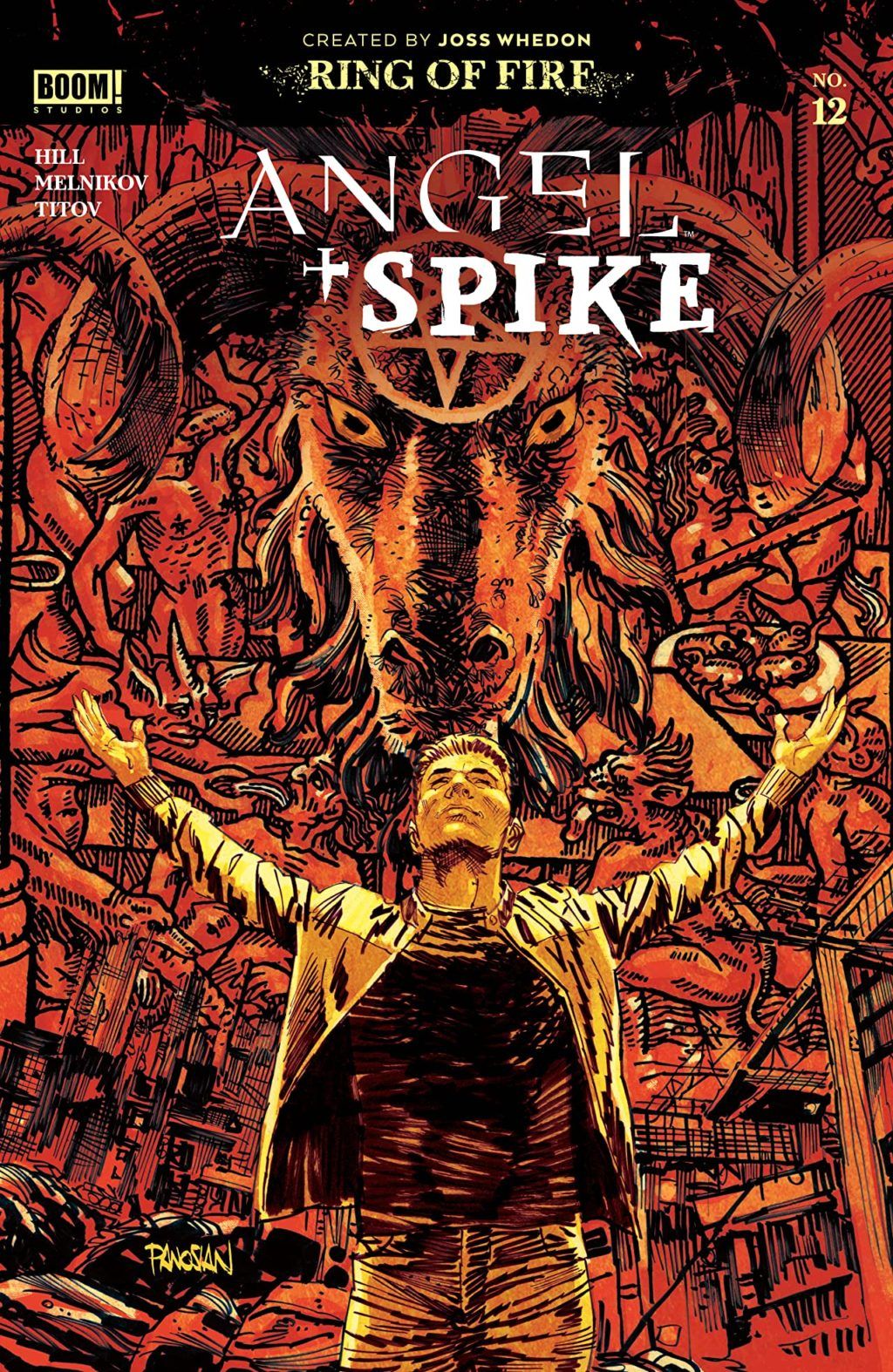
Review: Angel & Spike #12
 With the introduction of a Willow book into the comic Buffy-verse, it’s probably a good time to re-visit the original spin-off, Angel. Very much like the Buffy book, Angel has taken a somewhat different tack in order to get to where TV fans can see some sense of familiarity. That comes with the continued inclusion of vampire frenemy Spike in the title. The change may seems like a good call, given Spike’s popularity. But does the book really need it?
Team Angel are in dire straits (when are they not, right?), again. After surviving the Hellmouth, one of their own has to make a difficult decision in order to save the rest of the ream. Whilst the idea of “the needs of the many outweigh the needs of the few, or the one”, may originate from a different franchise, it certainly seems like an easy choice for Fred.
I have a lot of time for Bryan Edward Hill’s writing, whether it is his Detective Comics work, or his Fallen Angel book, and of course this book. With a couple of hits in the cancellation of Fallen Angels and more recently Batman and the Outsiders. Looking back at those books, I think it’s safe to say that Fallen Angels had a rather limited shelf life idea and Outsiders, likewise, was potentially going to get lost in the crossover madness of the upcoming Joker War. So therefore, this book is the best example of Hill’s writing; it has an engaging cast, a story-line that could go in one of many ways. An example of this would be the revelation regarding Kate Lockley, which has taken some time to get to this key point. Throw in some great dialogue, an understanding of the characters and even managing to make Spike, a character I never really warmed to, enjoyable. The only downside is the ongoing corruption of Fred, which feels like a slap in face to her survival in the Hellmouth story; this though is a minor snag.
Gleb Melnikov provides the art for issue, as he has done for this series. Somewhere along the lines though, his inks have given the book a pseudo Capullo feel. Not that I am complaining; I like Capullo’s art. The style has it’s drawback in that it detracts from some of the likenesses you would expect for a tie-in book. Melnikov panel design’s lean towards the chaos, which kind of works for this title. This is helped massively by the colors from Roman Titov, whose scheme, which utilises browns and greens to great effect. Overall, the art is effective and really helps with the feel of the book. Finally, Ed Dukeshire keeps things tight with a font that has a simple style that contrasts the chaos.
This book has been surprisingly fun from the get go. Slower issues have been used well to move things long well and even the crossover, with it’s less Angel focused plot encapsulated the “team” element of the book, even if the term “team” is massively over used.
Writing – 4 Stars
Art – 4 Stars
Colors – 4 Stars
Overall – 4 Stars
Written by; Bryan Edward Hill
Art by; Gleb Melnikov
Colors by; Roman Titov
Letters by; Ed Dukeshire
Published by; BOOM! Studios
Author Profile
- I am a long time comic book fan, being first introduced to Batman in the mid to late 70's. This led to a appreciation of classic artists like Neal Adams and Jim Aparo. Moving through the decades that followed, I have a working knowledge of a huge raft of characters with a fondness for old school characters like JSA and The Shadow
Currently reading a slew of Bat Books, enjoying a mini Marvel revival, and the host of The Definative Crusade and Outside the Panels whilst also appearing on No-Prize Podcast on the Undercover Capes Podcast Network
Latest entries
 Comic BooksOctober 14, 2024Review: Absolute Batman #1
 Comic BooksSeptember 25, 2024Review: Defenders of the Earth #2 (of 8)
 Comic BooksAugust 7, 2024Review: Gatchaman #2
 Advance ReviewJuly 30, 2024Advance Review: Defenders of the Earth #1 (of 8)
