Review: Bad Reception #1
 Bad Reception #1 from AfterShock Comics has been billed as a horror comic, but after giving it a read it feels more like a murder mystery. Now, I gotta admit I have a love/hate relationship with murder mysteries. Either I hate the story, or I love the story. In the case of this murder mystery, I have to tell follow on creators some bad news: The bar has been raised.
Juan Doe, creator, writer and artist on the comic, who has been known previously for his art work on (Dark Ark, Animosity, and World Reader) has decided set his story in a truth that It is said that every bride wants to feel like a princess on her wedding day, but let’s be honest: Some brides take that a little too far. A noticeable trend has been the ‘Unplugged wedding’ largely inspired by celebrities like Kim Kardashian, who instituted a strict no-cell phone policy to prevent wedding photos from leaking to the press. So let’s recap”¦A bride prone to unusual yet demanding requests, a wedding on an isolated island, with no cellphones, and I assume most of the people will be inebriated from the celebration. What could possibly go wrong?
In between the panels there’s there is a shadowy figure prepping for something, and that something will be heinous and gruesome, foreshadowing that at some point, Bad Reception will turn into full-on murder mystery. Juan Doe has manged to capture some of the elements that makes murder mysteries addictive. There“s the fact that the story is actually a problem that not only gets solved, but you get to feel as if you“re participating in solving it.
The look of Bad Reception #1 is perhaps the most interesting part about it. The opening is a dialogue between the Groom and a radio host delivering exposition about Nomophobia, the fear of no-mobile-phone overlaid onto a black background with an expanding red trail that eventually leads to a horrific murder scene.
As for the art ,as the story progresses Doe uses an interesting technique as the character seem to go out of focus more and the dialogue starts to take more precedence.  Doe changes the panel coloring for each character to distinguish between them on a page and give some instinctive indication of their personality.
To be honest Doe may have tried to introduce to many concepts all at once. While each concept individually is really interesting, together in one 38 page issue it may be too much to swallow. Especially when you consider that I have to wait another month to get some of my questions answered. I can see already that this would be perfect for a movie script.
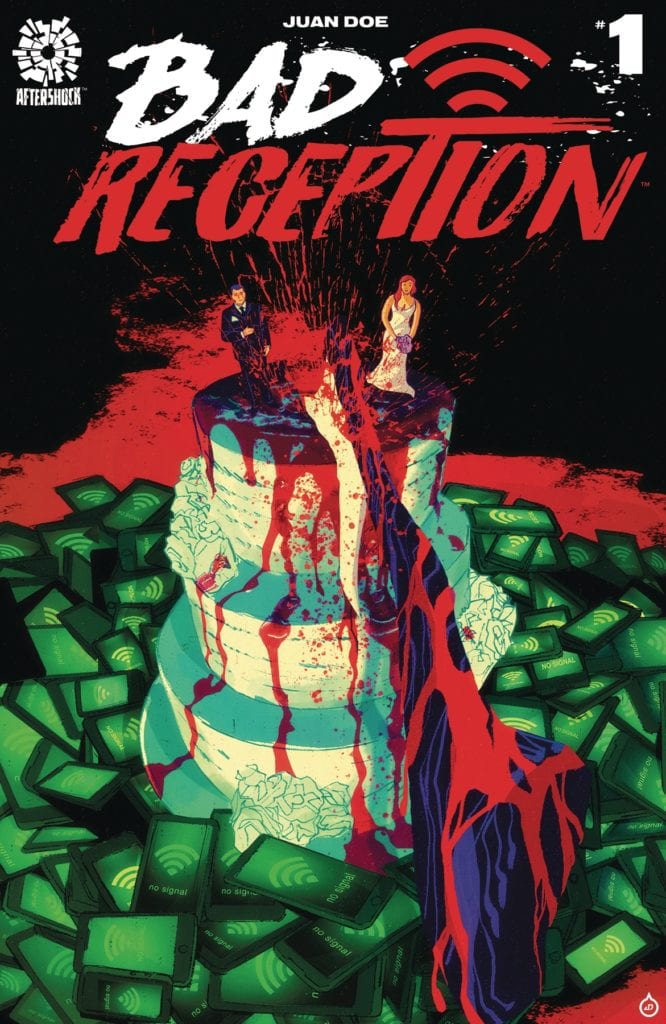
Bad Reception #1 comes with two covers; the Cover A Regular Juan Doe Cover; and the Cover B Incentive Paul Azaceta Variant Cover (1:15).
[yasr_overall_rating size=”large”]
Writer: Juan Doe
Artist: Juan Doe
Colorist: Juan Doe
Letterer: Juan Doe
Cover Artist: Juan Doe
Published by: AfterShock
Author Profile
Latest entries
 Comic BooksAugust 4, 2022G.I JOE: A Real American Hero #296
 Comic BooksJuly 21, 2022REVIEW: Transformers: The Last Bot Standing #3
 Comic BooksJuly 20, 2022REVIEW: SPIDER-GWEN: GWENVERSE #4
 Comic BooksApril 18, 2022REVIEW: Captain Carter #2
