 The latest issue of Barstow #3 is a visual feast, dripping with atmosphere and soaked in horror, but beneath the striking art lies a chaotic story that struggles to find its footing. It’s the kind of comic that hooks you with its grotesque visuals and keeps you turning pages, even as the narrative stumbles along the way. There’s something compelling here, even if it doesn’t quite come together in the end.
From the very first page, the pacing hits hard and fast, almost like watching an episode of a horror anthology show. The story wastes no time throwing readers into its dark, twisted world, leaning heavily into body horror and surreal supernatural elements. That breakneck momentum works in its favor, keeping things lively and unpredictable, but it also makes it harder to latch onto any one character or storyline. By issue #3, readers should have a solid grasp of the cast, but instead, we’re introduced to more faces, making it tough to form emotional connections. When people start dying, it should hurt, but without enough time to know who they are, those moments fall flat.
The comic tries to inject humor to break up the bleakness, but the jokes don’t land. It’s not for lack of trying, but the tone is so firmly rooted in horror that the comedic beats feel out of place, almost like interruptions rather than relief. Still, the horror elements are where Barstow shines. The monstrous imagery and sudden bursts of violence are handled with such grotesque creativity that it makes up for a lot of the narrative missteps. There’s one double-page spread, for example, where papers flutter toward a looming purple figure, and the way the motion is illustrated is genuinely inventive. The spread is a bit hard to follow, but the artistry is undeniable.
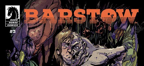
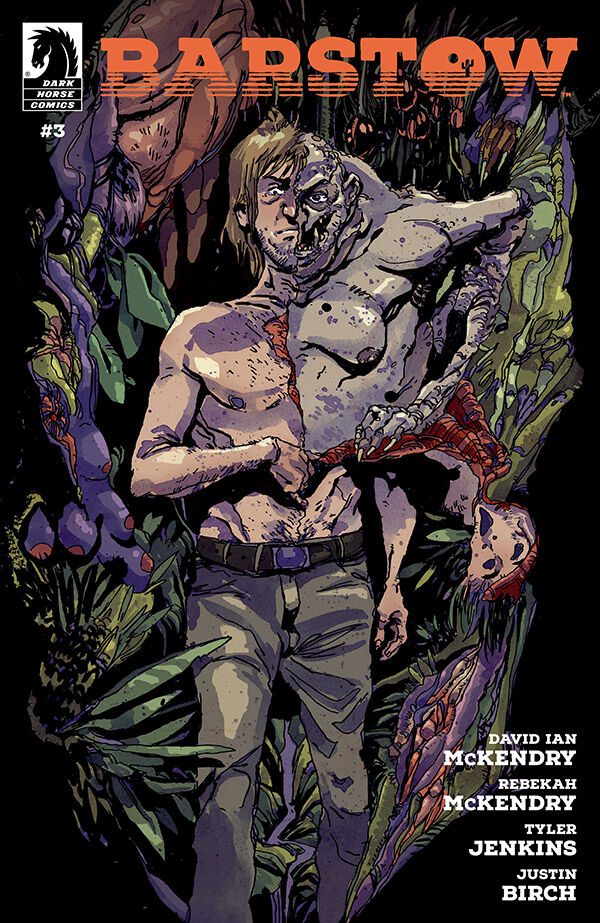
Speaking of art, Tyler Jenkins absolutely delivers on the visuals. The cover is a standout—a man splitting open down the middle, a creature crawling out of his body, all painted in sickly greens and purples with splashes of red and pink. It’s disgusting, haunting, and completely magnetic. You can’t help but pick it up. The credit page is equally striking, depicting a man dragging his lower body, entrails spilling out, in stark black and white. The layout is clever, with the text placed in the negative space created by the figure’s twisted form. It’s the kind of visual storytelling that makes comics such a unique medium.
Inside, the art remains strong, though not quite as polished as the cover. The character designs are a little less refined, but there’s a rough, sketchy charm to them, especially if you’re a fan of traditional inking. The linework looks like it was done with microns and ink brushes, giving everything a tactile, handmade feel. The panel layouts are dynamic and sometimes experimental, adding to the sense of disorientation that the story thrives on. And the monster designs get even more disturbing as the issue progresses, which is always a plus in a horror comic.
The colors are easily the strongest aspect of the book. The palette is carefully curated, with bold, limited colors that heighten the atmosphere. Even when the art gets a bit chaotic, the colors ground the scenes and guide the eye. There’s a beautiful mix of what looks like digital coloring and traditional textures, almost like watercolor markers blended with digital overlays. It gives the comic a gritty, organic look that enhances the horror elements. The only minor critique is that softer lines in the backgrounds might help the characters pop more, but that’s a small nitpick in an otherwise stellar coloring job.
Unfortunately, the lettering doesn’t quite match the quality of the rest of the visuals. The font choice is too clean, too perfect for such a raw and textured art style. It has that “sticker syndrome” where the text feels like it’s sitting on top of the art rather than being part of it. The speech balloons, thankfully, have some subtle irregularities that help them blend in, but it’s not quite enough. And with only one sound effect in the entire issue, there’s a missed opportunity to amplify key moments with some bold, stylized typography.
Despite its narrative flaws, Barstow #3 is a fascinating comic. The art, colors, and paneling make it a visual spectacle, and the horror elements are imaginative and visceral. But the story itself feels unfocused, and the lack of emotional weight makes it hard to care about what’s happening beyond the surface level. It’s fun in a grim, chaotic way, but it never quite hits that deeper, more resonant level.
If you’re into horror comics with bold visuals and are okay with a messy story, Barstow #3 is worth a read. It’s the kind of book you buy for the art and atmosphere, not necessarily for the plot. But if you’re looking for a tightly written, emotionally gripping narrative, this one might leave you wanting more. Still, for horror fans who love grotesque monsters, experimental paneling, and jaw-dropping color work, there’s plenty to appreciate here.
Writing: 3
Art: 4
Colors: 5
Overall: 4
Script by: David Ian McKendry & Rebekah McKendry
Illustrated by & Cover Art by: Tyler Jenkins
Lettering by: Justin Birch
Published by: Dark Horse Comics
Author Profile
- Antonio Rodriguez
Latest entries

 ColumnsMay 6, 2025Primordios: Enchanting Creations and Heartfelt Moments at Puerto Rico Comic Con 2025
 Comic BooksApril 17, 2025REVIEW: Sister Imperator #1
 Comic BooksFebruary 25, 2025REVIEW: Cruel Kingdom #2
 Comic BooksFebruary 24, 2025REVIEW: Godzilla Heist #1