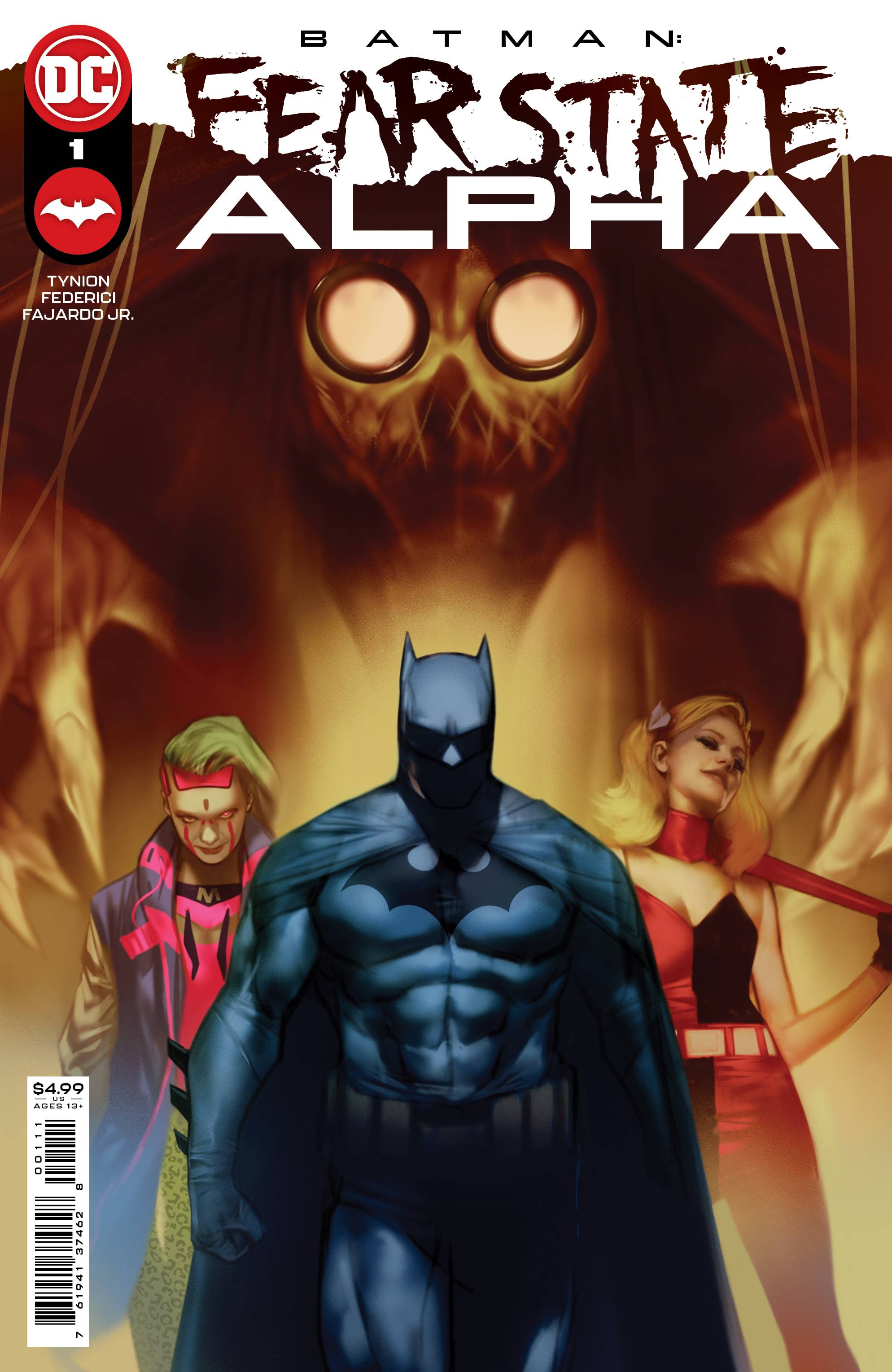
Fear State Alpha kicks off the event, with steps leading into the Future State whether you like it or not. Scarecrow has a new sponsor and armed with some Tetch tech looks to push Gotham, and Batman, past their respective breaking points. Thrown into the mix is the Peacekeeper 01 and the Mayor’s own plans for the city, so chaos and fear is just around every corner. This being comic books it is going to take 34 issues to resolve these and various other problems that are going to flower.
It has been reported that Fear State is going to be writer James Tynion IV’s swan song for Batman, a character that he has written on and off for quite a few years now. Maybe working to DC’s editorial scheduling may have taken its toll. After all, do we really need a writer of Tynion’s quality to have to tell us a potted history of Scarecrow? Tynion also has to set the scene for all the crossover issues, by introducing the start of various threads, including the Batgirls, The Next Batman, Harley and Ivy and of course a sprinkling of the actual Batman. The book is wordy, as each story factor gets time to shine; it all feels well and good for now, I guess we will see how the various writers add and subtract to the overall story.
The art is provided by Riccardo Federici who goes for a realistic style akin to Mikel Janin, which looks great. True, I am glad that someone called Montoya by her name otherwise I wouldn’t have known who she was, but this for me is the only miss-step of an otherwise well drawn book. As much of the book is a “talking heads” issue, Federici has to be imaginative regarding poses and camera angles to keep the readers eye interested. Of course, the art is helped out brilliantly by the various colouring textures of Chris Sotomayor, who I remember for his work on the Batgirl book. Sotomayor may be under appreciated when compared to other big name colorsists, but here, as he has done many times before, he absolutely nails it here with the various textures implying the various mindsets of the separate elements. When you say big names, for letterers Clayton Cowles is up there. This issue is no exception with different coloured text boxes, well placed font that doesn’t detract from the art and ensures that the conversations are followed.
Despite the talent on show, this book is an advert for the coming event, which is going to cover a range of books and characters that I don’t really care about, I get that this is the marketing point of a crossover, to get readers to buy all the books. But I do worry, that with DC’s focus on a new Batman that Bruce Wayne may be relegated to a lame duck. Hopefully this is not going to be the case as for me, there is only one Batman of present day Gotham City.
Writing – 3 Stars
Art – 5 Stars
Colors – 5 Stars
Overall – 3.5 Stars
Written by; James Tynion IV
Art by; Riccardo Federici
Colors by; Chris Sotomayor
Letters by; Clayton Cowles
Published by; DC Comics
Author Profile
-
I am a long time comic book fan, being first introduced to Batman in the mid to late 70's. This led to a appreciation of classic artists like Neal Adams and Jim Aparo. Moving through the decades that followed, I have a working knowledge of a huge raft of characters with a fondness for old school characters like JSA and The Shadow
Currently reading a slew of Bat Books, enjoying a mini Marvel revival, and the host of The Definative Crusade and Outside the Panels whilst also appearing on No-Prize Podcast on the Undercover Capes Podcast Network
Latest entries

