
Review: Bloodstrike #1 Remastered
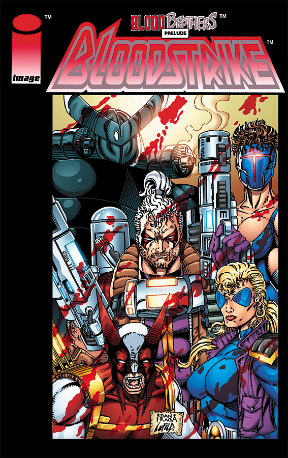 I have a recurring nightmare: One day in the far distant future, when the human race has long died out, the highly evolved race of whatever animal will replace us with their own civilization. An archaeological expedition will uncover a cave filled with long boxes. Inside, those long boxes will be perfectly preserved bagged and boarded comics from the 1990’s. These being will ponder those who came before them and have many questions about the violent civilizations depicted in the comics. They may solve many mysteries, but the one that eludes them is: Why did they need so many pouches?
So very many pouches.
To celebrate the first publication of Bloodstrike 25 years ago, Image is publishing a remastered first issue of the comic. If Youngbloods was Rob Liefeld’s take on the Teen Titans, Bloodstrike was visually based on the X-Men.
Bloodstrike is a team of technologically re-animated dead government operatives who need a special formula to keep them alive. Since the shady agency that deploys them is the only source of the miracle formula, they are forced to do their bidding with no chance of ever leaving.
But to paraphrase a super-powered being that is the visual basis for Deadlock, they are the best at what they do and what they do is infiltrate the secret lairs of villainous people and blow stuff up. The first issue is more focused on introducing the team as a whole tasked with taking down a secret weapons base in Arizona called Jericho. Only one or two characters get more than just a passing mention of who they are and what abilities they bring to the team.
The only character in the story who gets any development that we deal with is Cabbot Stone, who we find out is related to a member of the Youngbloods, one of Liefeld’s more successful titles at Image. The other characters just remain visual pastiches of other characters you know with slightly different powers.
Speaking of visuals, this book is almost a self-parody of Liefeld’s style. Everyone is carrying nine or 10 guns, has biceps the size of Yugos and four-foot long ponytails that stand straight up like the tails of startled cats. And pouches. I think Cabl… um Cabbot’s pouches have pouches.
But despite everything that is wrong with the art, there is raw straight forward action in this style. You can look at it and make fun of it, but at the same time see why it became so popular. For all it’s faults, Liefeld’s style knows how to take full advantage of every millimeter of the comic book page. And the action is clear and easy to follow. There are a lot of things that some current comic artists could learn from Liefeld.
This book is a good look at the excesses of the 90’s and is interesting for a number of reasons. If you are a Liefeld fan, you probably already have this. If you want to find out what all the fuss is about when people talk about 90’s comics, this is a prime example of the good and bad. Now, if you’ll excuse me, I’ve got to dig out some old Jesus Jones and Blind Melons cds to complete this trip down memory lane.
[yasr_overall_rating size=”large”]
Story: Rob Liefeld
Script: Eric Stephenson
Pencils: Dan Fraga
Inks: Danny Miki, Rob Liefeld
Colors: Thomas Mason
Publisher: Image
Author Profile
- Sent from the future by our Robot Ape overlords to preserve the timeline. Reading and writing about comics until the revolution comes. All hail the Orangutan Android Solar King!
Latest entries
 Comic BooksFebruary 5, 2020Review: Black Badge Vol.3 HC
 Comic BooksJanuary 29, 2020Review: Read Only Memories #2
 Comic BooksAugust 7, 2019Review: LOIS LANE #2 (OF 12)
 Comic BooksMay 8, 2019Review: Hawkman #12



You must be logged in to post a comment.