REVIEW: Breath of Shadows #4
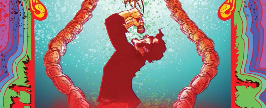
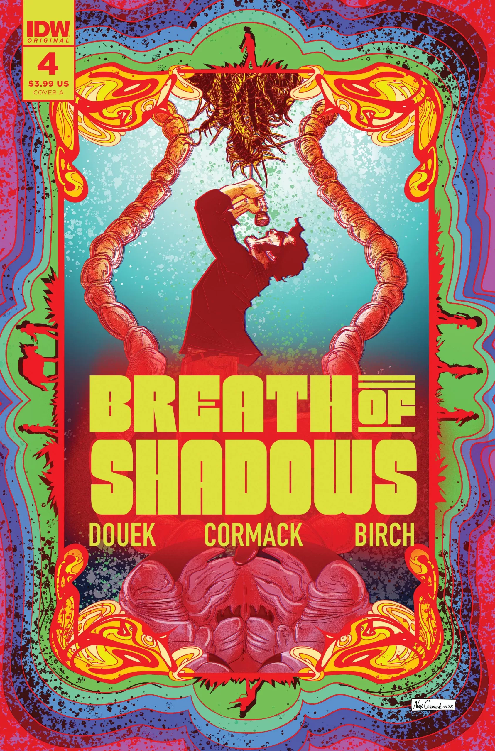 Jimmy Meadows is the lead singer of a band. He makes great music, has good friends, and the love of millions but yet is that enough for Jimmy? Breath of Shadows #4, is a very interesting story in the the series. Coming from an outside perspective this book is quite an interesting read. Whilst not particularly action-filled or attention-grabbing there are some scenes that are worth a look for sure.
The art is quite nice, when it comes to character designs I think Alex Cormack does a great job at creating a good mix of interesting characters that feel real and grounded. I think my favorite character has to be the kid with the afro. He definitely reminds me of Takashi Okazaki’s Afro-Samurai, of course just because of the hair. That being said, the expression game is alright, I think there is a bit of work to be done in regards to really getting those faces to show emotions that we as readers can connect with.
There are 2 things this book does really well though, and that is backgrounds and really suspenseful out-of-this-world acid trip moments. There is a scene where a spider eats a fly and the detail not only in the web but in the moment the spider bites down on that fly is truly gruesome, and it serves so well to put the reader in a nasty place mentally. Then we’re transported into the mind of what looks to be a deranged murderer and through the use of narration boxes we are given a deeper insight into their motives and I think it’s done so well that the sometimes weird faces can be forgiven.
The use of darkness and insects to cause anxiety in the reader and push forward the feeling of being crazy is particularly wonderful. There are some full-page illustrations in this book that I legit would hope never to see in my deepest nightmares because they are terrifyingly wonderful. Justapoxe all of this with the green and yellow backgrounds of what looks to be a forest and you have a very pretty book honestly. Whenever we cut back to the forest I can’t help but feel like we’re watching a scene from the tv series “Lost”, it just feels like the kind of place where these psychedelic, mind-bending, deep, and dark introspection would would happen. I love that it feels like Lost because in all honesty, I think a good description to describe what are characters are feeling is lost, so to me, it seems perfect to recall this show because it helps to deepen the emotional connection to the characters when we have a frame of reference from our own personal lives to add on top of what is being shown.
Aside from the art, I have to give a huge shoutout to writer Rich Douek, for his outstanding use of dialogue and narration to really put you in a bad place mentally. The pace is quite nice in terms of what’s happening to the characters as they struggle to get to safety from wherever it is they are. However, I keep coming back to the evil subplot happening inside the minds of Jimmy Meadows and Bill Tarrant, both of these scenes are particularly horrifying in such a weird way that I can’t help but get the feeling that maybe, just maybe, if we were to jump inside the mind of a true murder some of this imagery would be plaguing their psyche. The use of insects as a metaphor for evil omens is creepy, to say the least, and simply nauseating to say the most. There are panels in this book that literally send chills down my spine, and I hate to love it so much because this is dark! Broken necks, gauged-out eyes, human-faced centipedes, and insectoid babies make me want to puke. In a good way of course because I have no doubt that this is entirely what Rich and Alex wanted me to feel and in that they have definitely succeeded.
The lettering by Justin Birch is good. Often in the comic world, we like to compare letterers to bassists in the sense that a good bassist usually goes unnoticed, whilst a bad bassist will no doubt stand out and ruin the whole performance. Here the case with Justin Birch’s lettering is that of a good bassist, it doesn’t stand out but it does its job very well to tell the story. It is a rather straightforward job mostly composed of narration and word ballons, but the few couple of places where Justin is able to make some good sound fx text, they really go for it, and it looks awesome. There is one scene where music is being sung and the way Justin handles it by making the text wave out of the character’s mouths is a really good way of portraying melody and music that I haven’t seen done a lot. I also really admire that they opted out of adding any musical notes to portray music as this can very often look cheesy and this story is anything but cheesy.
This book is quite good and whilst a bit hard to get reading halfway down the story, it is still a great work of gruesome, bloody art. Not to mention that last page, and the awesome cliffhanger it ends on. I think this book is worth it just for the writing alone, but the mental journeys of the characters’ minds, definitely boost the enjoyment of this book. I give this book a strong 4.3 out of 5. I really didn’t like some of the faces in the book, they just look weird, and throughout the dark evil scenes, those faces fit right in. Yet when we’re just looking at the characters talking, they simply look odd.
Writing – 5 Stars
Artwork – 4 Stars
Colors – 5 Stars
Lettering– 5 Stars
Overall – 4.5 Stars
Written by; Rich Douek
Art by; Alex Cormack
Lettering by; Justin Birch
Design & Production by; Neil Uyetake
Edited by; Chase Marotz
Assistant Editor; Jake Williams
Cover A by; Alex Cormack
Cover B by; Björn Barends
Retailer Cover by; Joe Mulvey and Colors by Adam Guzowksi
Published by; IDW
Review by AntonioMabs
Author Profile
Latest entries
 ColumnsMay 6, 2025Primordios: Enchanting Creations and Heartfelt Moments at Puerto Rico Comic Con 2025
 Comic BooksApril 17, 2025REVIEW: Sister Imperator #1
 Comic BooksFebruary 25, 2025REVIEW: Cruel Kingdom #2
 Comic BooksFebruary 24, 2025REVIEW: Godzilla Heist #1
