Review: Dr. Horrible: Best Friends Forever One-Shot
 Superhero humour is a bit of an unforgiving beast. As a creator you put together a comic that you think is funny, with script and visual nods. As a reader, you hope that by the end of the book, that those involved have brought the laughs. Either way, if the funny is missed then everyone is left disappointed.
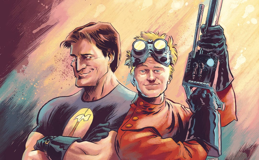
Following the death of their beloved Penny, Doctor Horrible and Captain Hammer have become best friends. Surely, their loss has brought them together, right? Surely it’s not some fandangled contraption that has caused this turnabout? The pair are soon up to the necks in time worms and double entendre as they try to help Hourglass.
Joss Whedon provides the script for the book and is in full on humour mode. Snarky comments, stupid comments and alluded to sexual metaphors all fight for your attention in a pretty pacy book that seems to cram a lot of stuff in its interior pages. For the longest time, Whedon as been around comic books and of course TV and movies. In fact, you could even say that the “everyone makes a quip” style that’s prevalent in Marvel comics at the moments, pretty much stems from his influence on the MCU. The odd thing is that this level of jokes and innuendo seemingly works better on a non franchised book like this. Is that something to do with the readers level of expectation or is there a creative freedom in play that is not seen on Big 2 books? Whatever the reason, I couldn’t help but be charmed by the pairing of Horrible and Hammer.
The art is a simple style that uses visual cues to aid the gags that is supplied by a couple of artists; the majority of the book is by Jose Maria Beroy, with Sara Soler also contributing. Both have a kind of Adam Hughes style that borders on caricature, with Hammer’s musdcles on muscles, Horrible looking weedy and weasel and of course Hourglass whose figure obviously matches her name. The pairing of the artists may have been put together as they do share some similarities. However, the differences are quite off-putting once they catch your eye. Still the duo help the story maintain its momentum through the various moments of the story. Colors are provided by Dan Jackson who gives the book a bright kind of look that accentuates the pulp influences. Nate Piekos supplies the lettering, ensuring that the balloons don’t hinder proceedings and giving the time-worms their own voice.
I didn’t know what to expect with this book, not being the biggest fan of Whedon on the block. To say I quietly surprised is a bot of an understatement, leaving me far from disappointed.
Writing – 5 Stars
Art – 4 Stars
Colors – 4 Stars
[yasr_overall_rating size=”large”]
Written by; Joss Whedon
Art by; Jose Maria Beroy & Sara Soler
Colors by; Dan Jackson
Letters by; Nate Piekos
Published by; Dark Horse Comics
Author Profile
- I am a long time comic book fan, being first introduced to Batman in the mid to late 70's. This led to a appreciation of classic artists like Neal Adams and Jim Aparo. Moving through the decades that followed, I have a working knowledge of a huge raft of characters with a fondness for old school characters like JSA and The Shadow
Currently reading a slew of Bat Books, enjoying a mini Marvel revival, and the host of The Definative Crusade and Outside the Panels whilst also appearing on No-Prize Podcast on the Undercover Capes Podcast Network
Latest entries
 Comic BooksOctober 14, 2024Review: Absolute Batman #1
 Comic BooksSeptember 25, 2024Review: Defenders of the Earth #2 (of 8)
 Comic BooksAugust 7, 2024Review: Gatchaman #2
 Advance ReviewJuly 30, 2024Advance Review: Defenders of the Earth #1 (of 8)
