REVIEW: Eden’s Fall #3
I don’t say this much, so I hope you are sitting comfortably: Man, I am an idiot!
Diving between reviews and books I didn’t even notice that this book is supposed to be a crossover book with a trio of Image books, those being Think Tank, The Tithe and Postal! No wonder then that this final issue of this previously well written book confused me.
When a comic book starts with a funeral, you can pretty much be assured that it’s not going to be a fun book! Still, now that James Miller is gone, people can get on with their lives. Unless of course we live in Happenstance County, which much be where the town of Eden’s Fall is situated. How else can you explain the myriad of people who just so happen to turn up, happen to be able to get into town and happen to succeed where others have failed?
Matt Hawkins and Bryan Hill have somehow managed to take out the human element, instead going for quick hits. This approach may work for fans of the books from which this series is sired, but as a new reader, the almost in your face introduction of new characters without nary a glance to those that have gone before is jarring. In fact, it’s as if once these characters have done their little bit, they are just left back in the proverbial tool box. It’s a shame that the story became a little out of balances as the dialogue was working. In this new light however, it somehow just feels a tad cliché. For example, one of the characters is not allowed a blanket as “they” feel she may hang herself. Strange then she is wearing clothes that could used for the same thing. Think it through!
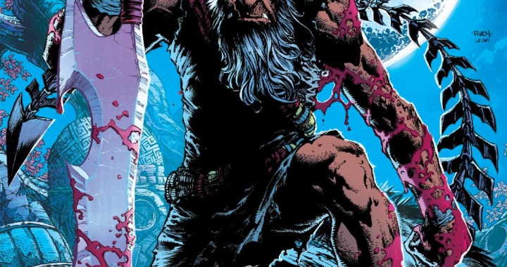
Atilio Rojo provides another stellar example of comic art, although as part of this issue is somewhat of a rinse, lather and repeat kind of affair, there are obvious similarities from the set pieces used previously. Whilst there is something to said about enjoying your favourite meal every night, man or woman can not live by pizza alone, no matter how tasty the toppings. Rojo uses bigger panels then I think used previously, which adds to the jumpy introductions that the story seemingly calls for. Rojo also provides the inks and the colors, the latter used to good effect, being a consistent flavouring throughout the series.
I really enjoyed the first couple of issues. But as I read this book, I am struck by the idea that after the surprise ending of issue one, you pretty much know where the book is going. Maybe the new characters were meant to be the curve balls, but in the end, this story pretty much concluded halfway through the second issue. A very disappointing ending to a series that started so well.
Writing- 2.5 Stars
Art – 3 Stars
Colors 4 Stars
[yasr_overall_rating size=”large”]
Story By:Â Matt Hawkins & Bryan Hill
Art By:Â Atilio Rojo
Cover By:Â Rahsan Ekedal
Variant Cover By:Â Linda Sejic
Lettered by: Troy Peteri
Author Profile
- I am a long time comic book fan, being first introduced to Batman in the mid to late 70's. This led to a appreciation of classic artists like Neal Adams and Jim Aparo. Moving through the decades that followed, I have a working knowledge of a huge raft of characters with a fondness for old school characters like JSA and The Shadow
Currently reading a slew of Bat Books, enjoying a mini Marvel revival, and the host of The Definative Crusade and Outside the Panels whilst also appearing on No-Prize Podcast on the Undercover Capes Podcast Network
Latest entries
 Comic BooksOctober 14, 2024Review: Absolute Batman #1
 Comic BooksSeptember 25, 2024Review: Defenders of the Earth #2 (of 8)
 Comic BooksAugust 7, 2024Review: Gatchaman #2
 Advance ReviewJuly 30, 2024Advance Review: Defenders of the Earth #1 (of 8)
