REVIEW: Evil Heroes #1 (of 6)
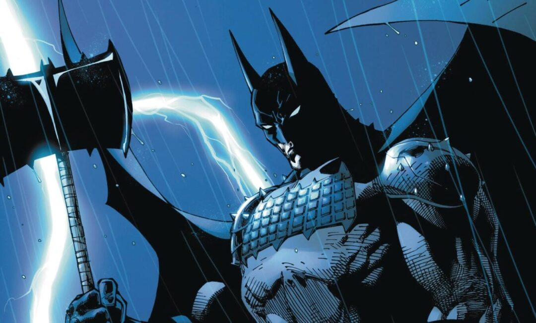
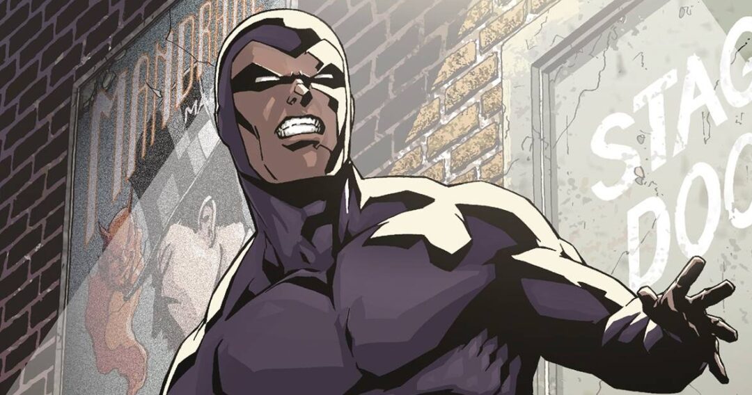
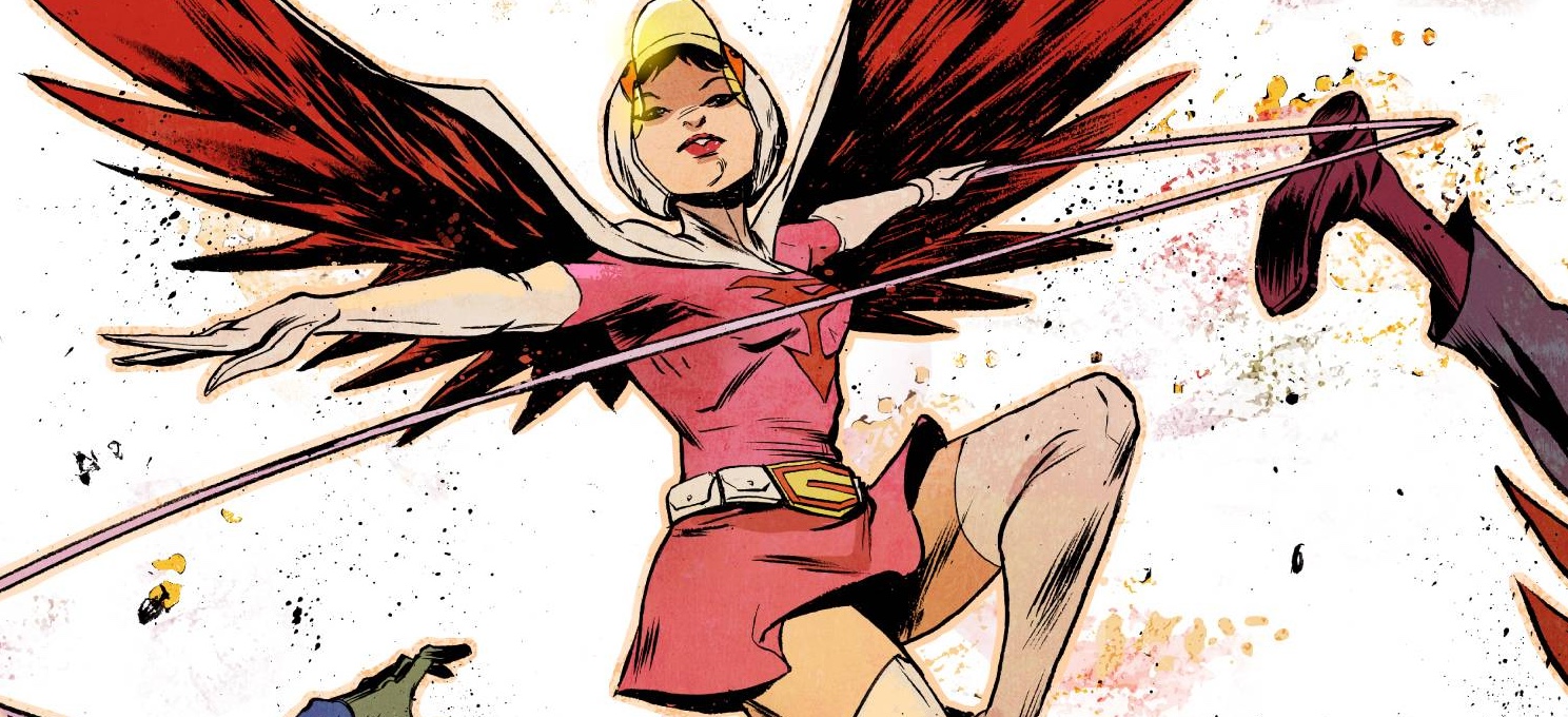
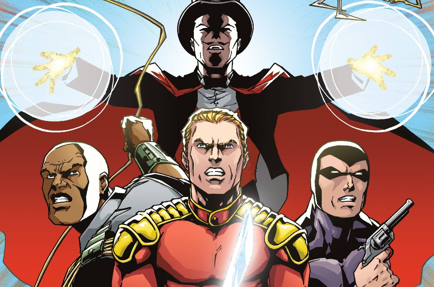
Rogue heroes are not a particularly new idea. Every time Superman does something , well super, you think of what would his evil twin “Skippy”“ be like. True, in the DC universe, we get to see that often in enough Earth 3 characters. So it“s more than a little surprising for Zenescope to get into the act. Even more surprising is the more than obvious metaphors of some pretty big DC heroes, with the inclusion of a warrior woman, a scarlet speedster and of course, a flying strong man who is initially mistaken for a bird. Or is it a plane?
This issue is pure setup, with cataclysmic destruction on hand from page two. It“s quite relentless; buildings fall, people die whilst those with powers stand amid the wreckage to survey their newly conquered world. Of course, there is a rebellion and this issue starts to hint at those who may yet stand against those harbingers of death.
Writer Joe Brusha, brings the noise in this first issue, although a cynic may suggest that writing this level of collateral damage can“t be too hard to write; Brusha does well in showing the capability of the various evil doers. In addition, he trickles the introduction of the main hope of the story in a way that whilst seems familiar, will lead to further revelations. The dialogue is pretty much as you would expect. There is the usual grumbling about around humans being weak and slaves and a search for safety, leading to unanswered questions in an effort to build on the level of tension.
The art is provided by a couple of artists, Eric J who details the majority of the book with a 3 page supporting gig from Cristhian “Crizam”“ Zamora. Taking the majority first, Eric J“s work is clean and crisp even as he almost parodies classic heroes. The action shots are pretty dramatic, with the sheer volume on show. He backs this up with the “pose”“ for characters, as if the colors of the outfits weren“t enough for you to work out who is who. As a parody, I guess it works, even if it does have an early Earth 2 or even Injustice: Gods Among Us feel. I would like to say some great things about Zamora“ work, however, as he seems to go for the “house style”“ it“s not too different from the main book. As a reader, I can see the need for separate artists to blend at times, but as seen in books like Faith, a different style can have a big impact on storytelling. With an action book, where there is a certain lack of whimsy, more regular art may be the necessity, but I would still liked to have seen a difference between the two. Zenescope are color specialists, with this book being no different under the skills of Marko Lesko.
With this book, Zenescope are showing readers that they can do more than salacious covers and fairy tales both Grimm and not so Grimm.  If this I means to get more recognition for their books, then I am a little disappointed that they have chosen to make the stand in such a facsimile manner.
Wrting ”“ 3 Stars
Art ”“ 3 Stars
Colors ”“ 4 Stars
[yasr_overall_rating size=”large”]
(W) Joe Brusha (A) Eric J (CA) Ian Richardson
Publisher: Zenescope
Author Profile
- I am a long time comic book fan, being first introduced to Batman in the mid to late 70's. This led to a appreciation of classic artists like Neal Adams and Jim Aparo. Moving through the decades that followed, I have a working knowledge of a huge raft of characters with a fondness for old school characters like JSA and The Shadow
Currently reading a slew of Bat Books, enjoying a mini Marvel revival, and the host of The Definative Crusade and Outside the Panels whilst also appearing on No-Prize Podcast on the Undercover Capes Podcast Network
Latest entries
 Comic BooksOctober 14, 2024Review: Absolute Batman #1
 Comic BooksSeptember 25, 2024Review: Defenders of the Earth #2 (of 8)
 Comic BooksAugust 7, 2024Review: Gatchaman #2
 Advance ReviewJuly 30, 2024Advance Review: Defenders of the Earth #1 (of 8)
