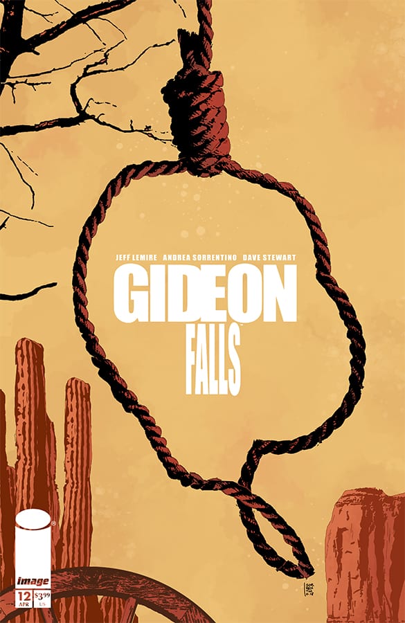
With this issue, we have the start of a completely new arc. We are taking a step back in time to Gideon Falls during the Old West in the year 1886. Having a major shift like this can elicit some confusion at first as you try to understand why the story is suddenly in a new place and time. By the time this issue ends that reasoning becomes rather clear. Since this story began it has made a habit of keeping the reader at a distance. You are never fully sure what exactly is happening or what the hidden meaning behind certain images may be. As has been the case since the start for every answer yields many more questions.
Although we have changed time and place the person at the center of this carnage is Norton Sinclair. If this is the same Norton Sinclair from the supposed future has yet to be determined. Making things even more complex is another Priest, Father Burke is also involved in the hunt for Sinclair. This is a hunt that will take him to unimaginable places. Links to the past have been a major part of this story so far and that is now being personified with this arc. What it means for the grander picture is still developing.
For some that could yield some frustration. At first glance, it can seem like this story is moving backward just to return to where it left off. There is a level of patience required and to be fair so that patience continues to be rewarded. Where this book has greatly excelled since its start is how well it builds this overwhelming sense of dread that emotes from every nook and cranny of each issue. A huge part of that is the artwork of Andrea Sorrentino and colorist Dave Stewart. In order to produce a genuine fear, it helps to break from the typical convention which they do on the regular. Â Â
When you pick up a book drawn by Andrea Sorrentino there is a good chance you will see something you have never seen before in a comic. Here he utilizes the breaking of panels to represent the literal breaking of reality as if some mysterious force transform this world into their own personal jigsaw puzzle only to return it back to an entirely new form. With Dave Stewart“s colors, browns, blacks, and greys do tend to dominate each page. They set the mood only to be contrasted with stark reds once the more horrific story elements kick in. The imagery of the Smiling Man personifies everything that works with this creative team. It is a design that is not overly complicated which gives Sorrentino room to showcase it some chilling ways and the red eyes and blood-soaked teeth give it the type of design the will fuel nightmares.
Everything about this book as an element of texture to it. Faint lines dominate each page to make it look like the imagery was etched out of wood. Even Steve Wands carries through with this aesthetic Similar to the general art style they are imperfect to a point to appear hand drawn and worn. This type of consistency and attention to detail is why this series remains one of the best books out today.
Overall Thoughts:
Gideon Falls#12 shifts the focus of the book to a new time and place in more ways than one. This may seem like a restart at first but clearly, the approach here is much bolder and well executed as anyone in this series would expect. As you turn each page the atmosphere builds to that expected boiling point only to go further and father than one would expect. Based on this issue Gideon Falls has no intention of slowing down. Â
[yasr_overall_rating size=”large”]
Writer: Jeff Lemire
Artist: Andrea Sorrentino
Colors: Dave Stewart
Lettering & Design: Steve Wands
Author Profile
- A fan of all things comics. Growing up on a healthy diet of 90's Batman and X-Men cartoon series ignited a love for the medium that remains strong today.
Latest entries

