Review: Grimm Fairy Tales 2019 Giant-Size
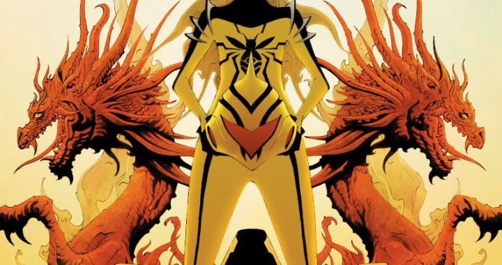
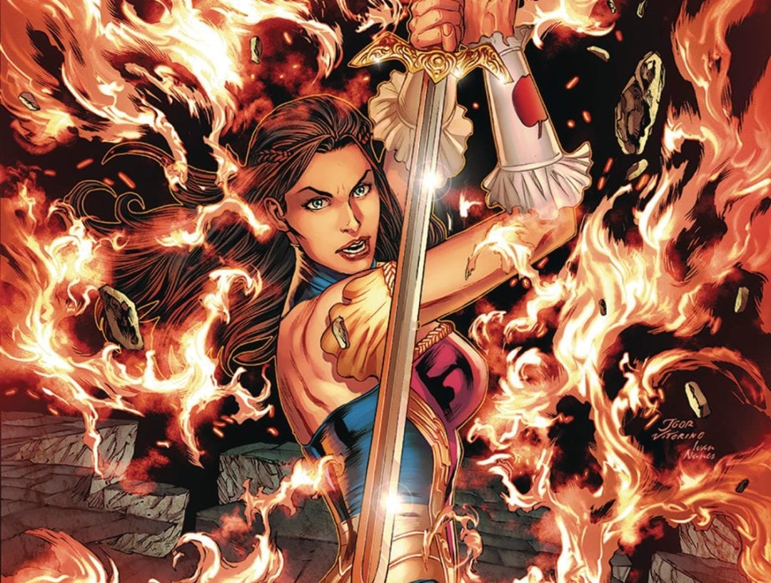
 The battle royale of the Grimm universe is finally here! Merlin, now possessing the power of the grail, has become the most powerful being in the universe. Backed up by his knights, he is about to unleash the power of the Tarot and conquer the world. Still, thankfully the world has a smitten of half-dressed, magically powered young women led by Sela Matthews and her mentor Shang.
This climax of this arc has been on the cards, no pun intended, for quite a while. For the most part, the various characters have been moved in to place, which serves as a montage of sorts, possibly to showcase their respective talents, as the gang meander across the world to stop the knights and ultimately Merlin himself.
Grimm co-creator Joe Brusha is on hand to lead the reader through this fight issue. If you are a fan of any of the Grim characters, you will either love it or hate this book. With such a large cast, your favourite character may not get enough panel time for your liking. That said, Sela is the main heroine of Grimm; with so many of the significant cast in play, I do wonder about the timing of it all especially as there is a Zodiac mini-series that ties into part of this story, some readers may wonder what the whole point of continuing to read Zodiac as the main story reaches a conclusion here. The dialogue is pretty standard fare, covering the bases well enough, even if Merlin can come across as a mustache twirling villain.
The art is provided , mainly by Eman Casallos, who delivers a house style that if you read Zenescope, you would come to expect. The characters in action look dynamic which suits the whole feel of the book. True, some of the details on the faces can go a little sideways, but this isn’t a book that is looking to deliver conversation pieces. The art does get a change-up with the last couple of pages being supplied by Milton Estevam who gives the book a David Finch look that totally changes how Sela is drawn, and that isn’t even mentioning the fact that her costume becomes even more skimpier than usual. Jorge Cortes does a stellar job on colors, which by know, you should expect from Zenescope. Lettering guru Tyler Esposito does the sort of exemplary job that only he can complete, utilising a range of fonts and text bubbles that add to the ambience of the comic.
Looking at Zenescope books, I have to admire that they have stuck to their publishing model, walking a fine line between cover girls style art and gratuitous art. I only wish that they were more consistent in the actual overall quality of the product.
Writing – 3 Stars
Art – 3 Stars
Colors – 4 Stars
[yasr_overall_rating size=”large”]
Written by; Joe Brusha
Art by; Eman Casallos & Milton Estevam
Colors by; Jorge Cortes
Letters by; Taylor Esposito
Published by;Â Zenescope Entertainment
Author Profile
- I am a long time comic book fan, being first introduced to Batman in the mid to late 70's. This led to a appreciation of classic artists like Neal Adams and Jim Aparo. Moving through the decades that followed, I have a working knowledge of a huge raft of characters with a fondness for old school characters like JSA and The Shadow
Currently reading a slew of Bat Books, enjoying a mini Marvel revival, and the host of The Definative Crusade and Outside the Panels whilst also appearing on No-Prize Podcast on the Undercover Capes Podcast Network
Latest entries
 Comic BooksOctober 14, 2024Review: Absolute Batman #1
 Comic BooksSeptember 25, 2024Review: Defenders of the Earth #2 (of 8)
 Comic BooksAugust 7, 2024Review: Gatchaman #2
 Advance ReviewJuly 30, 2024Advance Review: Defenders of the Earth #1 (of 8)
