Review: Grimm Fairy Tales #5
 For me, Grimm Fairy Tales are something of a guilty pleasure. Sure, the stories can be a little wonky and the cover art can be misleading, but there comes a time when you have to say “enough is enough!”
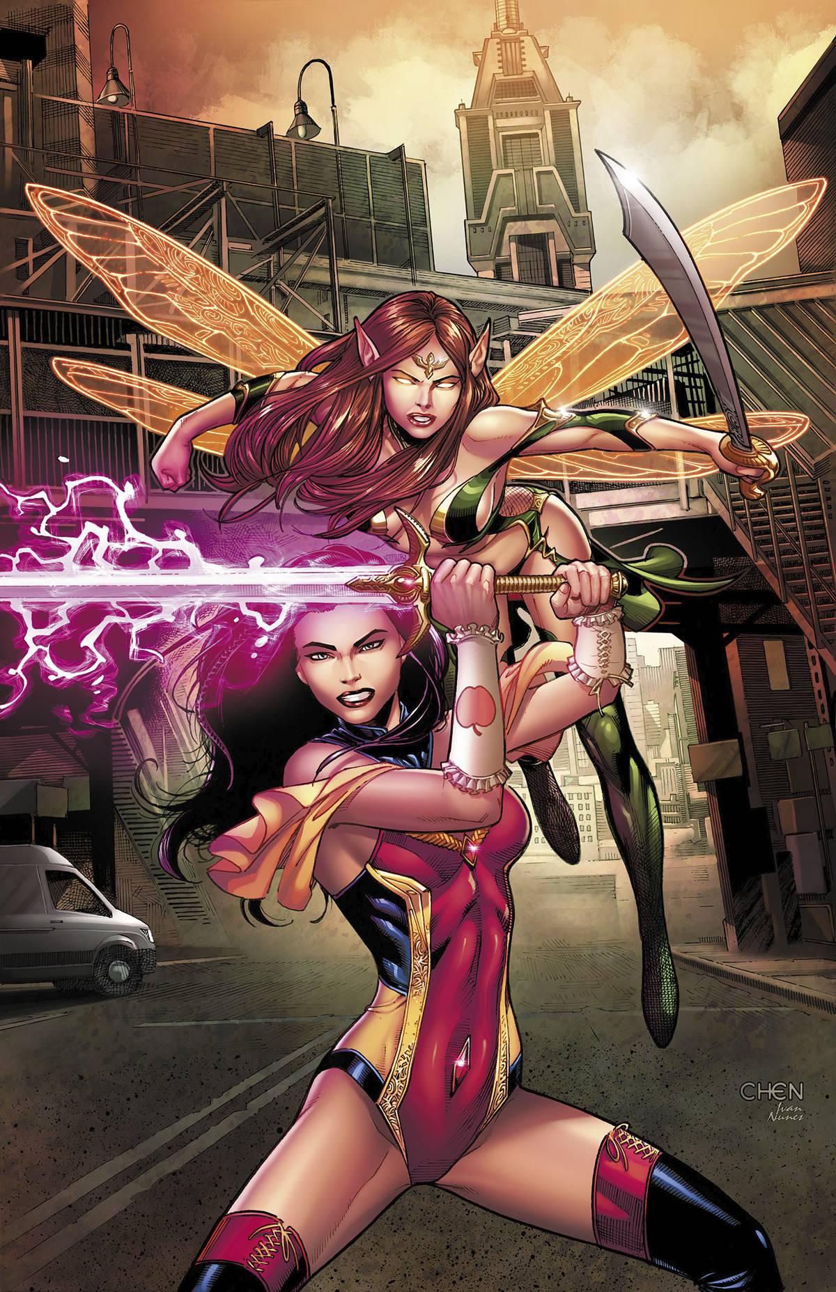
Issue 5 sees the new Guardian of the Nexus, Skye Matthews, back at Arcane Arts keeping up with her fighting skills. As part of this it seems that this is right time for her to be given her mother’s sword in a scene that practically screams “you are going to need that later!” From there, it’s all quiet until she is kidnapped by Belle, who needs Sela’s help to thwart an evil in Neverland leading to exposition, scenery chewing and a fight. Pretty basic stuff.
However, things fall off the wagon early. Joe Brusha is a Grimm veteran who should do so much better here. First of, the timing of the practice sword fight seems at odds as it happens before Skye is actually given her sword. There is the sword itself which is slid into the story at just the right time to be of use later on. Finally, there is the dialogue; in one panel Skye asks “What’s the plan?”. Belle then tells her and Skye’s response is “Sounds like a plan.” Isn’t that what Skye, asked for? It’s just plain clunky.
The art is by Ario Murti who does a great job of drawing huge breasts on every woman. I am all for artistic licence, but c’mon! It seems that boobs are about the only that Murti can draw consistently. Faces on the same characters constantly change, with their framework also suffering from the incessant need to have boobs in the panel. Take a look at the panels of the final fight. The way that Skye is holding her sword is anatomically impossible. One other thing to consider; Skye is meant to be a young woman enrolled in Arcane Arts. Murti has drawn her a much more mature woman. Now this may be the only way that the editors allowed the over sized breasts, being as it would be extremely poor taste to depict a younger woman in some of the poses that Skye and her cleavage find themselves in. Whatever the reason, it’s a lack of forethought from the editors that, for me, disrespect’s fans of the book.
Grimm books are an acquired taste, like the best junk food their packaging tempts and teases, yet this time around, they have left a left a sour after taste.
Writing – 2.5 Stars
Art – 2.5 Stars
Colors -3 Stars
[yasr_overall_rating size=”large”]
Writer: Joe Brusha
Artist: Ario Murti
Colors: Ivan Nunes
Letters: Taylor Esposito
Publisher: Zenescope
Author Profile
- I am a long time comic book fan, being first introduced to Batman in the mid to late 70's. This led to a appreciation of classic artists like Neal Adams and Jim Aparo. Moving through the decades that followed, I have a working knowledge of a huge raft of characters with a fondness for old school characters like JSA and The Shadow
Currently reading a slew of Bat Books, enjoying a mini Marvel revival, and the host of The Definative Crusade and Outside the Panels whilst also appearing on No-Prize Podcast on the Undercover Capes Podcast Network
Latest entries
 Comic BooksOctober 14, 2024Review: Absolute Batman #1
 Comic BooksSeptember 25, 2024Review: Defenders of the Earth #2 (of 8)
 Comic BooksAugust 7, 2024Review: Gatchaman #2
 Advance ReviewJuly 30, 2024Advance Review: Defenders of the Earth #1 (of 8)
