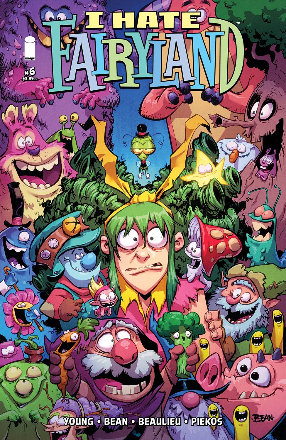
First off, our lovable potty-mouthed friend is back! Gertrude is now a teenager from the looks of it and she’s angrier than ever. King Cloudeus will have none of it, so he enlists Judd the time-traveling hillbilly to find the one person able to take care of Gertrude, and who he finds will no doubt surprise you. Like every other Skottie Young creation this is fun to read, reads smooth like butter, and looks amazing right from page one. This is volume two in the stories of I Hate Fairyland and whilst this is not drawn by Skottie themselves it definitely retains the feel of the first volume and of course the wonderfully inventive world of the first books. Each and every character is drawn with a masterful knowledge of character design and literally every one of them looks awesome. It doesn’t matter if they will appear in one panel or throughout the whole book they are simply fantastic! I love these characters because they take what would otherwise just be a childish aesthetic and push it toward a more punk and gritty look. Whilst they are not scary per-se that grittiness comes from the fact that here everything is a little messed up. If there’s a wooden table, that wooden table will have some cracks. If there’s a man whose head is a teacup (which there is) the tea will be spilling from him. If a boy has a flower pot for a head you better bet that there will be a couple of butterflies and bees around those flowers. Everything is just a little gnarly! Even King Cloudeus himself has a couple of hairs on his nose, and how could he? He’s a walking cloud man?! All of these little details serve to set the mood for the overall story. Yes we are in Fairyland but this is not gonna be pretty.
Enter Gertrude, bags under her eyes, crooked teeth, and a mane of green hair so unkempt you’ll probably find a couple of fleas up in there. She’s so awesome! I honestly don’t want to talk too much about the story because it’s fantastic and you need to read it. It’s crammed with funny quips, and biting commentary that is both self-aware and yet incredibly engaging. I also love how every cuss word is exaggerated and turned into its fairyland alternative. It manages to both censor and still pack every punch of the original word all in one go. Speaking of words and exaggeration. These books are actually lettered by none other than Nate Piekos! This is literally the kind of lettering, the man recently released a book called Essential Guide to Comic Book LetteringWhich I have the pleasure to be reading right now and in it, he details all the techniques that a professional letterer should master in order to translate scripts into word balloons, sound fxs, and caption boxes. Seeing his work on these pages is a living example of how applying the techniques in his book will elevate any piece of art to its fullest! From the hand-drawn word balloons to the fantastically drawn sound fxs that are just as much a part of the art as the character themselves to the fantastic fonts, Piekos is truly a master at their craft. If you’re wanting to be a comic book artist this is one of those books that you need to read, because it’s amazing from page 1 to page 30. The character designs are uniquely inventive and push themselves to be something that you’ve never seen before, the colors are outstanding and each panel gives you a wonderful feeling of where the action is unfolding because the lights and shadows are so well executed that it doesn’t matter if you’re outside in the sun or traveling through time and space, the colors will reflect it perfectly.
The creators in this book achieve a perfect symbiosis between storytelling and visual medium and I love it. It’s fun, it’s detailed, it’s exciting, it’s gory, it’s everything you want from a Fairytale story for young adults. This issue, in particular, sets us up for what will no doubt be a fantastic run of issues with a plethora of alternate versions of our favorite green-haired mother-fluffin’ protagonist, and I am all for it. It also features 7 full-page illustrations that are to die for! I would love to have any of these on my wall as posters because they are fantastic. This book is just pure perfection! From the cover art to the credits page all the way to the cliffhanger page, it’s amazing to look at. I also love how simple yet complex it is. It’s one of those stories that is easy to pick up on any issue and you’re gonna have a ton of fun reading it because it has so many jokes and visual gags that even though there is an actual story arch to it from issue to issue, each book is filled with enjoyable moments that anyone can read. From the first-time reader to the long-time fan, I Hate Fairyland is a must-have always. Pure perfection.
Writing:5 Stars
Art: 5 Stars
Colors: 5 Stars
Overall: 5 Stars
Created by; Skottie Young
Art by; Brett Bean
Coloring by; Jean- Francois Beaulieu
Lettering by; Nate Piekos
Cover art by; Brett Bean
Variant Covers by; Peach Momoko, Eric Powell, Jim Mahfood
Published by; Image Comics
Author Profile
Latest entries

