REVIEW: James Bond Hammerhead #4 (of 6)
Things are looking grim for James Bond as schemes and counter schemes fall into place. As we start, James is tied to chair facing death whilst Kraken, whose identity still remains secret, seeks to gain the upper hand with the aid a nuclear device. This is pretty much a normal day at the office for 007 so as you would expect, he lives to meander through the rest of the issue, where the revelation of his enemies identity lies waiting in the depths.
Dynamite have been consistent with their approach to the famous British spy’s adventures, giving them a of air darkness that suits the ambiguity of a man whose job it is to kill. To do this, Dynamite have sourced some of the best British writers, firstly Warren Ellis and now with the man who inspired a TV character who inspired a comic character, proving that art imitates life, Andy Diggle.
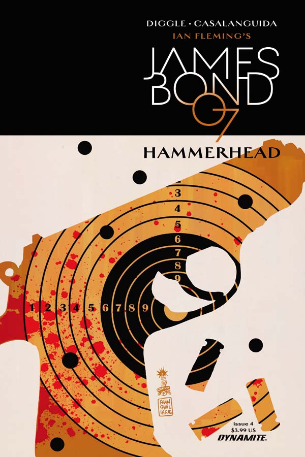
Behind a fantastic Francesco Francavilla cover, Andy Diggle cements the previous issues with a book laden with tense confrontation and a stark realization. It seems that Bond’s immediate villain isn’t too great at taking orders, leading to a burgeoning friendship of sorts. Diggle writes in a way that belies the complex settings of a spy story. In his hands, Bond seems more focused than in previous books. This may just my perception as this issue is the starting part for the climax of the story, rather than the set up. Still Diggle fleshes out his characters well; the honorable fox, the minister’s plea all the way to Monnypenny’s stand.
Luca Casalanguida provides the art for the book. The European influences are clear to see, giving Bond and the characters a stylish feel. Indeed, whilst it is not the dynamic vision of movement seen in a lot of American book, there is story telling abound, through the little details, which are on show in most panels though surprisingly, can be missing in the characters appearances. Casalanguida is helped no end by the excellent colors, which are reminiscent of the Mike Mignola and Dave Stewart partnership. In fact, you could say that the colors more than any other aspect of the book define the world of spies with its, shadows upon shadows environment.
Whilst I have recognised the quality of Dynamite’s interpretation of Ian Fleming’s hero, I have been a little critical regarding the art and the lack of background work. In this run, I can have no such argument as the fantastic art meet story and out of the fusion, a higher standard of book awaits eager Bond fans.
Writing – 5 Stars
Art – 5 Stars
Colors – 5 Stars
Cover (Francavilla) – 5 Stars
[yasr_overall_rating size=”large”]
Cover: Francesco Francavilla
Writer: Andy Diggle
Art: Luca Casalanguida
Author Profile
- I am a long time comic book fan, being first introduced to Batman in the mid to late 70's. This led to a appreciation of classic artists like Neal Adams and Jim Aparo. Moving through the decades that followed, I have a working knowledge of a huge raft of characters with a fondness for old school characters like JSA and The Shadow
Currently reading a slew of Bat Books, enjoying a mini Marvel revival, and the host of The Definative Crusade and Outside the Panels whilst also appearing on No-Prize Podcast on the Undercover Capes Podcast Network
Latest entries
 Comic BooksOctober 14, 2024Review: Absolute Batman #1
 Comic BooksSeptember 25, 2024Review: Defenders of the Earth #2 (of 8)
 Comic BooksAugust 7, 2024Review: Gatchaman #2
 Advance ReviewJuly 30, 2024Advance Review: Defenders of the Earth #1 (of 8)
