My first impression of the book wasn’t a positive one. The art was very loose and put me off at first. However, the more I read the issue, the more the art grew on me. I’ll have more on that later. What kept my interest was the natural and realistic dialogue. The issue has a wonderfully smooth flow thanks to the strong writing. Each character in the issue has a clearly defined personality. I especially liked the banter with Charles and his father in the first few pages. His father is very matter-of-fact in his language and his body language demonstrates that perfectly. We see him with his arms crossed and he shows affection for his son with a handshake. Tuition is expensive, so he expects his son to take school seriously and he makes no bones about it. Tamara’s dad is almost a complete opposite. Tamara and her father are both shown to be people of faith and her father is supportive, but knows he has to let go. It was smart to start off the issue highlighting our main characters and taking a story/characters first approach. While I could see the hook coming, I cared to keep going because I liked Charles and Tamara. I think many of us can relate to the fish out of water, first days of college feeling. The issue does a great job of building our main characters personalities and giving them a solid motivation for coming together.
Jey Levang’s art is a good match for the story. As mentioned previously, it didn’t make a strong first impression on me. Buildings and material objects that we expect to have straight lines are wavy and lack a sense of weight. The art style has a bit of an unfinished, loose look to it. However, that does play into the humanity of the story and its characters first approach. Even the colors have a penciled look and not the overdone digital paint style typical of modern books. The colors look especially good in the scenes involving sick characters where the panels pop with deep crimson reds and saturated greens. It looks unsettling in an appropriate way for this type of book. Jey also makes use of some creative page/frame layout choices including invoking round pop out panels in scenes involving the sickness. The characters are drawn to be very expressive which helps to flesh out their personalities and convey their emotions.
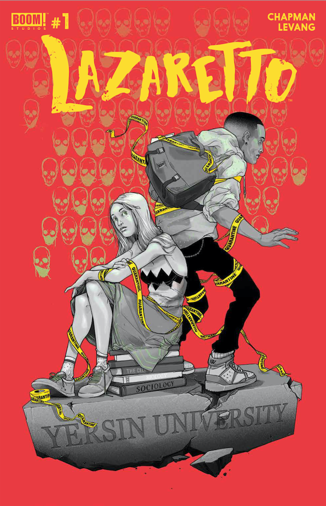
The cover by Ignacio Valicenti is excellent. It makes nice use of color and framing to draw your attention. The yellow quarantine tape is a nice touch and hints at what is inside.
I enjoyed this issue more than I initially thought I would. It’s not a groundbreaking story and it’s fairly obvious early on where the story is leading to, but it’s executed well. The dialogue is a highlight and keeps the story moving along. The art style has a great human, analog look to it. I rate this issue 4 out of 5 stars.
[yasr_overall_rating size=”large”]
Written by Clay McLeod Chapman
Illustrated by Jey Levang
Published by Boom Studios
Author Profile
Latest entries

