I’m a fan of classic monsters in contemporary fiction, which is probably why shows like Grimm and Midnight Texas appeal to me, along with the Percy Jackson book series. Blending the terrifying things of childhood nightmares with real world scenarios makes stories exciting in their “what if” presentation.
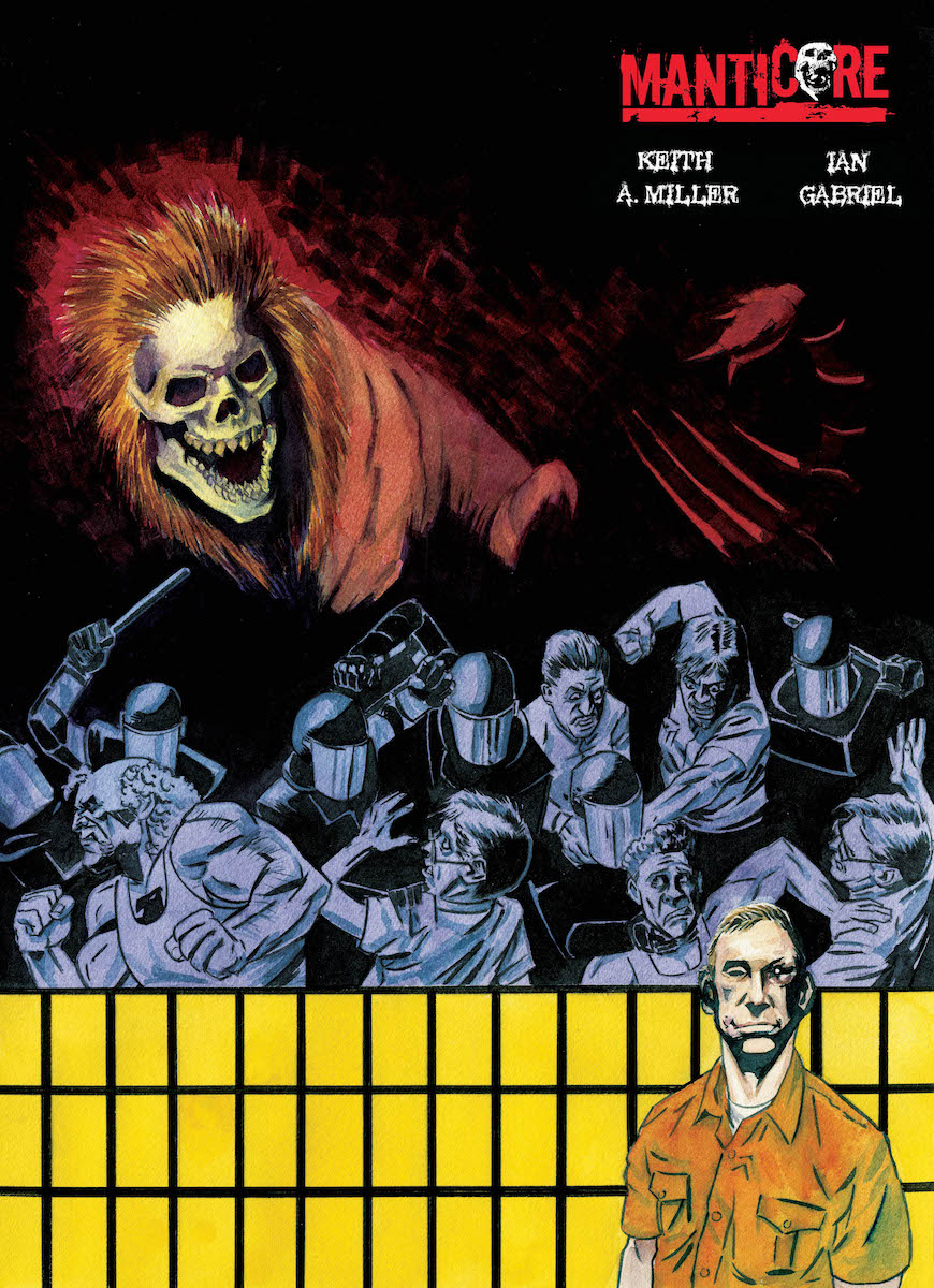
In Manticore, a group of inmates are subjected to daily drugs and are always at odds with one another. So when a new transfer from Guantanamo Bay turns the prison into his own personal buffet, our criminals must face the beast head on or suffer a terrible fate.
I wanted to like this. I really, really did. However, a combination of writing, art, lettering, and layout missteps kept me from appreciating what had the potential to be much better.
.
Now before I rip this five issue trade to pieces, I do want to say there are some really successful aspects of Manticore worth mentioning. The build-up of suspense is well worth it in the first half, leading up to the full reveal of our mythical beast. Great usage of shadows, visions, speculation, and partial views of teeth and scorpion tails and lion claws in the mix. When the action happens, it’s intense and gory and cool as hell. The content does not shy away from adult themes like sex (and nudity), violence, and offensive language. The characters are not unique but do span an array of prison stereotypes: a child molester, a white supremacist, a gang banger, an Asian mobster, an old man with a mile-long rap sheet, a Mexican druglord, and the newest addition- a white collar criminal who we follow from booking to… well… you’ll see. And finally, the scenes where the lights go out and the inking is inverted for several pages near the end were some of my favorites.
Now, let’s get down to brass tacks. First of all, there is a blend of prison life and bureaucratic bullshit in this trade that is really unnecessary. I would have much rather had four issues with just the cellblock plot development than extend to a fifth and have boring office discussions. They may progress the plot and provide insight, but the rhythm is disrupted. Showing guards slacking off and all that is fine, but the warden does nothing for the story. To make matters worse, those scenes are much more dense with dialogue, making the lettering several sizes smaller than the rest of the book. May be inconsequential in print, but digitally I had to compromise between the text being too small to read and too blurry when I zoom in. On a similar note, the speech is sometimes contained within bubbles and other times free floating near the speaker. This caused some confusion for me when determining who is speaking in what order, or even whether or not speech is taking place (versus, say, internal monologue or narration). The inconsistancy is my big gripe here; they needed to choose a convention and run with it. Plus, it feels lazy.
As for the art, the overall feel is not bad. Some scenes come off as cluttered but overall I’d describe the style as “minimal”. Now, frequent readers of my reviews will know I have a natural inclination against black and white comics, and it is work like this that reinforces those views. A fine line lies between having details without dimension and having no detail at all. Manticore follows the latter, having zero in terms of background in many scenes and leaving characters floating on a white background like doodles in a notepad. Not even greyscale, which is sad because, like I said, this story has much potential and color could have boosted this up a whole star if done well.
So, my overall impression of Manticore is what I would consider passable, but below the standard I have grown accustomed to. Call it mediocre or ho hum or whatever you see fit, but I will neither recommend nor dissuade you from checking this out. It has some really enthralling moments but suffers from an overall style that I found disappointing. Wanna read it? Great, go for it. Hope the gamble pays off and you love it. Would I blame you for skipping it? Not one bit.
2.5 out of 5 Stars
[yasr_overall_rating size=”large”]
Published by Rosarium
Written by Keith A. Miller
Art by Ian Gabriel
Author Profile
- Robert joined Comic Crusaders in 2016 as contributor, but has been an active online voice through social media for almost ten years. His hobbies include reading and collecting comics, attending theme parks, making music, and driving his wife insane. Deadpool and Nightcrawler are his two favorite superheroes, and while his preference is Marvel, he dabbles in every major and indie label in the comics community. He graduated from UTPB in 2013 with a BS in Mechanical Engineering and is currently seeking employment in that field. A southern boy at heart, he currently resides in the Midwest.
Latest entries

