I understand that comic books sometimes take an entire issue to set things up and introduce the reader to some details that seemed scattered, and this usually takes place in issue number one. Being the second issue of the series, I was no less confused by the end of it and had to remind myself exactly what it was about from the Image Comics website. It“s about time travel, such a broad subject and yet I didn“t get that impression at all.
There“s some dudes going all alpha male in many parts, some cyborg elements that would usually draw me in but instead pushed me farther away, violence, some explosions, more Tough Men, and then the only part of the book that didn“t seem like it belonged: a few panels of a genuinely interesting witch woman and her gamer friend. That part felt like it didn“t belong because it was clearer, like somebody stepped in and just wrote a few panels and dashed away because they realized that Retcon is not the book to do such a thing in. I clung to those panels but it was all for naught.
I have no idea what Matt Nixon was thinking when he wrote this. Being chaotic and trippy is something I normally adore in a story, but it seemed like all hope of that escaped him. The story feels like it“s trying way too hard and fucking itself way too sloppily in the process, and nobody wants to watch. It“s jumbled, and it“s not artistic. There is no sense of abstract, just a burning trash fire and there is zero story. Having a few pages of people yelling and cursing at each other was just annoying and pointless, and it happened entirely too often. Actually, that was pretty much the entire book, a petty show of make-believe testosterone. Plus some…magical elements? Who knows.
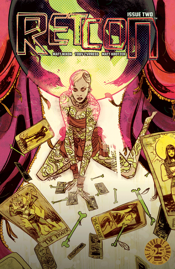
Now the artwork of Toby Cypress was much more successful in actually doing something worth talking about. As much as I hate the writing, I feel the art did all it could do to keep up with the chaos and the messy nature, and surprisingly worked out quite well. There are things you can do with words that you can“t do with art, and vice versa, and Toby was completely successful in giving us a jumbled mess of characters and scenes without it looking like a total carnival wreck. The lines work in harmony with the splashes and cuts of color, and the words should really be removed altogether, they“re not needed.
If this comic had just gone more the route of a “Strange Art Book”“, then it would have been so much better. I can“t guarantee that it would have been good, but trying too hard to be weird and trying too little to be traditional did nothing but waste time and ruin paper. If anything, get it for the lovely cover and inside artwork because by issue number two, your potential has run out.
Story: 1 Star
Artwork: 5 Stars
Color: 5 Stars
Cover: 4 Stars
[yasr_overall_rating size=”large”]
Story:Â Matt Nixon
Art / Cover:Â Toby Cypress
Author Profile
Latest entries
