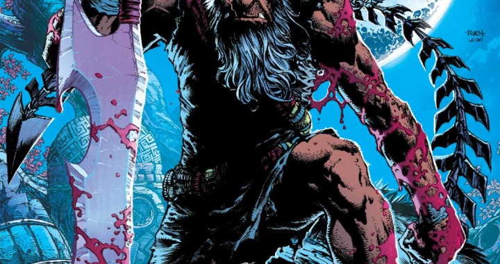
REVIEW: Shadowman #3
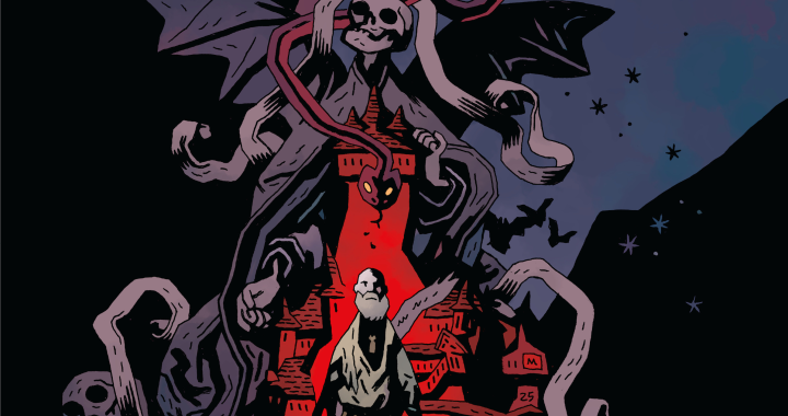
 Valiant“s “Shadowman”“ is back with the vengeance of a disrespected loa and issue #3 shows no signs of slowing down what has already been a fast-paced narrative complete with dizzying shifts between the worlds of the living and the dead. For the uninitiated, a loa is “an ancient voodoo spirit.”“ It is the kind of mythological entity that helps to authenticate the version of voodoo that serves as the substance of this book“s lore. Be prepared to learn a lot more about voodoo, New Orleans and the deadside ”“ the not-quite hell in which Shadowman/Jack Boniface has been trapped in the five years that precede this iteration of Valiant“s most overlooked superhero.
With artwork duties shared by Steven Sogovia, Adam Pollina, Ulises Arreola and David Baron, Shadowman #3 looks slightly different from the previous two issues, but much of the story ”“ penned by Andy Diggle ”“ takes place in/on the deadside, so the change in art is matched by the shift in setting of the story. Readers can sometimes be cagey about comic art by committee, but the style and feel of Shadowman is such that the blurry lines between worlds sometimes warrants a variable style.
Alyssa Miles, former abettor, and current mambo ”“ terms best understood in the context of the series ”“ is actually the core character of the book. She has been holding down the voodoo fort in Shadowman“s absence, and in this issue, it is largely up to her to provide the means by which Shadowman might be able to escape the deadside ”“ again. Together, Alyssa and Shadowman will have to figure out the history of his loa and its relationship to the pantheon of loas that seem to be working against them ”“ and all of humanity.
As reviewers we are regularly chided for not shouting out entire creative teams. There are all sorts of explanations for this beyond simple oversight, but that“s about as many words as I can afford to acknowledge on the issue in this review. That said, one of the most dynamic aspects of Shadowman is the brilliant lettering work done by Simon Bowland. Shadowman“s words and thoughts are a distinct inversion of most comic lettering ”“ white font on a black background. It signals the titular character“s presence even when he is not visible in the frame of a particular panel, having the effect of projecting Shadowman“s voice to the reader from another realm. Bowland also artfully renders distinct lettering for other, more sinister characters in the series as well. As a result, Shadowman has one of the most audible lettering styles in comics. Hopefully readers“ will give it a listen. 4/5.
[yasr_overall_rating size=”large”]
Written by ANDY DIGGLE
Art by STEPHEN SEGOVIA with ADAM POLLINA
Author Profile
Latest entries
 Comic BooksFebruary 27, 2020Review: Fax From Sarajevo: A Story of Survival
 Comic BooksFebruary 13, 2020Review: BOX OF BONES #1
 Comic BooksJanuary 16, 2020Review: HEARTTHROB Season Three #1
 Comic BooksJanuary 8, 2020Review: EXCALIBUR #5
