REVIEW: Shutter #27
 I’m sure this blend of mad designs, washed out colour and interesting ideas is really good if you’ve followed the previous 26 issues but as much as I could enjoy this one, I had NO idea what was going on.
Well paced, the plot snakes its way through the comic with only one serious misstep in the storytelling that utterly jars you, BUT as mentioned it may make more sense sequentially if you’ve read the previous issue…or read the recap that was conspicuous by its absence.
The art is where it’s at as it’s having a ball playing with classic designs and mad nightmare fuel. The colouring is faded but helps keep the panels distinct as the line work is all thin and delicate, beautiful, but without the colouring you wouldn’t be able to tell what was going on.
This would be glorious in a trade, I’d love to know why it’s called “Shutter”.
[yasr_overall_rating size=”large”]
Story: Joe Keatinge
Art / Cover: Leila Del Duca, Owen Gieni
Author Profile
Latest entries
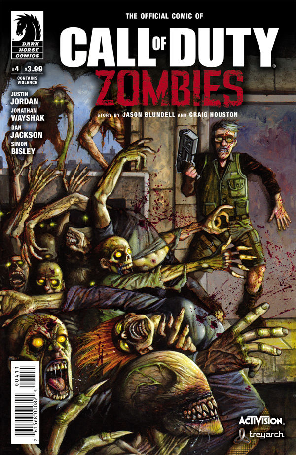
 ReviewsApril 20, 2017REVIEW: CALL OF DUTY ZOMBIES #4
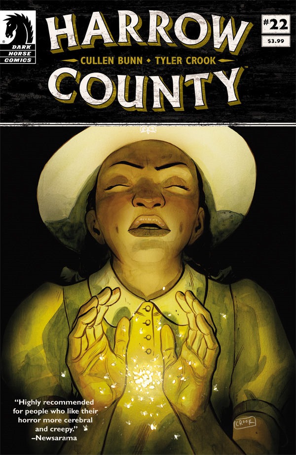
 ReviewsApril 12, 2017REVIEW: Harrow County #22
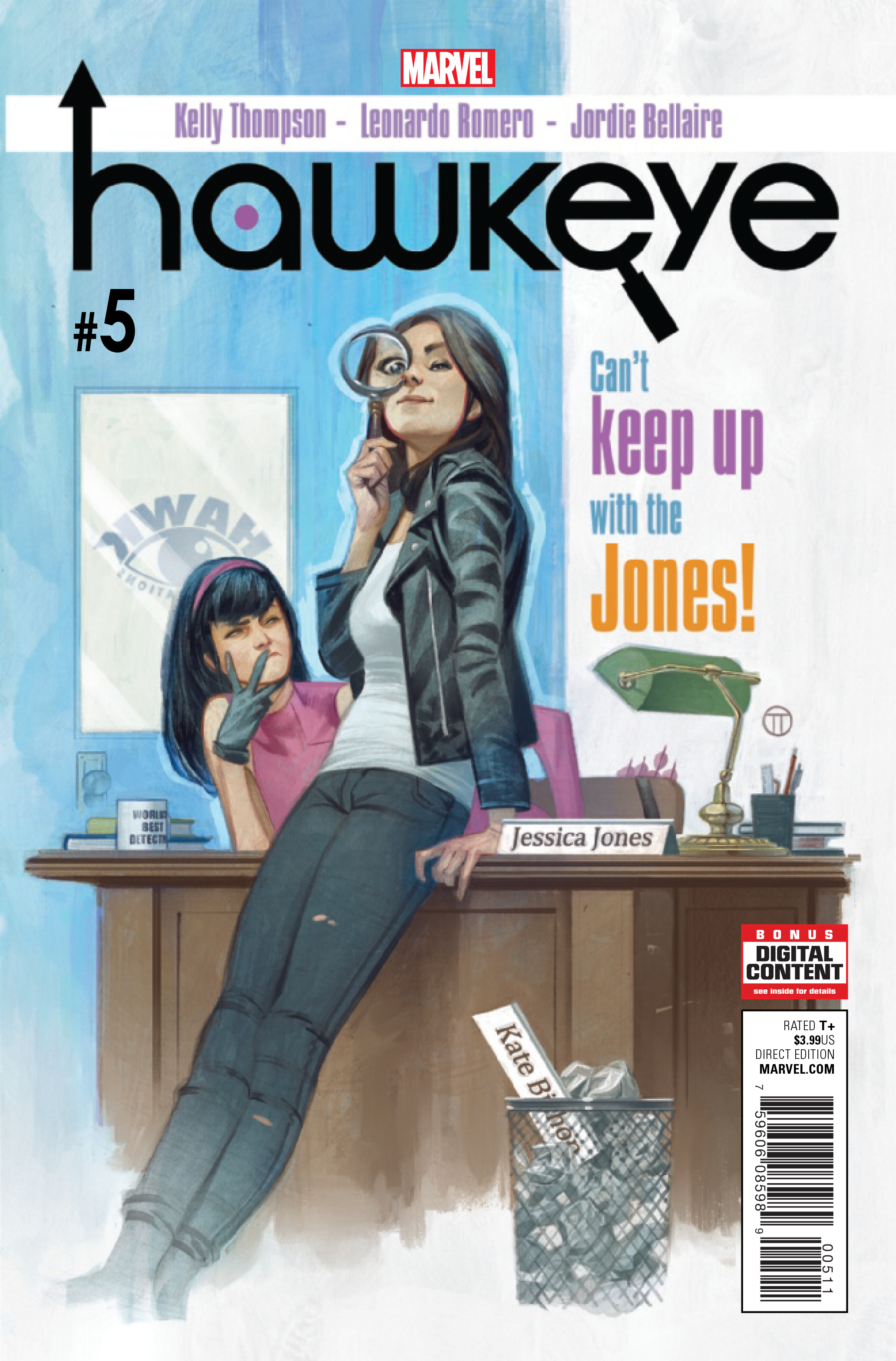
 ReviewsApril 11, 2017REVIEW: Hawkeye #5
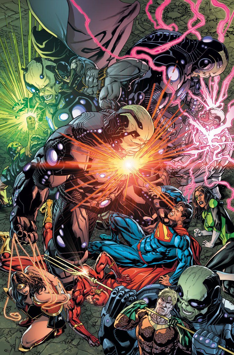
 ReviewsApril 10, 2017REVIEW: Justice League #18

You must be logged in to post a comment.