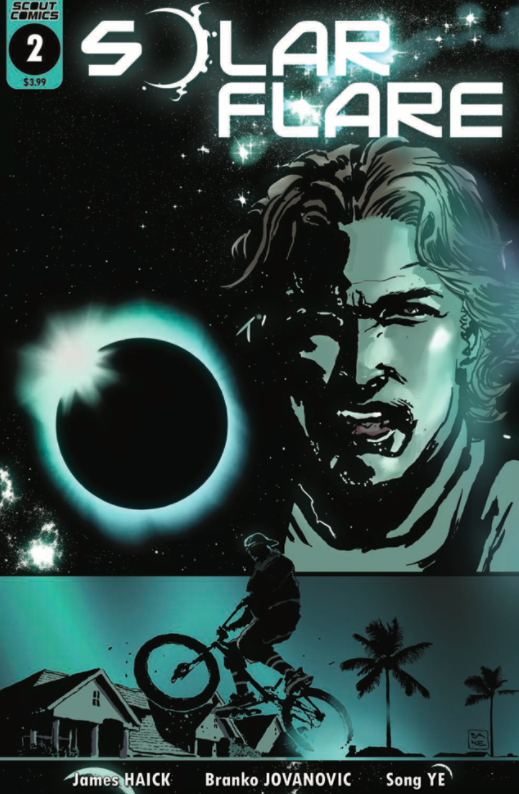
REVIEW: Solar Flare #2
In Solar Flare #1 we were introduced to Jake Clifford prior to electricity and modern technology being wiped out on a global scale by a solar flare. Jake was shown to be a normal, hardworking guy and the story emphasized his relationships with his friends and daughter. We had subtle nods to Jake and the world’s dependence on technology. James Haick made a point of building these characters and making us care about them.
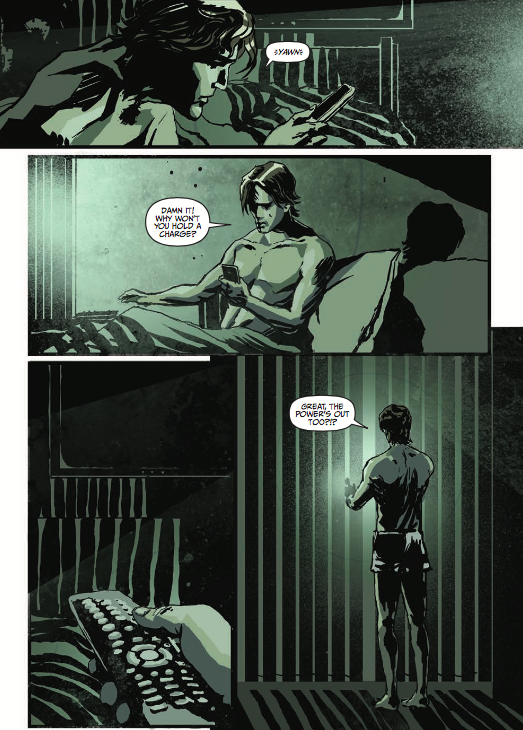
Solar Flare #2 picks up directly after the first, with Jake waking up to find that electricity and modern electronics are no longer functional. He realizes his television and phone are dead (he thinks his phone’s battery is no longer holding a charge) and his watch is displaying the wrong time. He then attempts to start his car, but it won’t start, so he takes his bike and travels into the world that has been plunged into darkness.
This issue does a great job of building suspense and has an ongoing, persistent tension. The pace is on the slow side, but it’s not objectionable. Like Jake, we don’t have a lot of answers at this point in the story. From a plot perspective, not a lot actually happens in issue 2, but what’s there is conveyed in an interesting fashion. The early portion of the book uses very little dialogue and the storytelling is told quietly through its art. Jake doesn’t know exactly what has happened and we follow him while he tries to adapt and put the pieces together. The tone is different from the first, which was all about helping us get to know the characters and setting up various plot threads. This issue is all about Jake trying to figure out what is going on.
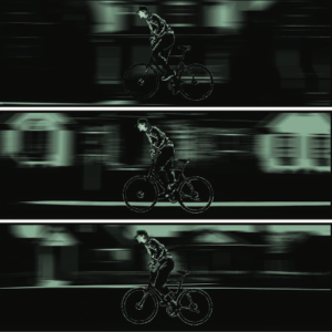
I had mixed feelings about Branko Jovanovic’s art. Overall, it is excellent, with cinematic framing and great use of shadows. It also has creative panel layouts and blur filters. As you would expect, it is intentionally dark, with minimal use of colors, to set the tone and convey what has happened to the world. The characters seem to be based on real people and are unique and well rendered. However, the art is so stylized to the point that some elements are unclear and things can muddy together in many panels. The cover is representative of the art inside, with dark and gritty visuals along with a touch of muddiness.
I give this issue 3.5 out of 5 stars. This is a good follow-up to the first issue with quality art and a great level of suspense.
[yasr_overall_rating]
Written by: James Haick
Art by: Branko Jovanovic
Published by: Scout Comics
Author Profile
Latest entries
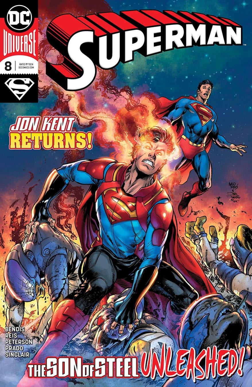
 Comic BooksFebruary 13, 2019REVIEW: Superman (2018) #8
 GamingDecember 21, 2018REVIEW – PowerA Enhanced Wireless Controller for the Nintendo Switch
 Comic BooksNovember 8, 2018REVIEW: ADVENTURES OF THE SUPER SONS #4 (OF 12)
 Comic BooksJuly 19, 2018REVIEW: Green Lanterns #51



You must be logged in to post a comment.