REVIEW: The Adventures of Augusta Wind: The Last Story #4
So this book was a bit of a mind…fudge. I“m thinking about the kids here! It is about a girl named Augusta Wind who is a storyteller, and can apparently dream and create stories into existence. Now being that this is issue number four, I find myself in a world of “huh?”“ though things were explained, but I don“t think they were explained well enough.
Augusta“s world seems heavily influenced on Alice“s Adventure in Wonderland, and rely on the main character“s power of imagination to construct the different people and things that exist in it. In theory, this sounds completely fantastic, but unfortunately the idea and the actual outcome just aren“t on the same level.
I feel like the writing of J.M. Dematteis could have been laid out so much better, and the whole book seemed like too many ideas crammed into one story. Key details needed to be better fleshed out, and because this issue is called “The Last Story”“ I expected it to be a four-part series and see the end of it. But the next issue is entitled the same thing which makes me wonder exactly what will happen then, because honestly this issue could have been the finale, albeit a very dark and depressing one. It just wasn“t clear what was happening, and I feel like I could have gotten a good grasp on the story and been up to snuff on what was going on if it wasn“t presented in such a messy fashion
Vassilis Gogtzilas serves as artist on this issue, and for an artist who has a very clear painting style, I was disappointed. The artwork is as convoluted as the writing, which is a damn shame because I do like his usual work, but here he just did not shine at all. Also I have no idea what Carlos Badilla did as far as colors go because everything has taken on such a sketchy and storyboard-esque look that is just ends up running together. The style mesh is different, but not in a good way. There are some aspects of it that radiate hope, but we only see it in the background or in panel design and nothing in the actual main part of the comic looks remotely finished. The colors are tossed here and there, and the lines look like they were done in an Ambien-induced sleep walk.
The main issue is: it just could have been so much better. Every aspect of the book is unfinished, and the parts that could have been good get overshadowed by shoddy work. I do dearly enjoy books that try to do something different, but this is a particular example of why things aren“t done in this fashion: it“s not good, Boo. I can“t focus on the art because I“m distracted by the writing, and vice versa. But I do think it can be polished up and something great could come out of the heart because it does have potential. Unfortunately potential just doesn“t cut it for poor Augusta.
Writing: 2 Stars
Artwork: 2 Stars
Colors: 2 Stars
[yasr_overall_rating size=”large”]
STORY BY J.M. DeMatteis
ART BY Vassilis Gogtzilas
COLORS BY Carlos Badilla
LETTERS BY Tom B. Long
Author Profile
Latest entries
 ReviewsMarch 23, 2018REVIEW: Dark Beach #3
 ReviewsMarch 22, 2018REVIEW: Punk’s Not Dead #2
 ReviewsJanuary 30, 2018REVIEW: EMPOWERED & SISTAH SPOOKYS HIGH SCHOOL HELL #2
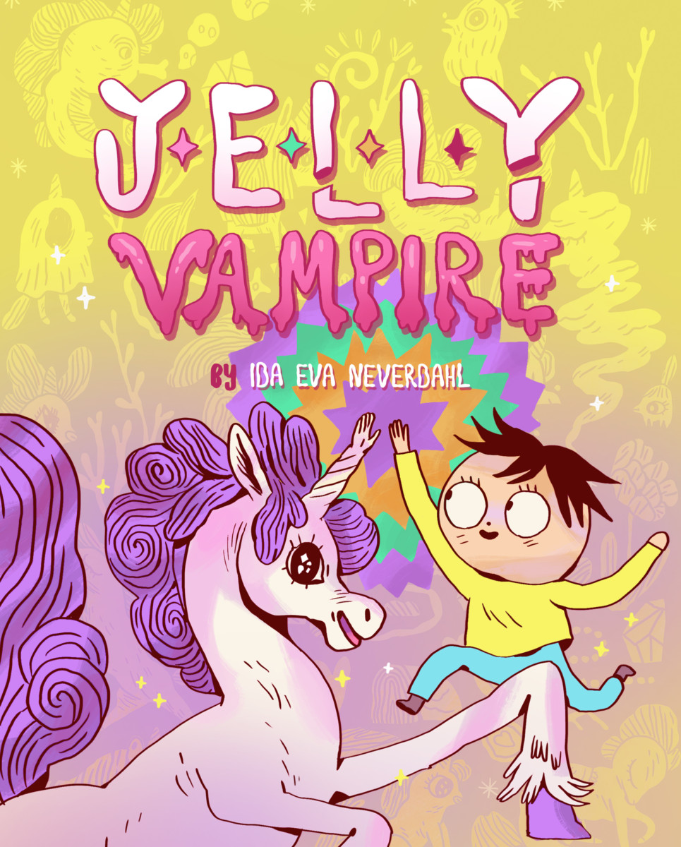
 ReviewsDecember 14, 2017REVIEW: Jelly Vampire


