REVIEW: The Enfield Gang Massacre #2 (of 6)
 Guns, Horses, and Outlaws. What does that sound like to you? It sounds to me like a cowboy story. This was good. I enjoyed it very much, I’m not a huge cowboy fan but I’m glad I had a chance to read through this comic. Essentially done by two people with color assistance from a third artist, this cowboy story is filled with gun-blazing action, saloon shoot-outs, and all the galloping horses you can ride. It features a dark art style that is very “Mignolesque” as well as heavy textured coloring with equally dark color palettes of blues, yellows, and reds. Also one very interesting note I just found out, is that it’s all inked traditionally on Bristol boards like in the good ol’ days.
It’s a western through and through, from the foul-mouthed cowboys telling their wives to listen to them when they are telling them to run away, to the blood-soaked hats and “Krakoom” sound fxs of guns blazing. Speaking of guns, one of the best things this comic has going for it is the gun battles. They are onset on yellow and red backdrops of pure carnage. Lots of Kablams, Blams, and even a huge BaBoom that’ll leave your heart racing! In all seriousness though, this is a really awesome comic and I love the fact that it’s done by such a small team because it just screams “This is our wheelhouse and we know what we’re doing” and oh boy are they doing it well! That BaBoom I’m talking about is the direct effect of a dynamite exploding inside a saloon and that full-page illustration is just pure orange and yellow goodness. Be warned, this is not a children’s story, this is a story of adults with guns shooting at each other, and when a bullet enters your brain and then dynamite blows you up, you’re not gonna be looking pretty and the black ink and textured paint on these pages do no effort at all to make a scene like that pretty. It is gorey, it is bloody and it is scary.
I found the writing to be very good, it’s quick and really easy to understand. Even jumping into it in the second chapter, you can quickly follow along. “Bad guys,” think the “good guys” killed their friends so now they are taking revenge on them and their whole town, let’s see all that play out. It’s easy, BANG BANG SHOOT. Just how a cowboy story should be, with a big emphasis on the SHOOT part. I really enjoyed the inking on these pages, especially the ones where we see close-ups of characters, those look really good, and the textured coloring mixes very well with the traditional inking and cross-hatching techniques to give a sort of grungy look to the whole comic. They are also masters at contrast, by using a dark muted palette of mostly blues and dark greens and then laying vibrant yellows on top of it you get panels that jump at you without having to try too hard to grab your attention. Speaking of attention-grabbing, the lettering on this is phenomenal! I couldn’t find any other names for the letterer so I’m assuming it was either lettered by Chris Condon or by the artists Jacob Phillips themselves, but whoever did it is seriously killing it here. They do a wonderful job at creating creative sound fxs that fit perfectly with the rest of the art as well as creating some really cool special fonts for when things are getting crazy. It’s honestly really nice, I also really love that the word ballons doesn’t have any outlines but instead goes up to the panel borders which also don’t have outlines, this gives off the impression that the white from the background is the same white on the balloons and amongst all the textures and chaos of the traditionally inked art, it makes the word balloons look very clean and easily readable whilst also having them fit perfectly into the art style. The one thing I would’ve loved to see however was perhaps a couple of extra balloon shapes here and there just to get a break from the standard word ballon oval.
The one thing I did not like about this comic however was the 3 pages of text at the end. I liked the design though, these last pages are designed as pages from a newspaper and I think that’s really interesting it even has the name “The Texas Record” to allude to these pages coming out of a newspaper from the comic’s world, which is nice. However, I still think that large blocks of text have no place in comics. I’ve always dreaded them, and even though I do understand that mailbags are a staple of the comic world, I’ve hardly ever found them interesting. I think this kind of stuff might have come from the magazines’ era when readers would mail in their questions and get answers, however when you’re reading a magazine you expect to read page after page of mostly just text, but when you’re reading a comic you are essentially picking a visual medium that primarily uses images to tell stories. I just think that if you’re gonna have these sorts of pages in your book, then perhaps throw in a couple of small illustrations here and there. Maybe answer the question with a small doodle or a quick panel of one of the characters answering the questions. Otherwise, that’s gonna be a big skip for me, and possibly like-minded readers. I did however love the inclusion of fan art by Nick Cagnetti, as well as the page explaining the process of how a panel comes to be made in this comic. I loved seeing the step-by-step process of going from script to fully rendered black-and-white inked drawing, that was very fun and educational. I also found it really cool to see that the authors of this book have a Patreon, I kinda love seeing that the book is published by Image but that they still are doing their thing through crowdfunding, that’s just cool honestly.
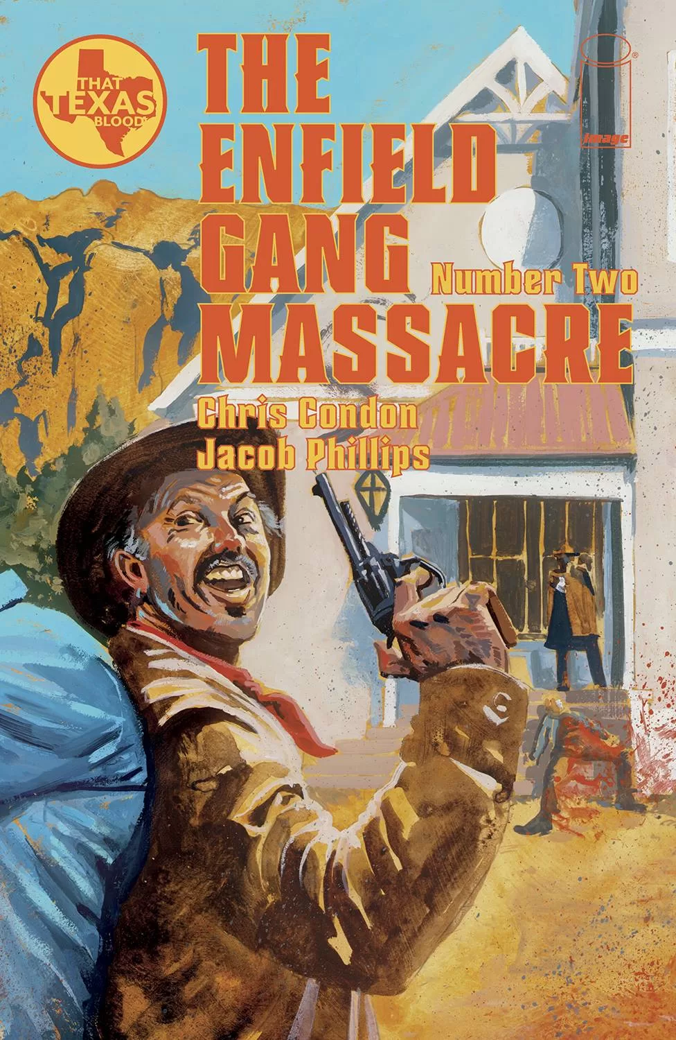
All in all, this was a great comic to read. I entered thinking that it would be a boring cowboy story but ended up loving every second of it. Oh, and before I forget, the covers are truly exceptional! They remind me of Norman Rockwell’s illustrations but with more blood and gore.
Writing: 5 Stars
Art: 5 Stars
Colors: 5 Stars
Overall: 5 Stars
Written by: Chris Condon
Art by: Jacob Phillips
Colors by: Pip Martin
Cover art by: Jacob Phillips
Published by Image Comics
Author Profile
Latest entries
 ColumnsMay 6, 2025Primordios: Enchanting Creations and Heartfelt Moments at Puerto Rico Comic Con 2025
 Comic BooksApril 17, 2025REVIEW: Sister Imperator #1
 Comic BooksFebruary 25, 2025REVIEW: Cruel Kingdom #2
 Comic BooksFebruary 24, 2025REVIEW: Godzilla Heist #1
