Review: The Flash #21
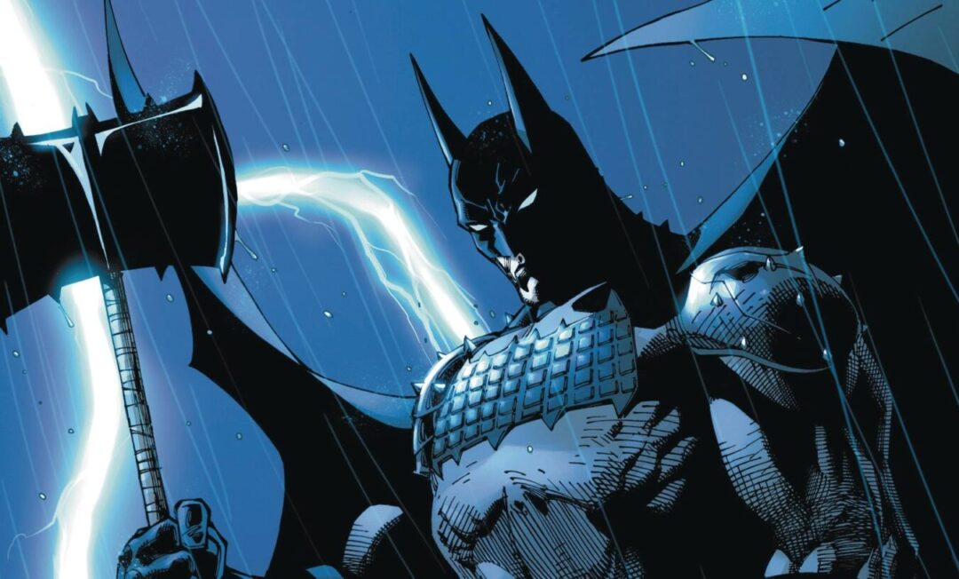
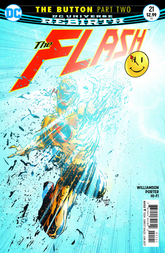
 The second part of The Button Batman / Flash crossover hits the racks this week, with a guest star from Rebirth #1, and a certain Mercury helmet making a brief appearance along with a couple of surprises.
This issue shows us the forensic nature of Barry Allen and the bridge between these two characters comes into focus as they both go into full analysis mode to determine the cause and possible effects of last issues reveals. This therefore means that the book is a lot more talky than its action laden predecessor. This was to be expected at some point yet coming so soon after the excellent Batman #21, it feels as if we have been kicked out of the speed force and moved into the pedestrian zone. In addition, the book goes into a lot of Pre-Flashpoint, Flashpoint history which doesn’t help with the pace and for long time readers feels more than a little redundant. Still this is a Flash book and its good to see an a certain piece of exercise equipment get a run out, leading to a meeting which to be fair has been a long time coming.
Joshua Williamson is in full tell mode, as he plots and pulls on various iterations of the DC Universe, moulding them into a cohesive story heavy on the illusion of its Watchmen connections. The links between Bruce and Barry are well used as a means to give some sense to these two characters being somewhat linked. The monologue belongs to Barry, who seems to be carrying the weight of the world on his shoulders. Interestingly, Williamson works hard to make sure that Batman seems to be in the Flash’s shadow, whether it is due to Batman’s injuries or the fact Flash’s knowledge of time streams gives him the advantage.
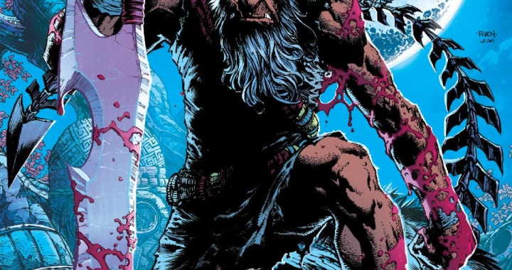
DC veteran Howard Porter is on art duties and displays a totally different style to Jason Fabok’s art in part one.  Porter’s work has a kinetic style that matches Flash well, conveying the movement and energy that always seems to be bubbling under the surface. I will say that I much prefer Fabok’s style over Porter’s; the former providing a mature look, including as it did the 9 panel pages. In contrast, the at in this book looks like just another book. The colors by Hi-Fi have a loud and day-glo vibe which again is jarring in comparison to the darkness of the Batcave. With these distinctive styles in play it will be interesting to see how cohesive the separate parts end up being.
Despite his status in the Justice League and being a major DC character, I haven’t been that impressed with Flash for a number of years. Like Jason Todd, Barry Allen for me, serves the cause better as a fallen hero. This book tries hard and a lot of readers will no doubt love this book. Yet, I can’t help but think that the main problem that this book has to overcome is that it follows the high standards of part one, yet ultimately falls a little short. Bring on Batman #22!
Writing – 3.5 Stars
Art -Â 3.5 Stars
Colors – 4 Stars
[yasr_overall_rating size=”large”]
STORY BY Joshua Williamson
ART BY Howard Porter
COLORS BY Hi-Fi
COVER BY Howard Porter, Jason Fabok, and Mikel Janin
PUBLISHER DC Comics
Author Profile
- I am a long time comic book fan, being first introduced to Batman in the mid to late 70's. This led to a appreciation of classic artists like Neal Adams and Jim Aparo. Moving through the decades that followed, I have a working knowledge of a huge raft of characters with a fondness for old school characters like JSA and The Shadow
Currently reading a slew of Bat Books, enjoying a mini Marvel revival, and the host of The Definative Crusade and Outside the Panels whilst also appearing on No-Prize Podcast on the Undercover Capes Podcast Network
Latest entries
 Comic BooksOctober 14, 2024Review: Absolute Batman #1
 Comic BooksSeptember 25, 2024Review: Defenders of the Earth #2 (of 8)
 Comic BooksAugust 7, 2024Review: Gatchaman #2
 Advance ReviewJuly 30, 2024Advance Review: Defenders of the Earth #1 (of 8)
