Review: The Villain #1
 We all have our gifts. For some its the ability to throw a football around with startling efficiency, or maybe its being able to throw ingredients around and make a superb dinner. Me, I like to think I can throw a few lines together about comic books. (For the record, I can write about other things, but this is a comic book site and do you really want to know my thoughts on how bad the Dolphins are this season?)
The Villain, Jon Doe is the best at what he does, with that skill being bad, very bad. In fact he is so bad he can break the rules, get sent to military school, break the rules again, graduate get hired by the CIA and become the world’s greatest super-villain. This first issue is nothing more than a setup, in which the rug will be pulled out from under the reader at the first opportunity. The book is a creation of Neal Adams, William Applegate Jr and Mikael Bergkvist and between them, they have managed to hit every cliché in the story telling big book of clichés.
Whilst the concept was created by Neal Adams, the book is actually written by William Applegate Jr. Between them, the pair trawl the theories of what makes a bad man turn good, in much the same way the Despicable Me movies do, without the funny/annoying little yellow dudes. The monologue that follows Doe is equally lacking any originality. Personally, I hope the copy I read was a preview as there are two spelling mistakes (page 2, text box 1 and text box 2 for those keeping score). These errors didn’t make a good first impression.
The art by Mikael Bergkvist is a serviceable homage to Neal Adams in a lot of ways. True, it doesn’t carry the weight of Adams’ experience normally seen in the amount of shading used, but in places there is a sense of dynamism even if perspective is lost at times. For large parts of the book, the art is left to carry the story. This trick was recently used and to better effect I have to say, in the Morte One-Shot, which is reviewed on this site here. Looking at this attempt, Bergkvist doesn’t quite have the skills to make this bold step work effectively. Rather than enjoying the view, I found myself rushing towards the obvious “to be continued” teaser. Colorist Eugen Betivu tries hard to make the art pop, with blurred background effects used to accentuate Doe in action. Unfortunately, all it does is highlight the problems I had with the art.
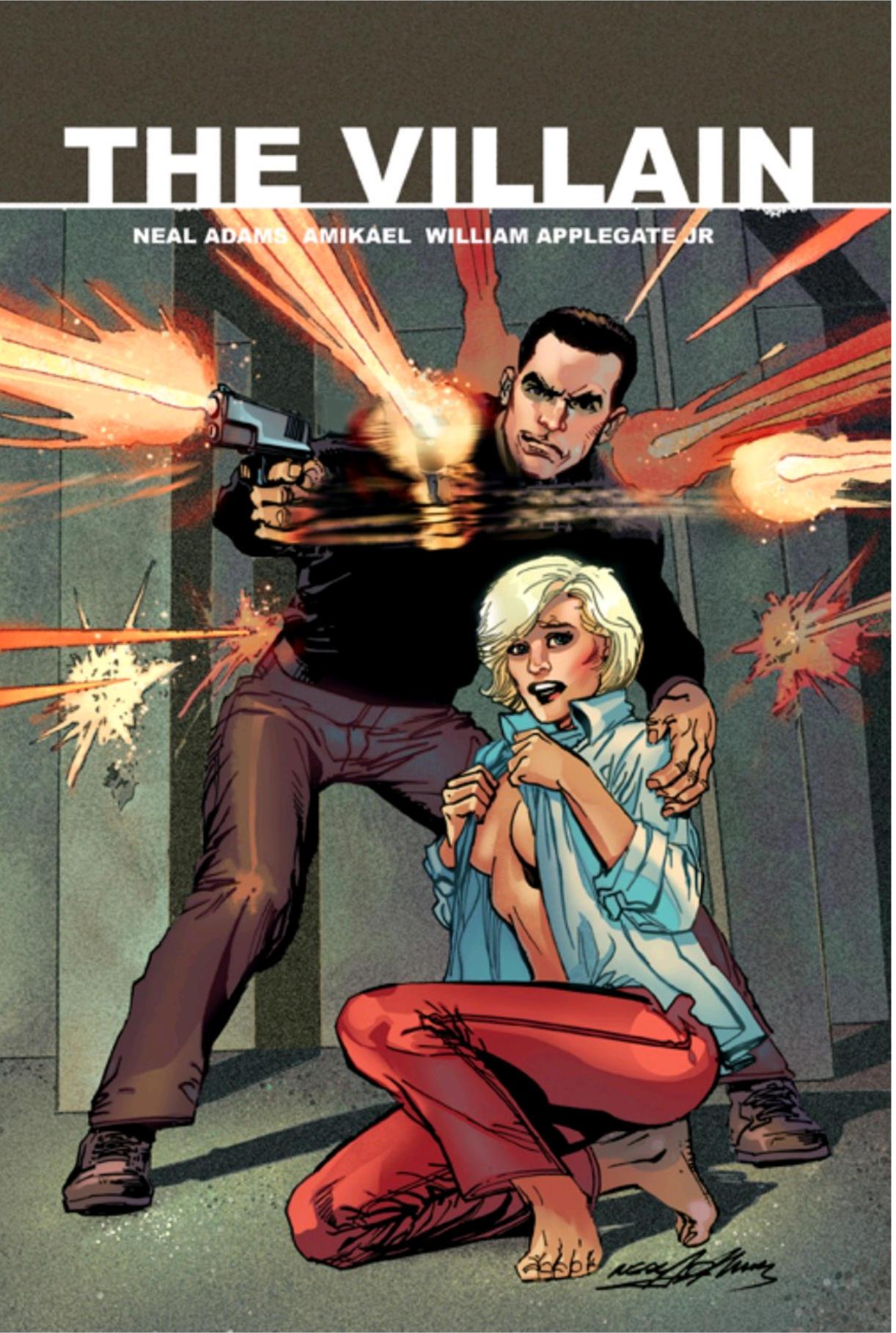
Looking through this book, I am unsure to whom this book is aimed at. For long time Neal Adams fans, there are the covers, though I am not certain why the female character has to be half-naked on them. True the whole thing is his concept, but after all, Adams was more well know for his art than his writing. Maybe this book will attract the action orientated. For me, however, the villainy of the book is the lack of originality, that s definitely not that well executed, regardless of what the lead character may tell you, over and over again.
Writing – 2 Stars
Art – 2..5 Stars
Colors – 2.5 Stars
[yasr_overall_rating size=”large”]
Created / Written by; Neal Adams & William Applegate Jr
Art by; Mikael Bergkvist
Colors by; Eugen Betivu
Published by; Red Giant Entertainment
Author Profile
- I am a long time comic book fan, being first introduced to Batman in the mid to late 70's. This led to a appreciation of classic artists like Neal Adams and Jim Aparo. Moving through the decades that followed, I have a working knowledge of a huge raft of characters with a fondness for old school characters like JSA and The Shadow
Currently reading a slew of Bat Books, enjoying a mini Marvel revival, and the host of The Definative Crusade and Outside the Panels whilst also appearing on No-Prize Podcast on the Undercover Capes Podcast Network
Latest entries
 Comic BooksOctober 14, 2024Review: Absolute Batman #1
 Comic BooksSeptember 25, 2024Review: Defenders of the Earth #2 (of 8)
 Comic BooksAugust 7, 2024Review: Gatchaman #2
 Advance ReviewJuly 30, 2024Advance Review: Defenders of the Earth #1 (of 8)
