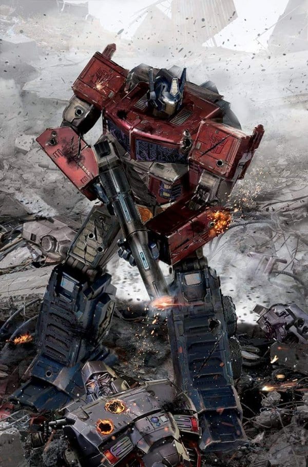
When it comes to jumping on points you cannot get much fresher than this. Any reader can pick this up off the rack and understanding every piece of what is happening. The question is does it do enough to make it worth your attention. Is this a reboot that is on the right path or are we already ready to hit the reset button again. So far it is way too soon to make that call partially due to how overly light this issue felt. Writer Brian Ruckley clearly has no desire to rush things as he slowly builds the pieces for the inevitable downfall.
Having an issue that operates both as a relaunch and a prequel is rather challenging. It comes with a lot of expectations to make a statement about how this new era will be defined, yet at the same time, this is this narrative albatross weighing everything down causing events to feel like they are slowly inching along to an unavoidable conclusion. Â So far that challenge is handled adequately as this issue does not give you a great deal to go on. There is a heavy dose of exposition setting up story elements like sleeping titans that will clearly play into the future, however, the present is still undefined.
Giving new readers enough room to jump in is understandable. What happens though is too much room is given so you are left a lack of a foundation to hook you in for more. Just because these characters are developing into the heroes we know them as does not mean they cannot be interesting now. Minus a few snarky remarks from Megatron and wacky humor from Rubble, no one shows a great deal of personality. Each character“s voice appears to be correct. It simply is not yet loud enough.
The narrative here is broken into two major parts. One sees Bumblebee showing Rubble around the world of Cybertron outside of the city confines. It works as a way to showcase the functionality of Cybertron. The dialog is at times too transparent it how characters are speaking to the reader more than each other. For the other piece, we have a brief scene between Megatron and Orion Pax debating over an upcoming political rally. There is an element of surrealism seeing who we know as Optimus Prime and Megatron having a civil conversation over a hotbed issue. Having more moments like these can lead to a Professor Xavier and Magneto dynamic where their falling out has more weight compared to them simply hating each other out from the get-go.
One wonders if they are building some allegorical significance with this direction. Showcasing how political extremism can lead to the type of divide that cannot be mended. Where power-hungry ideologues manufacture conflict for their own self-interest. If future issues can continue to build on that thread it will lead to a stronger comic. Bolstering themes is one of the best ways to avoid the aforementioned challenges with prequels. Making the meaning behind what is happening more important can counteract an inability to construct major stakes.
Angel Hernandez“s works well when it comes to character designs. He utilizes a thick line that gives the book a modern cartoony style. Fans of the past cartoons will be able to transition well with the way he renders these classic characters. His characters have life and he utilizes body language well to sell the emotion of the scene. Â Where his art falls short is with making the world of Cybertron seem epic and vast. Backgrounds tend to be non-despective and empty giving everything a hollow feel. An opening shot of Cybertron designed to evoke beauty and awe lacks depth and space.
Even when the location and artist change a similar issue occurs. When Cachet Whitman takes over she does not do enough to set the city as its own unique location. When we come upon an apparent protest the camera is placed at an angle that diminishes the size of the crowd to make it look like only a small number Transformers have decided to show. Whitman character designs are great as she gives life to a scene that could easily read as dull and overwrought.Â
Joana Lafuente does do what she can to make up for some of the art shortcomings with her strong color palette. Considering this is a series betting back to basics it makes sense to use a large number of primary colors, and while the world of Cybertron may seem lacking the opening sunrise was easily the best-looking image of the book. Her colors were a big reason why that moment worked.Â
Final Thoughts:
People often complain about an oversized first issue, but Transformers #1 shows why sometimes it is the right choice to make. When you have an issue that is attempting to relaunch a franchise for a new audience while still doing enough to maintain the fans that were previously there you can get a book that does not do either to a great extent. There are plenty of plot threads and potential themes that can lead to a fantastic new age for Transformers comics, however, for a first issue this does not bring with it the level of excitement one would hope for.
[yasr_overall_rating size=”large”]
Writer: Brian Ruckley
Art: Angel Hernandex, Cachet Whitman
Colors: Joana Lafuente
Letters: Tom B. Long
Author Profile
- A fan of all things comics. Growing up on a healthy diet of 90's Batman and X-Men cartoon series ignited a love for the medium that remains strong today.
Latest entries

