REVIEW: Vampire of the Lost Highway #1
The cover of “Vampire of the Lost Highway”“ made me immediately excited to read it. I was jumpin“ in my jammies because I love creepy stories. Then I read, and read some more, and after a while, my jammies no longer jumped.
Let me explain. This book is written in such a way that tells a story based on memories and interviews, like murder TV shows with actors and narrators. It“s an interesting way to write a comic book, and could very well work out if it“s written correctly. I will say that this one sadly failed.
The story is about a mysterious creature that people call “The Vampire”“, and is told from the viewpoint of a father and son traveling down the road called “The Lost Highway”“. The dialogue is meh, nothing interesting, and the writing makes sure we know where the bits of the story are sourced from. But then reading on, it seems that a scene or two completely breaks this format, as this is supposed to be a recounting from witnesses, and a few panels completely go against this. Maybe the story could not hold up on its own, maybe it needed more drama? I don“t know. To top it off, the ending of the story was very strange, and in no way left me wanting to read more. I just didn“t care about these characters and what was going to happen to them. They weren“t intriguing in any way, and I don“t care where they are now.
Next, the ads. Good kitten lords, the terrible ads. They are everywhere. I feel like I can“t read a page without seeing another FULL PAGE of ads, a lot of which look like links in geocities from Windows 98. They may have been interesting things to check out, I“ll never know because I was bombarded with them. Save them for the end! I personally am never a fan of ads in the middle of a book, and I don“t know who is. But even I can understand one or two, but they just kept coming up and after I while it completely derailed the story, which isn“t all that complicated to begin with.
The art in this book is very very basic, which isn“t always a bad thing. But here, I felt I was missing that depth and that creepy factor that the story was obviously trying to convey. There is almost no texture to the illustrations, and that makes it very difficult to tell one thing from another. The things that were supposed to be frightening just weren“t, and it felt very unfinished.
The best part of this book was the cover, hands down. The rest was a solid “no thanks”“, however I do feel that if they did some major cleaning up on this, it could be good. I do like the format in which they were basing the book around, and I think they could definitely go somewhere with that. But as it stands, it just feels like a rough draft packed with ads that isn“t going anywhere. 2 out of 5 stars.
[yasr_overall_rating size=”large”]
Publisher:Â CE Publishing Group
Author Profile
Latest entries
 ReviewsMarch 23, 2018REVIEW: Dark Beach #3
 ReviewsMarch 22, 2018REVIEW: Punk’s Not Dead #2
 ReviewsJanuary 30, 2018REVIEW: EMPOWERED & SISTAH SPOOKYS HIGH SCHOOL HELL #2
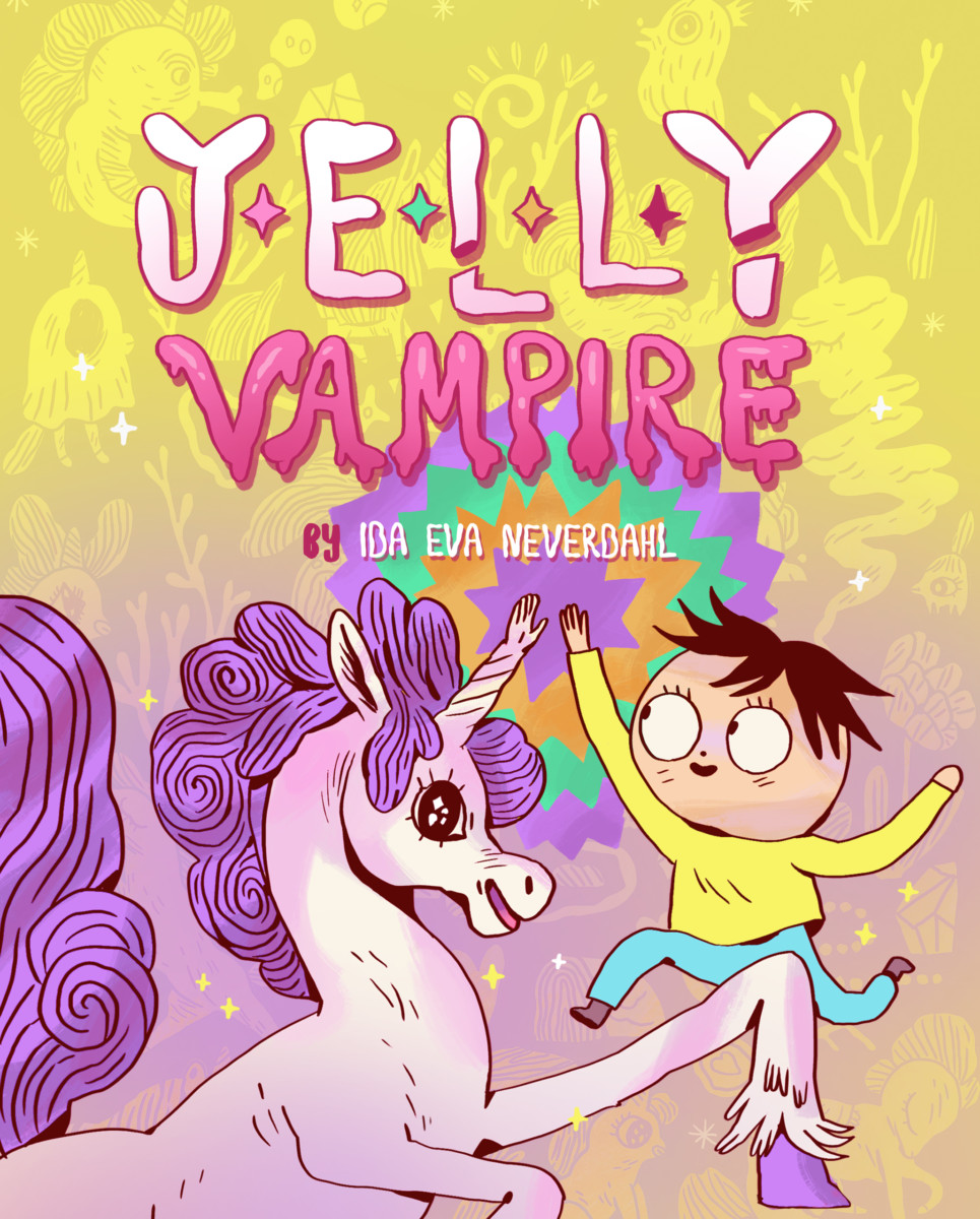
 ReviewsDecember 14, 2017REVIEW: Jelly Vampire


