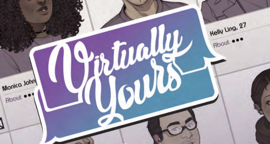
Review: Virtually Yours
 Two people, with two very different lifestyle goals. One wants to find a way to get out from under her watchful mother’s opinions and views; the other is looking get passed that which is past. Both then have to deal with what other people want from them. Only solution? Get a fake online boyfriend and become a fake online boyfriend. What do you think are the chances of it all ending in tears?
Eva Estrella joins a fake dating site, the titular Virtually Yours, to get away from her mother’s nagging. Virtually Yours offers all the online evidence of a partner without the actual need to see or date them. Emotional attractions for the socially inept, maybe? Max Kitteridge on the run from his “child star” history, becomes a profile creator / manager at said Virtually Yours. The two get paired up, creating a real bond. Things get a little “waiting for the other shoe to drop” when the pair actually meet up in real life and fail to see the wood for the trees. A rom-com for the online society?
Jeremy Holt is the writer who handles the comings and goings of this crowd of characters. Holt keeps everything sufficiently diverse in cast, creating a cast that wouldn’t be lost on a CW show. Like most rom-coms, the characters are a cliched group for sure. We are supposed to like Eva and Max, and to some extent, I do like Max. Eva on the other hand is a mixed up character; in part a strong female lead, in other parts a bit of a simp in front of her family. I guess that we all have different faces for the different aspects of our lives. The dialogue is ok, if a bit long winded at times. From a pacing point of view, I would say that the setup is a tad long and the middle bit, the meat and potatoes of Eva and Max’s duplicitous relationships a tad short.
The art and colors are provided by Elizabeth Beals whose style reminds me of a European style, where the major keys are the facial elements rather than the poses. I have to say I was quite charmed by it. Sure it looked a tad staid in places, but on the whole, it was the art that kept me turning the pages. The colors are a pastel affair that continues the rom-com, light-weight feel. Letters are supplied by Adam Wollet who makes sure that the over dramatised writing is easy to read and follow.
As mentioned, this book has a light-weight feel and therein lies the problem with this book. I am not sure who the audience is intended to be. Is it teens, as they have online savvy? Is it the disillusioned twenty-somethings who has already become jaded with their lives. Or is it the hopeless romantics who dream that every story has a happy ending? This lack of focus on who the readers will be means that for each demographic, only part of the story will be relevant. As such, despite the charming art, I am not sure that the remaining non-factors in the book will be strong enough to cater for the wider audience that it is trying to ensnare.
Writing – 2.5 Stars
Art & Colors – 4 Stars
Overall – 3 Stars
Written by; Jeremy Holt
Art & Colors by; Elizabeth Beals
Letters by; Adam Wollet
Published by; Comixology Originals
Author Profile
- I am a long time comic book fan, being first introduced to Batman in the mid to late 70's. This led to a appreciation of classic artists like Neal Adams and Jim Aparo. Moving through the decades that followed, I have a working knowledge of a huge raft of characters with a fondness for old school characters like JSA and The Shadow
Currently reading a slew of Bat Books, enjoying a mini Marvel revival, and the host of The Definative Crusade and Outside the Panels whilst also appearing on No-Prize Podcast on the Undercover Capes Podcast Network
Latest entries
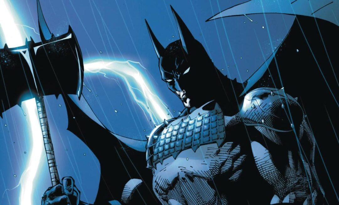
 Comic BooksOctober 14, 2024Review: Absolute Batman #1
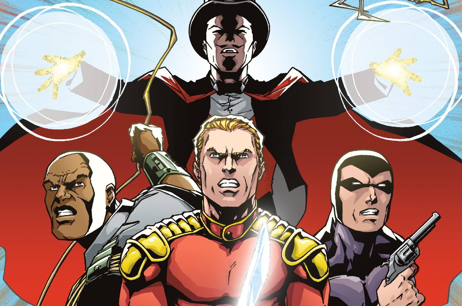
 Comic BooksSeptember 25, 2024Review: Defenders of the Earth #2 (of 8)
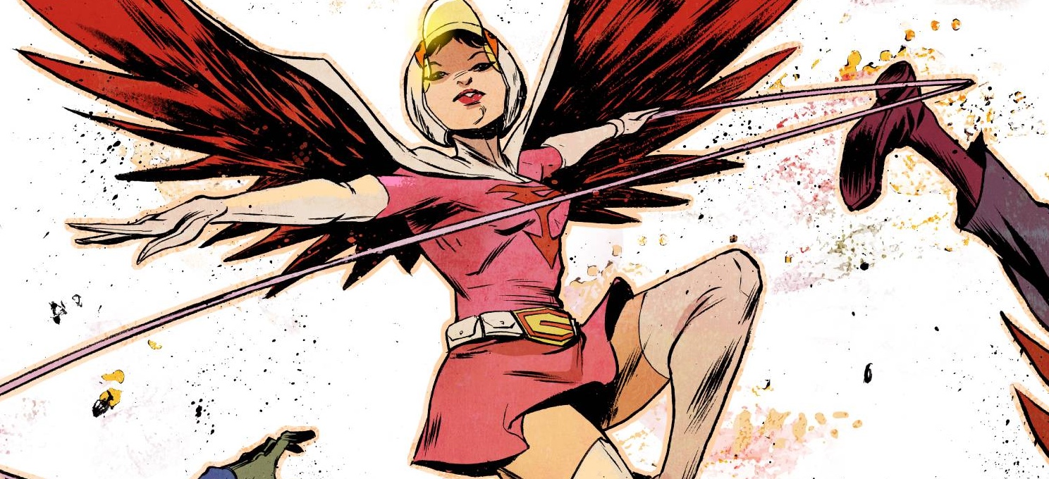
 Comic BooksAugust 7, 2024Review: Gatchaman #2
 Advance ReviewJuly 30, 2024Advance Review: Defenders of the Earth #1 (of 8)
