Review: Wasted Space #6
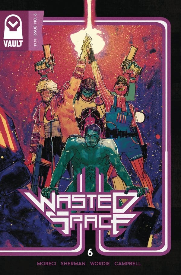
 Michael Moreci and Hayden Sherman“s Wasted Space is an ambitious piece of Science Fiction that approaches the fatality of humanity and its relationship with the concept of free will. Its brazen sardonic style makes it one of the satisfying reads in comics today. With issue six the series enters its second volume as it officially becomes an ongoing title. If this installment is any indication of what is to come that is a good thing for all of comic fandom.
Although this begins a new volume it is not a particularly strong jumping on point as there is not a lot of time spent doing catch up. Right away this is a comic that shows its hand as the subtextual components of this narrative continually push forward to becoming actual plot elements of the story. Legion is being forced to make a major decision that will impact all of humanity–a choice that could start or stop the actual end times. It is a challenging decision and when one must make a choice of this magnitude you do the only thing that makes sense: Think back to the first time you ever encounter a dog.
Of course, there is much more going on here than your typical end of the world scenario. It is a rather inventive way of approaching a meta-narrative as it is less concerned about drawing attention to its own artificiality and more focused one recontextualizing its foundational themes as focal plot points. It would akin to Robert Frost redoing his infamous “The Road Not Taken”“ poem as a direct reaction to people’s misinterpretations of the poem“s central themes. Both make the audience an active participant in that commentary while not hindering the overall story progression. It is a clever way of announcing your intentions to avoid the concerns of carrying a heavy-handed message.Â
In order for an endeavor of this nature to work though you have to have a strong enough story that does not get overshadowed by the crumbling facade. One that benefits from the willingness to step outside of itself without hindering its development. So far that is been the case although at times it does flirt with having too broad of a target spectrum. This issue alone takes on the importance of free will, the role of parenthood, the correlation of capitalistic society“s values with the rise of War and conflict, and the corrosive nature of corrupt politicians. Moreci“s dialog is a big reason why it works. It is always about moving the story forward and enhancing these characters, and the strong wit and snark stops it from ever feeling like a book that takes itself too seriously. For example, Legion“s absolute brutal take down of how children are nothing more than parasites is worth the price of the comic alone.
Although Legion“s moment steals the show Billy“s visit to the aforementioned corrupt politician is the key part of this issue. Corrance is as sleazy as you can get with his complete lack of shame and overinflated self-worth. He looks like a rejected 1970“s porn mogul and behaves like one as well. Billy though is able to get what he needs even if it takes some use of force. When you have Dust and Fury on your side you can rest easy making demands when they are happy to utilize their skills. Violence tends to give them some extra motivation so they are happy to oblige when called on. It again showcases that rhythmic approach to this series. One burst of violence is quickly followed by some intense passion and comedy.

Final Thoughts:
Wasted Space is like if someone took the more fun and adventurous pieces of something akin to Firefly and combined it with the surreal and thematic weight of 2001: A Space Odyssey. It is a series that wishes to approach big ideas both literally and figuratively and does so in an invigorating way. Â
[yasr_overall_rating size=”large”]
Writer: Michael Moreci
Art & Cover: Hayden Sherman
Colorist: Jason Wordie
Letterer: Jim Campbell
Designer: Tim Daniel
Author Profile
- A fan of all things comics. Growing up on a healthy diet of 90's Batman and X-Men cartoon series ignited a love for the medium that remains strong today.
Latest entries
 ColumnsSeptember 8, 2021What Big Fan teaches us about Fandom
 Comic BooksSeptember 2, 2021Review: Second Coming: Only Begotten Son #4
 Comic BooksAugust 12, 2021Review of Spider-Man: Spider’s Shadow #5
 Comic BooksAugust 5, 2021Advanced Review: PRIMORDIAL #1 (OF 6)

