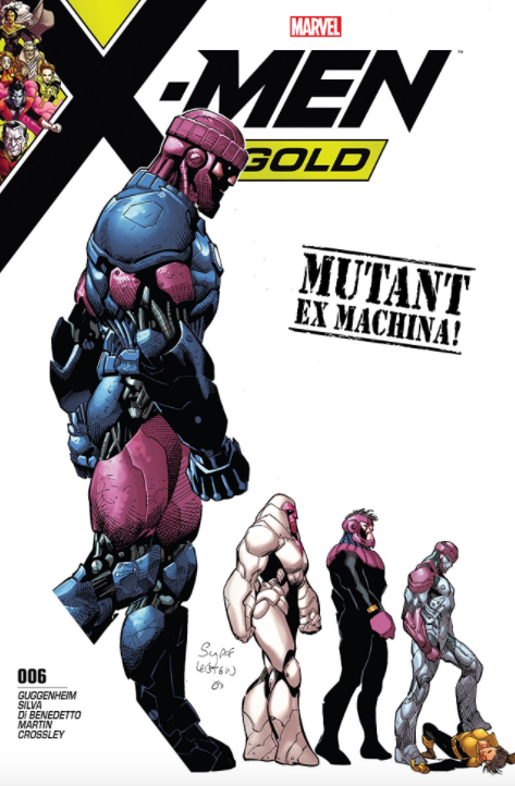
REVIEW: X-Men Gold #6
The X-Men take on a rampaging nanite cloud that was bonded with Sentinal A.I in the final issue of the Techno Superior storyline. The team is struggling to take on the storm due to its ability to quickly adapt to their attacks. It also has the ability to directly target anyone with a genetic mutation, which is just about everyone in its vicinity. The cloud is spreading its destruction throughout New York and the issue features appearances from other Marvel heroes such as Captain Marvel, The Hulk, etc. Its only weakness seems to be a vulnerability to psychic attacks.
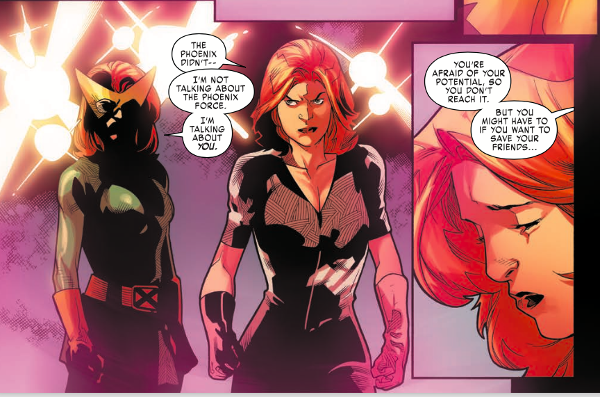
The main crux of the story is Prestige’s (Rachel Grey) internal struggle. She spends the majority of the issue in a coma-like state with dialogue hinting to the reader that nothing is physically wrong with her and it is all in her mind. We are shown that she is dealing with a deep inner fear that she will become like the worst versions of her parents if pushed hard enough. While the team is dealing with a foe that is conveniently vulnerable to psychic attacks, it’s clear that they need her to step up and live up to her potential. The dialogue is solid, but not exceptional. Despite taking on a somewhat silly villain that seemingly exists solely for Rachel to overcome, it is nice to see the focus on her and her character’s development. Overall, the story comes across as by the numbers and predictable. I also felt it ended somewhat abruptly. Of course, it leaves a few threads open for future issues.
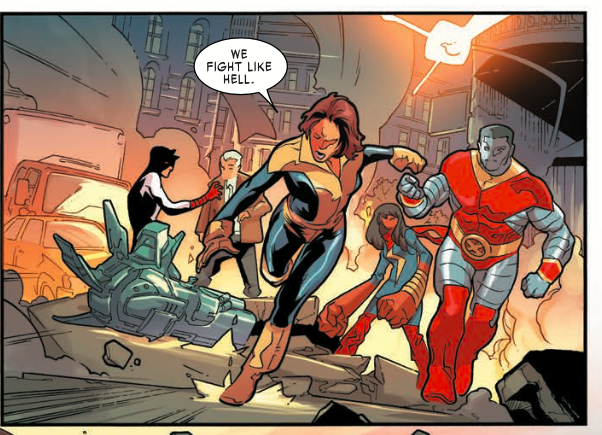
The art is very good. R.B. Silva conveys action with a clean, dynamic style. His characters are cartoony in a way that I appreciate. They don’t have any extraneous details that get in the way but convey enough emotion on their own. However, the art isn’t entirely consistent as some panels seem to be in a rough state. Faces, in particular, are missing entire features in some pages/panels. I like a clean style, but it’s clear that the art in this issue was somewhat rushed. The coloring assists in those panels that are lighter in detail by adding solid depth and shading to the characters.
I give this issue 3.5 out of 5 stars. It’s a solid end to the second arc for this series. However, I felt it was only slightly above average and came across as somewhat rushed.
[yasr_overall_rating size=”large”]
Written by Marc Guggenheim
Penciled by R.B. Silva
Inks by Adriano Di Benedetto
Colors by Frank Martin & Andrew Crossley
Author Profile
Latest entries
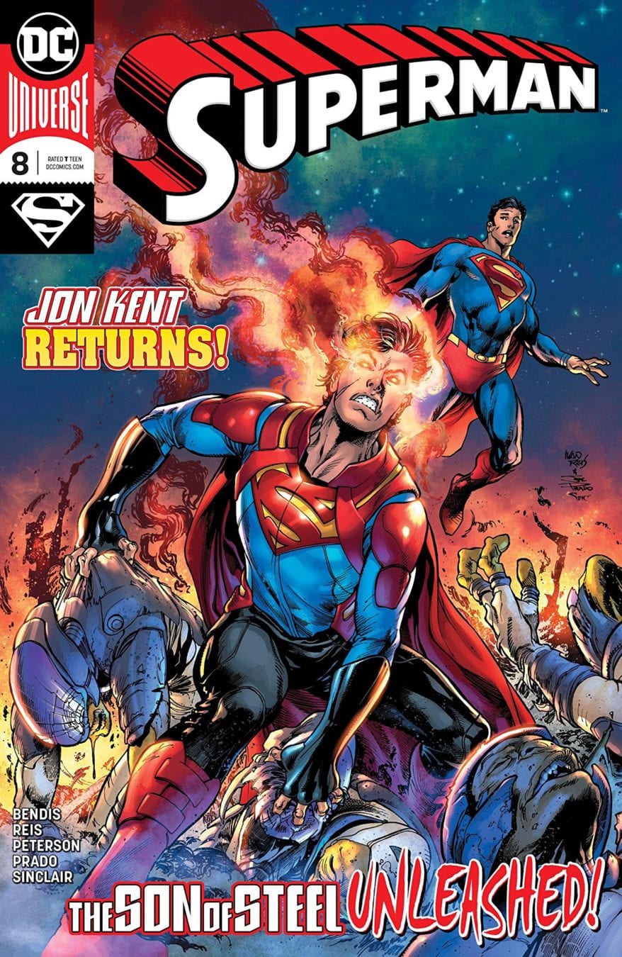
 Comic BooksFebruary 13, 2019REVIEW: Superman (2018) #8
 GamingDecember 21, 2018REVIEW – PowerA Enhanced Wireless Controller for the Nintendo Switch
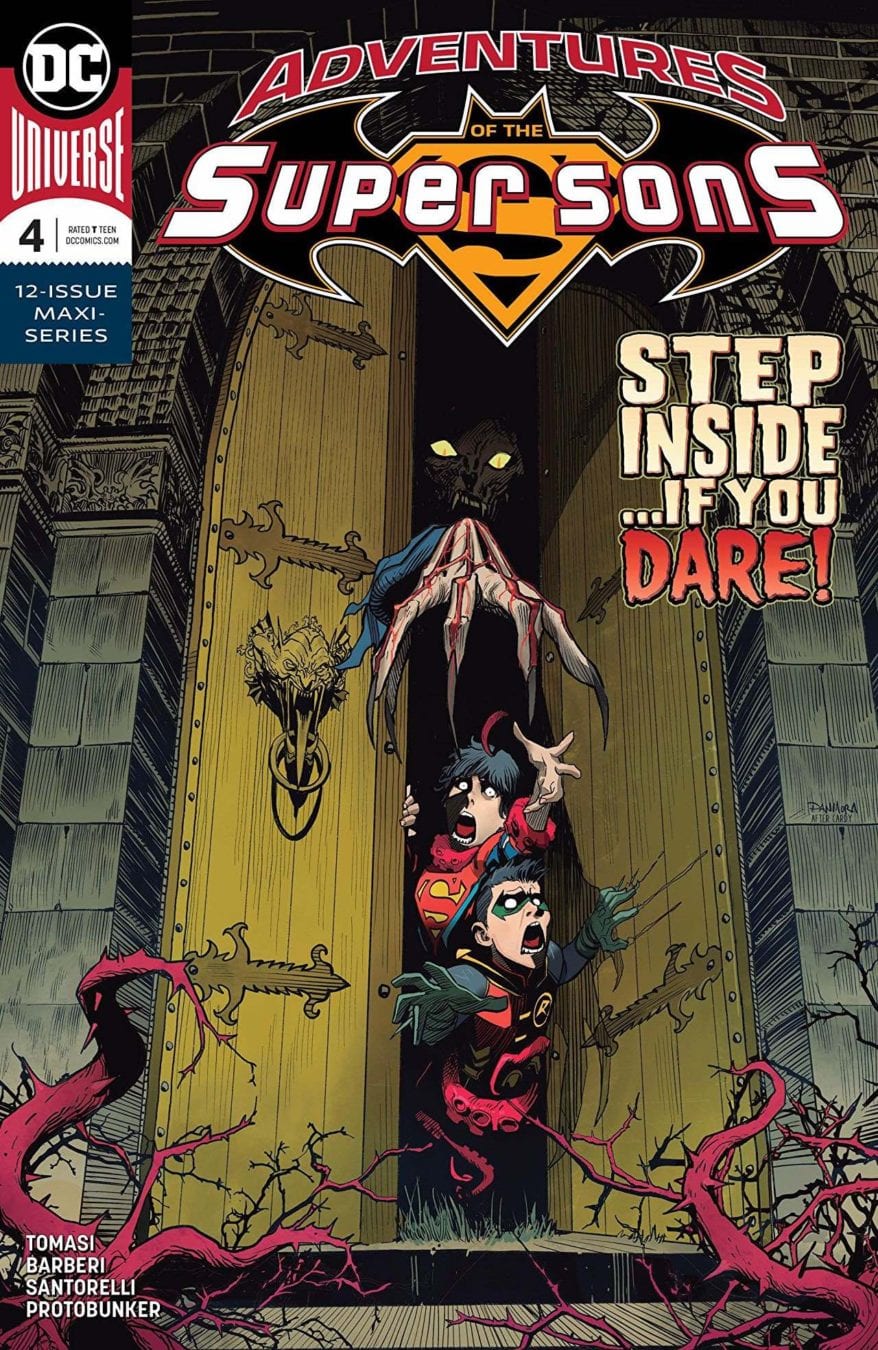
 Comic BooksNovember 8, 2018REVIEW: ADVENTURES OF THE SUPER SONS #4 (OF 12)
 Comic BooksJuly 19, 2018REVIEW: Green Lanterns #51



You must be logged in to post a comment.