Best Covers for the Week of 1/16/2019
And take two! This is my second attempt to point out some of my favorite covers for new comic book day this week. We all know that saying that one shoud not judge a book by its cover, but that does not mean we cannot judge the covers. The key with this article is that it is simply my opinion which makes these picks rather subjective. With each pick, I’ll point out what about it made me choose it for the list, and if you feel like it comment below with some of your picks. A reminder that for the sake of diversity I will only include one cover for each series. For those that have more than one cover, I just choose my favorite.
 Invaders #1
Cover By: Alex RossÂ
Outside of his work on Immortal Hulk I feel Alex Ross is at his best when he is doing throwback covers, especially when they feature aspects of World War II. For example, I love his cover for Captain America #1 last year. Seems like that time period really brings out his creativity. If there was one detraction from this cover it would be that Human Torch blends a little too well into the background making him less of a presence. It is a small issue for an otherwise fantastic cover. Helps that Ross has a clear affinity for the Golden Age of comics. Captain America just looks right when he is drawining him.Â
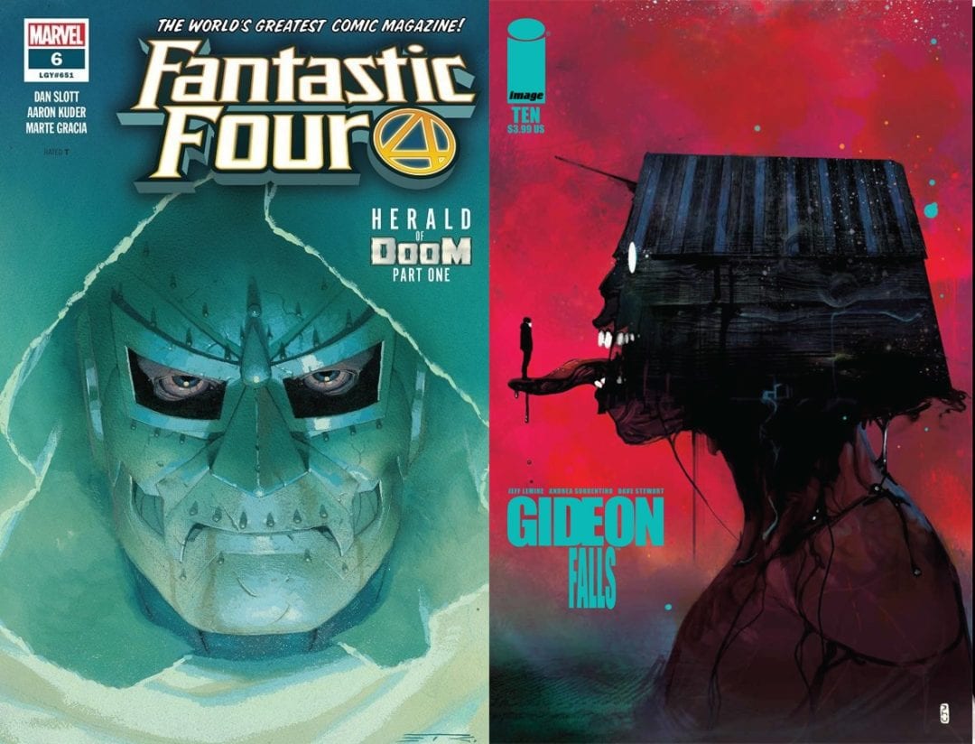
 Gideon Falls #10
Cover By:Â Christian Ward
Although I choose the Christian Ward cover I do have to make mention for the work Andrea Sorrentino has been doing for the Gideon Falls covers since the series started. I cannot think of a series that was able to keep a singular motif going for as long as he has. For this week though I went with Christian Wards cover because I found it a tad more striking. It fits into the surreal nature of the series, and both Ward and Sorrentino’s work well together. Ward has a knack for using eye-popping colors and this cover is no different. They had a great deal of texture and depth as if this figure was physically carved out of wood. For a series about finding messages in unexpected locations, this cover gives you a lot to analyze.
 Batman Who Laughs #2
Cover By:Â Ben Oliver
One thing is for certain and that is Scott Snyder writes for the long game. Allowing stories to build upon themselves for years and keeping everything closely tied together. Batman Who Laughs was the breakout character of Dark Knights Metal so he is deserving of his own series. This cover demonstrates a big reason why he stood out so much–he has a design that can be so disturbing you simply cannot look away. The way Ben Oliver has crafted that smile is utterly disturbing. That tidbit of mist slowly rising from his head adds the perfect touch. This is the type of cover you want to own but hide away in a longbox so it didn’t haunt your dreams at night.
 Dick Tracy: Dead or Alive #3
Cover By: Michael Allred
There was a time in my life when I was not a fan of Mike Allred’s art. I like to call those the ‘Dark Days’. Over time as I grew and matured as a comic reader I realized just how special his work can be. I do worry at times that he gets pigeonholed into doing more retro stuff, but you cannot deny it works for a character like Dick Tracy. Being able to convey motion with one still image is not the easiest of tasks. Not impossible by any means, but I love what Allredd does here. At first glance, one might think Dick Tracy took a spill in a local nuclear plant, but as you get your bearings you see what exactly is occurring. Also, love the bullet holes on the coattails that adds a level of stakes not normally associated with an image of this nature.
 Fantastic Four #6
Cover By:Â Esad Ribic
There are those characters you can put on a cover that bring with them a large sense of gravitas. Thanos, Darkseid, and of course Doctor Doom. Those baddies that define what it means to be a villain. Doctor Doom has to be near the top of that list. With that though when you have a face made up of metal images can be stilted and dull due to the lack of emotion. Esad Ribic does not have that problem. They say that the eyes are the window to the soul. The jury is still out regarding Doom having a soul, but what they at least add a level of emotion. Impressive what Ribic can say with just one physical feature. Ribic’s imagery often looks like it is itched out of granite so it is not surprising he can render the infamous mask so well. The faded color adds a finalized the stoic look.
 Detective Comics #996
Cover By:Â Brian Stelfreeze
Of course, a character as iconic as Batmans has had a near limitless amount of great covers. Some of the greatest of all time in fact. At times though the imagery can become repetitive. That’s what standouts with this cover. It does not reinvent the wheel but finds a way to take Batman’s iconography and remix it. Functionality wise I do not know if the bleeding shadow completely works, but on a symbolic standpoint, it is an effective way to demonstrate Batman’s relationship with Gotham City. Love how both the city and symbol overlooking a minimized Batman figure. It expresses how the individual is not as important as the symbol and the world it protects. At the same time shows the responsibility Batman so willing takes on.Â
 Deadly Class #36
Cover By: Wes Craig
Deadly Class #36 marks the return of the series since last June. With the TV series ready to begin its first season it marks a great time to get back into the series. This cover is much more active than a typical Deadly Class cover. In the issue, Marcus is going toe to toe with Master Lin so a moment as important as that needs a proper buildup. Having the two of them face to face with a literal mushroom cloud above them and fossilized remains underneath is a good way to do just that. Clueing us into the violence that is yet to come and the history both bring with them. Also, love the color choice with this cover. Choosing to use a neon pink to highlight both Marcus in Master Lin. Despite the fact, they take up so little of the page the focus is squarely on them.
 James Bond: Origin #5
Cover By:Â Michael Walsh
If you could not tell from my choice of Invaders #1 I am a big fan of the look of World War II propaganda art. Part of it is due to the fascination of how patriotism was used as a tool to sell things like war bonds or keeping a strong spirit going in a very troubling time. Also a big fan of the James Bond franchise so I feel like this series was made for me. I do feel it is more of the more underrated series out today. Love how this cover looks both modern and aged at the same time. It is not as bombastic as the Invaders cover but conveys a very similar spirit. You could easily imagine a poster of this nature up around the city of London during the Battle of Britain.Â
 A Walk Through Hell #7
Cover By:Â Goran Sudzuka
When I did my first run through of covers I wanted to include this initial didn’t make the cut. At first glance did not seem like anything all that special and noticeable. Then as I made a second pass what those random white dots actually were. Maybe it is just me but seeing a single tooth, or in this case teeth, so casually lying there sends those special types of shivers right down my spine. The blood red shade to the cover adds an additional layer of goosebumps so before the book even opens I am primed and ready for a horror story. The devil is in the details, and the devil would be pleased with this series for more reasons than just this cover.Â
 Conan the Barbarian #2
Cover By:Â Esad Ribic
The second Escad Ribic to make the list this week. If I did this article the first week of the year his cover for Conan the Barbarian #1 would have made the list as well. I guess you could say that I am a fan. I only wish he was doing interiors as well. I could somewhat understand why he is not as his art tends to have a stoicism to it. At times that can make movement seem stilted, but for something like a cover, you do not have that problem. Conan is not the most complex character in the world and this is not the most complex design. It gives off that claustrophobic feeling like you are being surrounded without overtaking the imagery of our main hero. Ribic’s style also adds a level of inheriting importance. As if you are looking at finely detailed statues in a living museum.Â
 The Man Without Fear #3
Cover By:Â Luke Ross
I may not love The Man Without Fear series so far, but it has given us some great covers. This week my personal favorite being this one done by Luke Ross. There may not be a character that has had more legendary runs by different creators than Daredevil. From Frank Miller to Ed Bruker to Mark Waid just to name a few. Which makes one wonder what is it about Daredevil that leads to so many fantastic stories. One of the biggest factors is how Catholicism has been such a major factor of his character, and this cover shows the striking imagery you can create with that foundation. This is a cover that has addition by subtraction as it removes the actual figure of Daredevil to make his silhouette even more poignant.Â
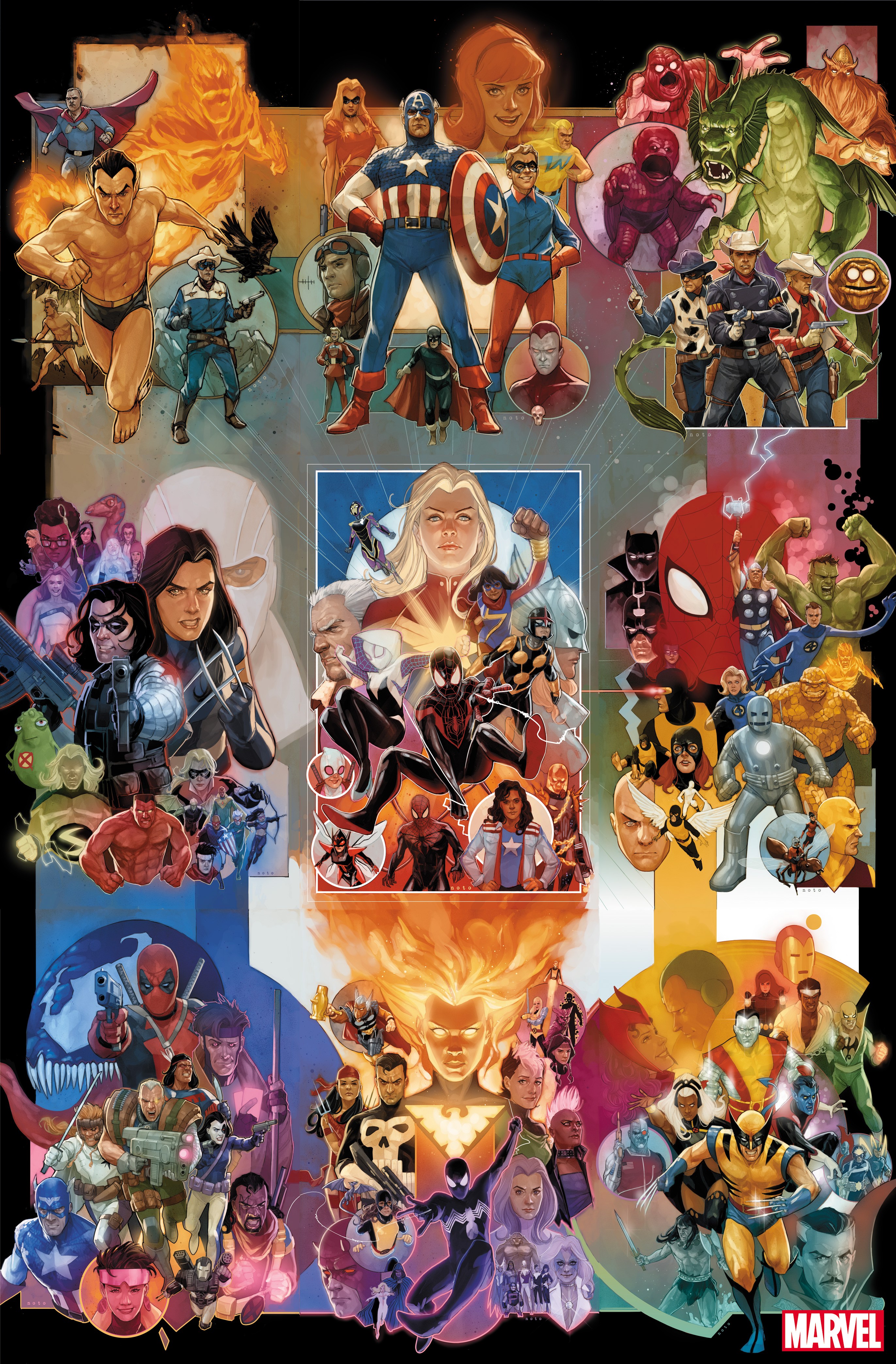
Phil Noto’s Special 80 Year Anniversary Special CoversÂ
So this last one is a bit of a cheat. Instead of listing Phil Noto’s special 80-year anniversary individually I instead chose to kill eight birds with one post. You can find out more about these cover here including what issues they are attached to for this month. One of the best things about these covers is just seeing what characters they chose for each decade. It is a great way to see how much comics have changed over the last 80 years and how much they stayed the same.Â
Author Profile
- A fan of all things comics. Growing up on a healthy diet of 90's Batman and X-Men cartoon series ignited a love for the medium that remains strong today.
Latest entries
 ColumnsSeptember 8, 2021What Big Fan teaches us about Fandom
 Comic BooksSeptember 2, 2021Review: Second Coming: Only Begotten Son #4
 Comic BooksAugust 12, 2021Review of Spider-Man: Spider’s Shadow #5
 Comic BooksAugust 5, 2021Advanced Review: PRIMORDIAL #1 (OF 6)


