Top Comic Covers for the Week of 1/1/2020
With the bringing in of a new year comes the time where everyone starts to do their New Year’s Resolutions. Where gyms fill up with people who are going to finally start living a healthy lifestyle at least until mid-February.Â
My major resolution is to get back to my weekly best-of lists where I look at the week of comics. First up I am taking a look where everything starts–the best comic covers of the week. One thing to keep in mind is what I personally look for in covers. For me, there is a difference between a great image and a great cover. A cover is part of the comic book storytelling process. It should tell a story within itself that sets expectations for what is to come. If a cover could pretty much e placed on any book then I will typically not consider it for this list.Â
For the sake of variety if an issue has a number of covers I will only list my favorite out of all of them. It was not the strongest week of covers but I still find some that caught my eye for one reason or another.
 Daredevil #16
Cover By: Julian Totino Tedesco
Daredevil is starting to get the overdue recognition of being one of Marvel“s best current series, but what is still being left out of that conversation is the work done by Julian Totino Tedesco and his covers. Their aesthetic is unlike anything Marvel is putting out right now. There is this claylike texture with a watercolor execution. Anytime you place Daredevil and Elecktra on a cover together you are asking to be compared to some of the iconic covers in comic history. What I like about this cover is how it stays away from the obvious homages we see time and time again. The orange background placed against the white sheets elicits a soft and tender atmosphere.
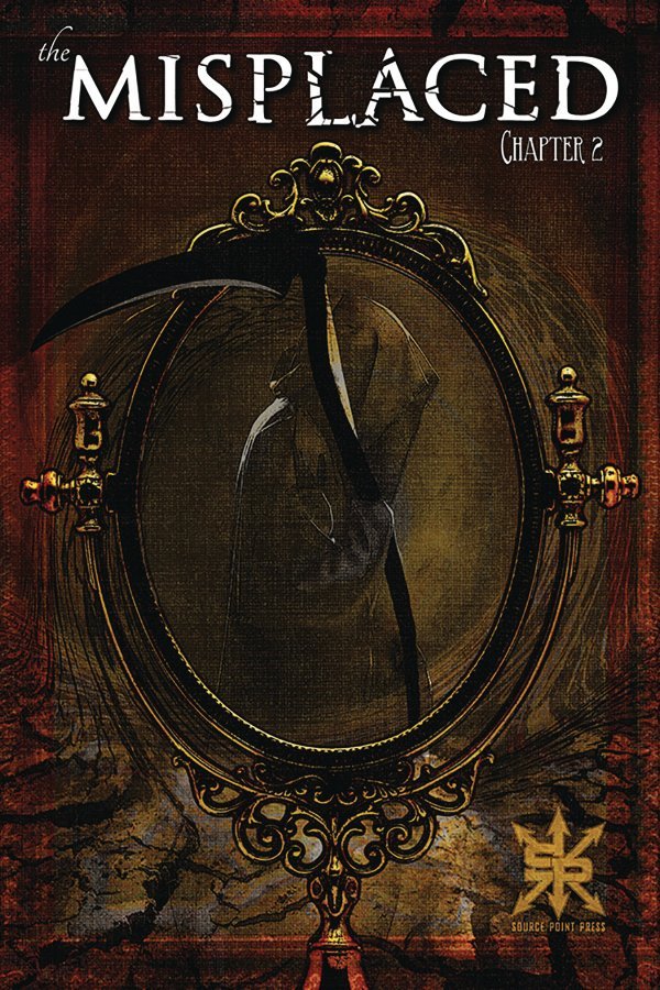
 Misplaced #2Â
Cover By: Chris Callahan
I love it when a cover of a series I never read catches my eye making me want to pick up that book. Is that not the major perhaps of covers in the first place? Rarely does it happen however. The word the comes ot my mind with this cover is eerie. The color pallete is dark and damp making you focus in on the page. One slight adjustment of taking a figure that resembles the classic iconography of death and placing his scythe slighting outside the framework of the mirror brings it to another level. Knowing cover artist Chris Callahan is also the writer and artist of the series gives me hope the inside of the book will be just as intriguing.
 Lois Lane #7
Cover By: Yasmine Putri
Lois Lane had two covers I considered this week but this is the one I went with. Anytime you can incorporate spreadsheets into your cover in a way that makes sense I have to tip my cap to the artist. Love how this scene just rings of chaos despite being a static image. It has a level of urgency to it as the ink or possible blood drips off the page in the shape of the infamous Superman symbol. Are these clues within these notes? Do they signify something important? When you can raise questions before the book opens you have done your job as a cover artist.Â
 Thor #1Â
Cover By: Mr. Garcin
As indicated I prefer covers that have stories and this cover has ALL the story. I have no artistic skill whatsoever so I cannot tell you what the overall skill level it takes to create this, but I can say it really works for me. Sometimes you do not realize how much history a comic character has until you see it in front of you. It can raise the importance of this new number one showing a taste of how we got to where we are today.Â
 Flash #85
Cover By: Kaare Andrews
So this choice may go against everything I was saying regarding wanting a cover that has a great deal of the of story, and yes you could probably put this image on any issue of Flash and it would work. Still, the choice of perspective was strong enough for me to put those rules to the side and include it on this list. Choosing where to place the camera is such an underrated trait when it comes to comic book storytelling. Plus the streaking Flash placed against the gorgeous blue sky and shimmering son makes me feel warm inside. When dealing with January weather that is enough to make me want to include it on this list.Â
 The Terrifics #23
Cover By: Dan Mora
I did not rank these in any specific way but if I was going to choose my favorite of the week it would most likely be this cover. This is a series I stopped reading after Jeff Lemire left and now I wish I had kept going. On the other hand, I feel well informed enough by this cover that maybe picking it up cold and reading from this point may not be a problem. There is a little bit of everything. You have a pinch of humor with the baby versions of Plastic Man, Mr. Terrific, and Metamorpho that look adorable. Now I want to see a Plastic Baby series all on its own. The use of a dialog bubble also gives it an old school feel, which is why this book was going for from the start. So when you cover has story, humor, provides a sense of tone. and includes a well-executed concept that includes all of those elements you have yourself this week’s best cover.Â
Author Profile
- A fan of all things comics. Growing up on a healthy diet of 90's Batman and X-Men cartoon series ignited a love for the medium that remains strong today.
Latest entries
 ColumnsSeptember 8, 2021What Big Fan teaches us about Fandom
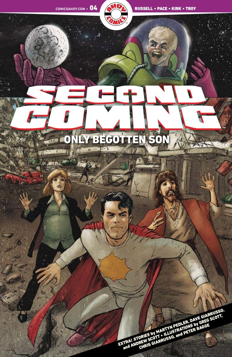
 Comic BooksSeptember 2, 2021Review: Second Coming: Only Begotten Son #4
 Comic BooksAugust 12, 2021Review of Spider-Man: Spider’s Shadow #5
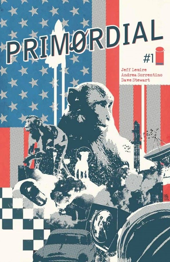
 Comic BooksAugust 5, 2021Advanced Review: PRIMORDIAL #1 (OF 6)
 Daredevil #16
 Misplaced #2Â
  Lois Lane #7
 Thor #1Â
  Flash #85
 The Terrifics #23
