Top Covers for the Week of 1/23/2019
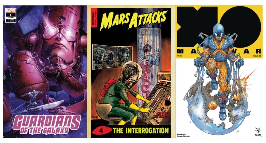
 Mars Attacks #4Â
Cover By: Robert Hack
I might be one of the few but I actually enjoy the Mars Attacks film. It’s not great but its sheer shlock is rather entertaining. Kyle Starks and Chris Schweizer current Mars Attacks series though is legit good. This cover harkens back to where this franchise got its start. Before the comics and movies, Mars Attacks was actually best known for their trading cards. Perhaps it is juvenile but I do find this cover rather humorous as it has the title of ‘The Interrogation’ and an image of a man who is literally being disintegrated. Also, love the deteriorating color design to give it an aged look as if you are finding it discarded in a random old cardboard box you have not opened since junior high.
 The Immortal Hulk #12
Cover By: Alex Ross
Only a few weeks into the year and this series and I am realizing a few things. One I really dig Alex Ross covers, and also love covers that utilize scale to build tension. So when you have two of things in one cover you have one of my favorite covers of the week. Before this series started I would never have thought that Ross’s aesthetic would work for a story of this nature. All it took was a slight color adjustment and now it works perfectly. The covers Ross has done for Immortal Hulk have been his best work in years.
 Buffy #1
Cover By: Matt Taylor
This may require me to return my geek card for some but I was never the biggest fan of Buffy or any of her spinoffs. Not that I could not understand why it was so beloved. Still, my lack of interest in the original property does not impact my appreciation for this cover. Matt Taylor’s choice in color palette is what makes it work. That eye-striking choice of neon pink specifically catches your full attention. What can easily be missed is the amount of story here as well. For one we can see this is a Buffy that still appears to be in High School fighting things that go bump in the night and based on her oversized smartphone during present time. It is not the most complex information but before someone opens the page fans know exactly what they should expect with this new series.
 X-O Manowar #23Â
Cover By:Â Â Kenneth Rocafort
When one-third of a comic book cover is made up of the character’s logo it does not leave you a great deal of room to make an impact. With this issue being the start of a new arc love how it has a rebirth feel. As of X-O and Aric are being born anew. I even missed how artist Kenneth Rocafort made use to showcase Aric’s missing hand as well. There are those covers that need every inch of real estate. Personally, love how such a compact image like this can be so compelling. Rocafort has a way of depicting images that do not have hard edges. This morphing sphere looks as if it is in constant motion as if Aric is reforming from a form of liquid mercury.Â
 Guardians of the Galaxy #1
Cover By:Â Clayton Crain
When doing these lists I try to stay away from the rare variant covers because it feels pointless putting them on a list when you need to pay an insane amount of money every to own them. Based on my limited research this cover is rare but not extremely expensive based on cover value. Also, my hope for these articles is not to just be a buyers guide, but rather finding compelling covers and discussing the stories they are attempting to tell. More importantly, though it’s a fantastic cover that represents the scale of Galactus perfectly. You can nearly never go wrong with traditional Galactus and Silver Surfer. What it lacks in compelxity it makes up for in sheer excitement.Â
 American Carnage #3
Cover By:Â Ben Oliver
Vertigo has never been a publisher that shies away from social issues of the day and has had plenty of series that were willing to make some rather bold statements. It is within that legacy that American Carnage lives as this cover clearly depicts a rather telling statement in its own right. Anytime you combine political symbolism with the American flag chances are you will strike a nerve or two. As someone who has read the series I know it provides additional context to what is occurring in this scene, however it may even work better as a standalone image. When you have a cross made out of literal firearms you are not concerned with being subtle. Still perspective could impact the way you view this cover. You may see a representation of tragedy as supposed traditional values have been morphed to excuse horrific action, or perhaps you see an element of hope. One where those specific values are being used as an attempt to comfort someone who has fallen. Out of all the covers that are out this week this one provides by far the most to debate and discuss.
 Go-Bots #3
Cover By:Â Tom Scioli
When you get a peek behind the curtain you can gain a new found respect for someone“s craft. It is that fact that made me select the Go-Bots #3“s cover by Tom Scioli for this list. Watching his process on his YouTube Channel I was shocked to see how we were able to get such an old school classic look with a modern piece of technology. Perhaps I am just naive or ignorant but his projects such an old school vibe I assumed his methods followed suit. The series itself is just downright insane. Scioli is breaking every rule when it comes to panel design and by doing so fills each issue with so much story. It is fascinating to view simply based on a craft standpoint. This cover showcases his figure design and the personality he brings to the title. IDW and Hasbro have given Scioli the room to do his own thing and he has been killing it.
 Shuri #4
Cover By:Â Sam Spratt
One complaint I hear a great deal when it comes to Marvel is how their covers will look great but the interiors are lacking. I tend to disagree with that notion more often than not, as I tend to enjoy artist Leonardo Romero that have a more simplified style. To be fair his work and cover artist Sam Spratt’s work is completely different so perhaps that is where the base of the issue lies. I can agree that Spratt’s covers are great. Here presenting Shuri as this angelic being of pristine beauty. At the same time use something like her shoes to demonstrate her more modernized personality. It is no accident they are located next to a cloud that looks quite like the continent of Africa.Â
 War is Hell #1
Cover By: Greg LandÂ
With this being Marvel’s 80th year they are putting a lot of focus on their companies connection to World War II. From relaunching the Invaders to bringing this title back as well. I know many are not fans of Greg Land’s work as they feel he relies too heavily on photo-referencing in his art. Especially his tendency to use porn actresses as reference points for female superheroes. Still, have to give credit where credit is due as I enjoy this cover. No doubt much of that is due to my love of World War II aviation. There is sheer chaos here that emphasizes the comic’s title. One that demonstrates the sheer danger that existed in the aerial battlefield.Â
 Lucifer #4
Cover By:Â Goni Montes
Every time I look at this cover I feel like I notice another small detail. As I gaze upon this cover I am unsure I fully grasp the message that is being conveyed. That lack of understanding actually has me more intrigued. Will this issue provide further insight into what artist Goni Montes message or I am just missing the obvious. There is a good chance the answer is both. On a general sense, it conveys struggle and pain. Montes’s style has a great deal of texture to it making it appears as if this man is bursting through an actual sculpture. Using religious iconography can get old rather quick. This week alone I listed two covers that utilize the cross in some way. If there is a reason for it you can still make it work as this cover of Lucifer shows.Â
Author Profile
- A fan of all things comics. Growing up on a healthy diet of 90's Batman and X-Men cartoon series ignited a love for the medium that remains strong today.
Latest entries
 ColumnsSeptember 8, 2021What Big Fan teaches us about Fandom
 Comic BooksSeptember 2, 2021Review: Second Coming: Only Begotten Son #4
 Comic BooksAugust 12, 2021Review of Spider-Man: Spider’s Shadow #5
 Comic BooksAugust 5, 2021Advanced Review: PRIMORDIAL #1 (OF 6)


