Review: 2000 AD Prog 2330
 2000 AD Prog 2330, is something else for sure. Aside from reading books like Knights of the Dinner Table, I don’t think I’ve ever had the chance to read such a weirdly structured comic book. This book contains five standalone stories or chapters of bigger stories broken into short 5-8 page sections. It is weird to read, the overall design of the book feels more like a Shonen Jump collection mange or a straight-up magazine, but despite all the weirdness, it has some pure gold in its pages.
Before we jump into reviewing each of the stories inside this book, I would like to talk about book design and how a great comic book can be hindered by poor book design. As an avid reader of comics, when we buy comic books we are looking to jump right into the stories we are buying. Many of us will follow specific stories for hundreds of issues and keep up to date with all of them, however, some of us are just starting to read particular stories, and depending on where we find our comics; whether it is at a local thrift shop or a comic’s book store there is a chance we will hold in our possessions any issue but the first one. That being said, creators please do not use the first page to write an 800-word novel on the story so far. This is so boring and makes me cringe every time I open a comic only to hit head-first onto a wall of text. This happens in this book immediately after turning to the first page.
Whilst it is understandable in an anthological book such as this one, the same information is basically displayed twice for no reason other than to fill up space. We have a blurb by a character named Tharg that explains all we’re going to see in the book, and then right next to it we have short but detailed descriptions of the stories and it is so unnecessary. The Tharg blurb is awesome and filled with character and gives us as much information as we need, and the long descriptions could just as well have been moved to the back of the book, or maybe even to the back cover so people that are picking up this edition of 2000AD could instantly know which stories they were getting when picking up the book. One last thing before we move on to the actual stories in the book, and this is something that all creators should know by now… Never interrupt the flow of the story. Do not put an ad right in the middle of your story (despite what you might have seen from Marvel’s constant use of Ads in their books) and for the sake of all that is mighty and inky, don’t put your letters column in the middle of your book! This is a huge no-no in book design! Letters, articles, and ads should be left at the end of the book. Otherwise, it stops the flow of the book.
Ok, enough nitpicking let’s talk about the actual comics!
I will do my best to review the five stories one by one as well as provide you with the information on who created what. Even though it’s a short book with just 32 pages, it is a lot of different creators so bare with me.
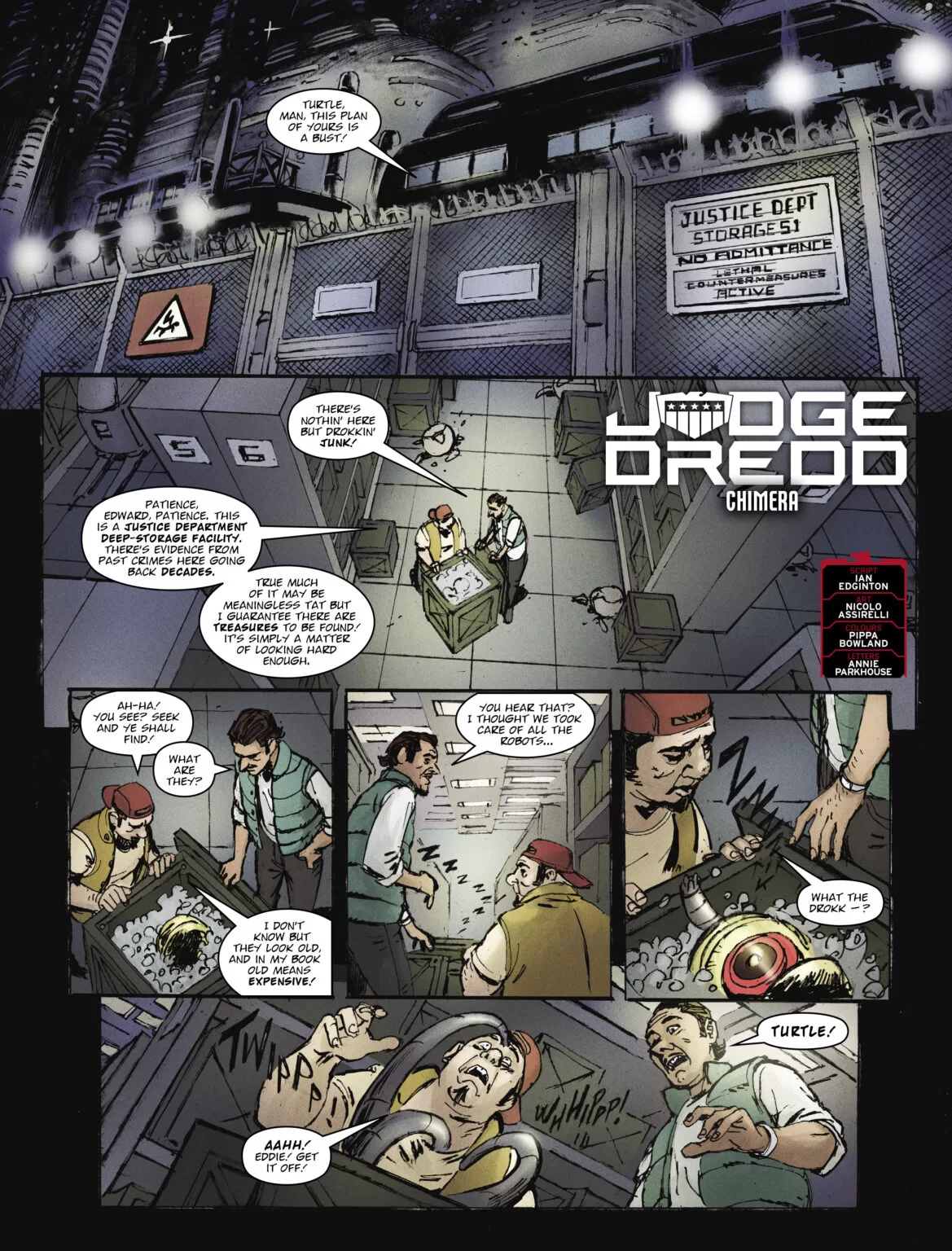 First, we have Judge Dredd, Chimera:
Writing by; Ian Edgington
Art by; Nicolo Assirelli
Colors by; Pippa Bowland
Lettering by; Annie Parkhouse
This Judge Dredd story is grungy as all heck and I love it! It tells the story of two low-level criminals stumbling into something they shouldn’t have and now Dredd has to clean up their mess. The art by Nicolo is a little sketchy and a little grungy and the faces are weird in some of the panels, and yet the whole thing combines into this magnificent punk story of gruesome disaster and I love it! It is short, it is sweet and the writing is on point. Action-packed and with some really awesome action moments, this is definitely worth a read.
The colors by Pippa are very nice and everything has this papery, kinda rough texture and it feels so dirty and grungy! I love it. Judge Dredd? More like, Grunge Dredd.
The grunginess of the coloring complements the sketchy style of the panel art and ties everything together in a nice space bow, so that’s awesome. Once we jump into the lettering there is some nice stuff here by Annie that we gotta talk about. In most cases, dialog text is nothing to talk about, it serves a purpose and here it is well served of course, but, that being said, the action text is fantastic! Annie really went crazy with the fx test because hot dang! I really like the fx text in the action sequences but there is a scene in which judge dress is talking to HQ and the audio in his helmet cuts out and somehow through the incredible skill of good lettering! We are able to read and feel the sound of radio interference perfectly, and that is very hard to pull off. So major props on the lettering for that, a weird mechanical sound like that is hard to convey in text and they captured it wonderfully.
The one thing I have to complain about in regard to this story is not really a fault of the authors but another major flaw in the book’s design. There are no full-page illustrations dividing the stories in this book, all the stories just have their title text and credits displayed on the first page, somewhere on the panels and it feels like a missed opportunity. So that’s a shame, but that being said. Here are the breakdown scores for Judge Dredd, Chimera:
Writing – 5 Stars
Art – 5 Stars
Colors – 5 Stars
Overall – 5 Stars
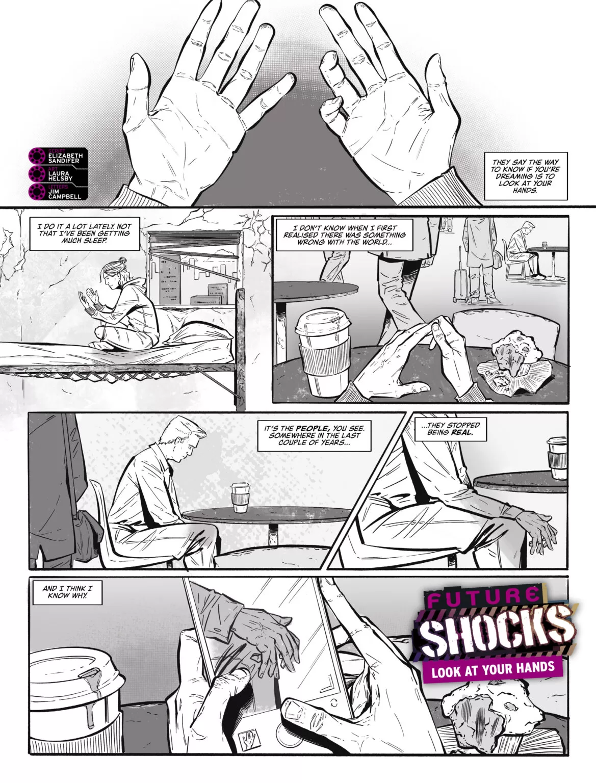 The next story in this anthology (I really don’t know what else to call this type of comic book) is Future Shocks, Look at your hands:
Writing by; Elizabeth Sandifer
Art by; Laura Helsby
Letters by; Jim Campbell
Right from the start, you already can see that we’re in for a good ride. The lettering by Jim Campbell although it is contained to only dialog bubbles and narration looks super crisp and legible which gives the story a very professional look overall. The art is good and I particularly love the use of halftone patterns for the background and the black-and-white aesthetic of the story. There are some easily avoidable tangent issues in one or two panels that are a little distracting but nothing too crazy that you would stop reading, and trust me you wouldn’t want to do that. This being another short story is perfect because it’s very weird and existential and will make you question wether we live in a simulation or not. This story is about a person that has been noticing some unusual “going-ons” in the world by looking at their hands and the hands of people around them. They’ve noticed that some people’s hands are all messed up with extra fingers and how this is an indication of a dream instead of reality. They eventually find the source of the simulation but instead of waking up, they go right back into the simulation the next day and pretend like nothing ever happened. It’s short, it’s sweet, and the art is pretty good but that last panel is amazing. It’s so simple and yet so complex emotionally that you just have to see it!
Writing – 5 Stars
Art – 4 Stars
Colors– 4 Stars
Overall – 4 Stars
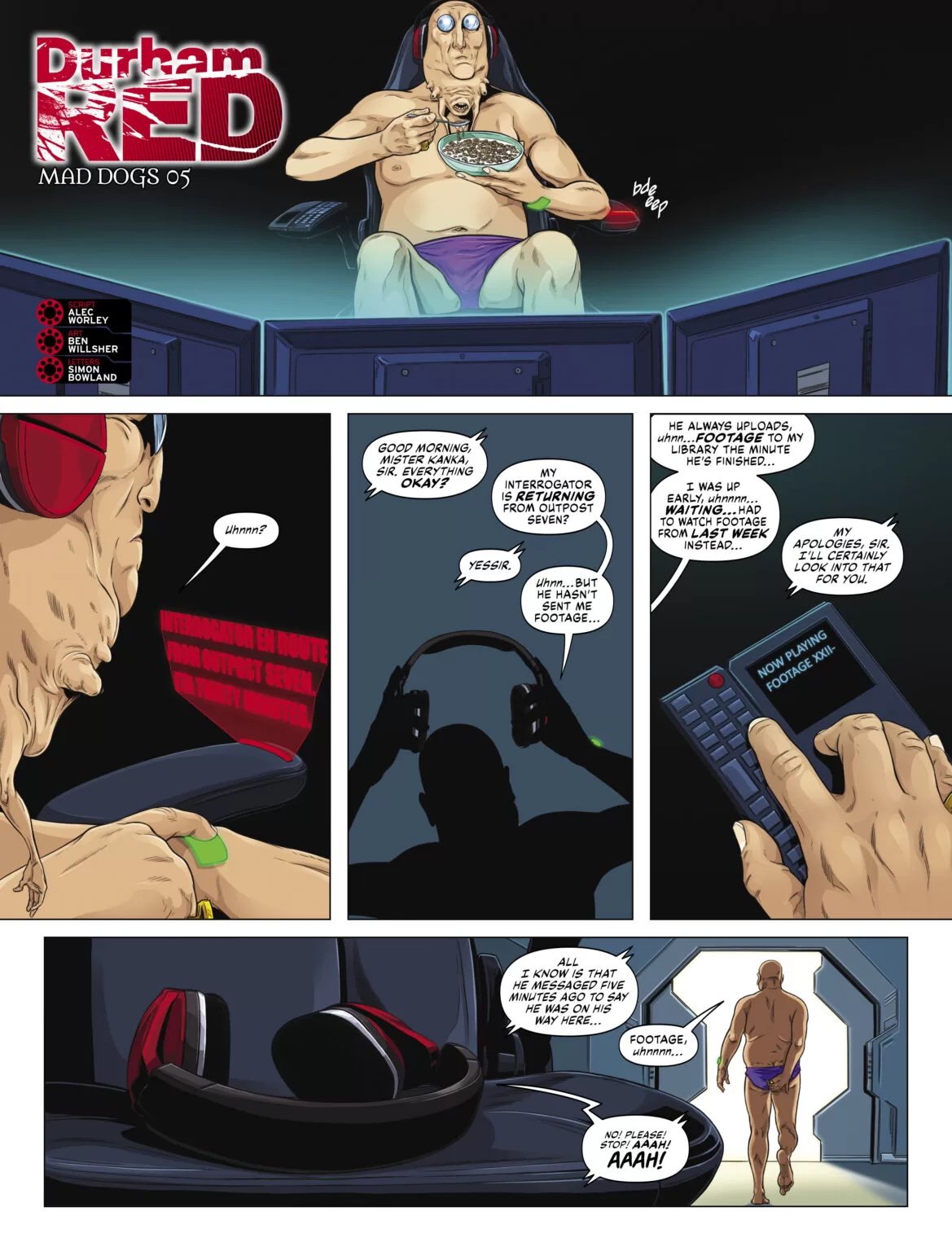 Third in our list of stories we have, Durham Red, Mad Dogs 05
Writing by; Alec Worley
Art by Ben Willsher
Letters by; Simon Bowland
This is one of those chapters of ongoing stories that we talked about at the beginning and other than the blurb at the beginning of the book, I don’t think there’s really very little context when you read the pages. That being said it follows some very weird alien creatures trying to stop a female agent/heroe from reaching her destination.
The whole full-page illustrations issue is a bit of a shame but personally, I like how they handled that limitation in this story. By having the first panel be an establishing shot of an alien watching computers they created a good banner image, which works very well with the title text and serves as a half-page cover illustration.
The art is extremely good in this one and literally all the character designs are supremely interesting. Especially the design of the lead scientist/alien, who has a tiny alien mouth with hands in its neck, and it just looks so creepy in close-up shots and so unsettling in all other shots. All the panels this guy is in I can’t help but stop and enjoy how cool he looks.
The writing is alright, there are one or two lines that don’t really serve a purpose and just feel out of place, but overall it’s a great taste of a bigger story. So that’s nice. The lettering is good, not the best in the business but good. I would’ve liked a bit more legibility in some places, but for the dialog balloons, it’s good. The coloring is outstanding and it makes sense because it was done by the same artist, Ben Willsher, and the art is fantastic. You might look at it and think that it’s standard in terms of what one can expect from a professional-level artist in the business, but the character designs are so good even on the non-speaking characters that you have to give them major props.
Writing – 4.5 Stars
Art – 5 Stars
Colors– 5 Stars
Overall – 4.5 Stars
 Story number four has to be my favorite out of the whole bunch.
Enemy Earth Book Two: Part Five
Writen by; Cavan Scott
Art by; Luke Horsman
Lettering by; Simon Bowland
I have such a soft spot for indie-looking art, and everything that uses minimalist color schemes and deep black shadows makes me think of Mignola and my heart is already on it. So you know, I love the art so much! Luke killed each and every one of these panels. The full black shading makes everything pop, and the colors are wonderful. The panel design is outstanding too. They make use of not only the panel borders to create some really cool camera angles but they also use the white space to add more interest to the story and it works very well.
The character designs are equally outstanding and the background art is really unique. They did not cut any corners with the art on this, and you can feel it. The lettering is good too, mostly dialog text but it works perfectly.
The writing is awesome and whilst this is just a chapter in a much longer story. I am definitely hooked and want to see more of this story. It’s a little hard to know what’s going on other than seeing characters interacting and talking in a remote barn, but it is no fault of the creators. It is just the way the story was chosen to be broken down into chapters and presented to the readers, that being said this tiny snippet has so much character, so much charisma, and so much love behind it that you can already tell that the full book will be really great.
Writing – 5 Stars
Art – 5 Stars
Colors– 5 Stars
Overall – 5 Stars
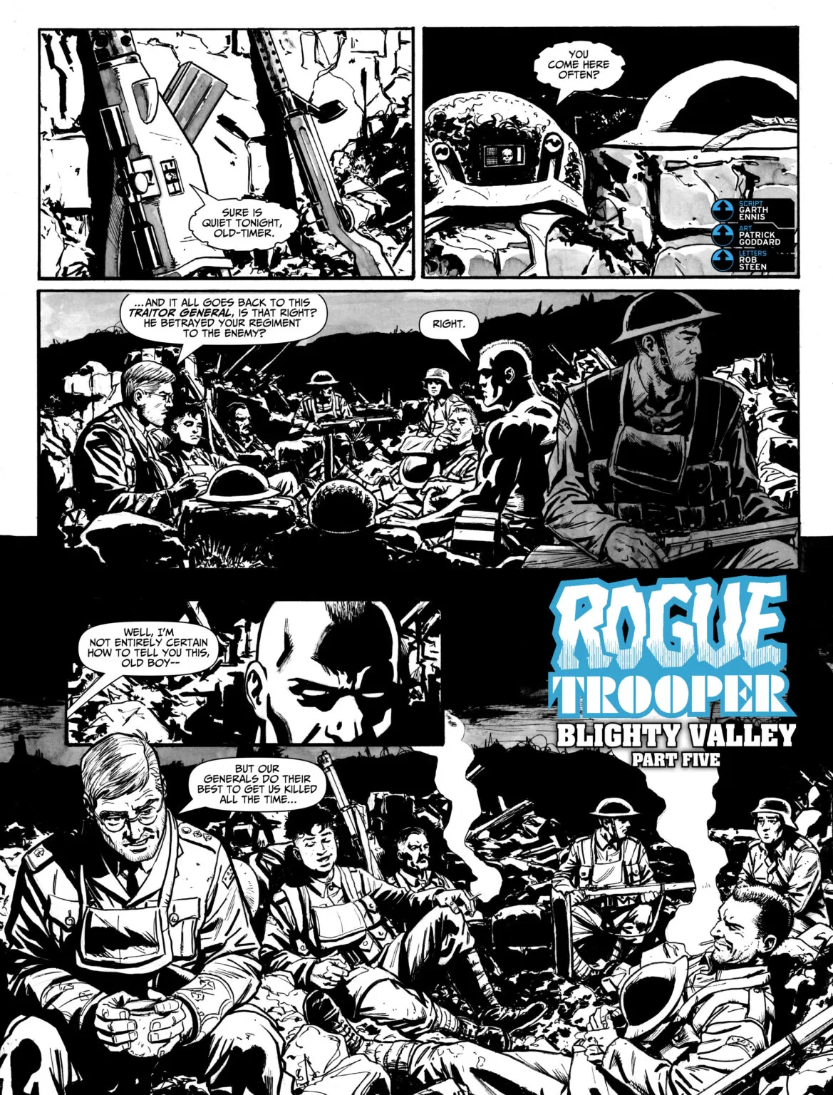 Last but definitely not least we have a war story. Rogue Trooper Blighty Valley, Part Five
Writing by; Garth Ennis
Art by; Patrick Goddard
Lettering by; Rob Steen
I’ll be completely honest, I am not a war comics guy at all, but dang this story surprised me. While also being part of a large narrative, this particular chapter tells the story of several soldiers being attacked whilst inside a bunker.
The art is masterful on this one, and I think they did a great job having it at the end because it acts like a cherry on top of some very good stories. I particularly enjoyed the decision they took with having watercolors for the grey tones in the background the texture really makes the black and white of the characters pop and works wonderfully for a war story like this one.
There are some scenes featuring explosions that are fantastic. The whole style reminds me of the art that Kim Jung Gi makes, and I say that in the best of ways, because this is some really magnificent stuff, the style fits very well with the mood and atmosphere of war.
The art itself is standard art in terms of anatomy and character design, and that makes sense when you’re just making soldiers fighting in a war. However the composition in each panel is so good, and the use of negative space is outstanding, so much so, that it elevates the sketchy backgrounds and generic soldier character designs to masterful work. I was not expecting to feel this way about a war story at all, but this is a great read, and I might just pick it up on my next book hunt because if this is just one chapter of the story, the full book most be a masterclass in amazing composition.
Writing- 5 Stars
Art – 5 Stars
Colors – 5 Stars
Overall – 5 Stars
All in all, this was a good experience. The book’s design and layout were not good in the slightest but you have to take that with a grain of salt because it’s not really a comic book. It’s more like a magazine or an anthology book that contains comics inside. One thing I do have to say that I did enjoy is that they happen to mention Free Comic Book Day in a very fun and joyful way, and I really like how they have the character Tharg deliver that bit of real-world information to the comics community and it makes it feel very cool and like you are in the know when you read these books. It sort of makes the whole thing feel like an exclusive newsletter with some cool art to go along with it, and I have to say I love that a lot.
A good read with a couple of things to keep in mind because it is not at all your standard comic book.
Book Overall Score- 4.5 Stars
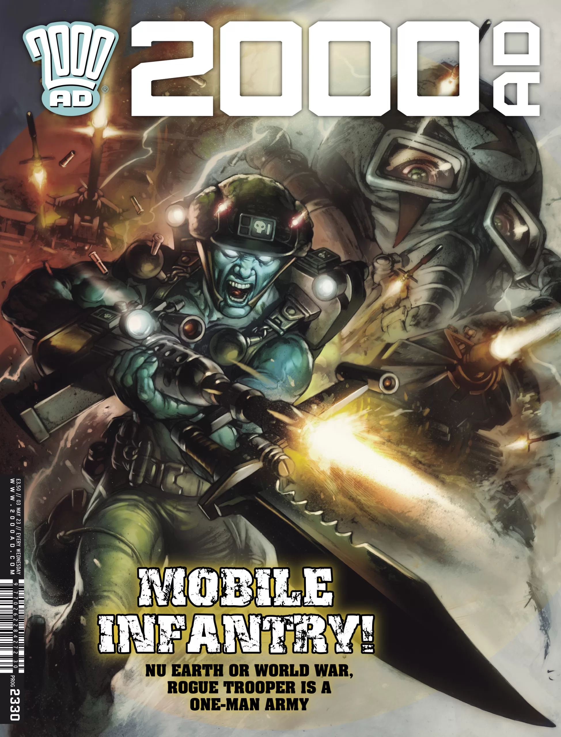
CoverArt by; Leonardo Manco
Published by; Rebellion
Reviewed by Antonio “Mabs”
Author Profile
Latest entries
 Comic BooksApril 30, 2024REVIEW: Rick and Morty: Kingdom Balls #1
 ReviewsApril 30, 2024PRCC2024 Recap: Fans from all over the world join together in Puerto Rico to celebrate all things comics, anime and videogame
 Comic BooksMarch 30, 2024REVIEW: Monstress #50
 Comic BooksMarch 28, 2024REVIEW: Cemetery Kids Don’t Die #2