Review: Alice Cooper #2 (of 5)
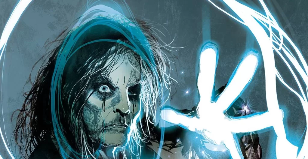
 The greatest rockstar of them all has offended the devil himself with his marvelous musical performances. Lucifer, the once greatest musician of the universe is dethroned by none other than Alice Cooper, and he will not stand for it! In this issue of Alice Cooper we get a nice alternate backstory on Lucy’s fall from God’s graces, and Alice is given a gift by the angel Gabriel. A magical guitar that is capable of vanquishing almost all the demons roaming Earth… Almost all of them…
A great story with lots of funny moments, wonderful art and great writing. Alice Cooper #2 will no doubt surpass your expectations, it surely surpassed mine. I was not at all expecting this to be a funny story, but it gave me a nice bunch of chuckles. The out of touch personality of the devil was great to read, because it is so far detached from the usual rendition of the devil as an almighty evil being, and instead it brings him down to just a really jealous guy that used to be famous and talented but holds a grudge with God and the humans for taking away his attention. It had a few visually captivating scenes such as a the montage of Alice Cooper playing his magical guitar and destroying all sorts of devils; from news anchors to uber drivers and hotel bellhops; Alice Cooper is not safe from the envy of the devil.
This issue is very easy to read, featuring a good balance of text and art with dialogue balloons often being filled with no more than one sentence and in some cases even, just a simple word. The story itself follows a three arc structure, starting with an introduction to the devil and his motives for hating Alice Cooper, followed by Alice Cooper receiving the glorious gift from Gabriel, and culminating with the devil playing a small venue to kick the rust out of his music playing skills. The panel layouts are easy to follow, and whilst they do not push the boundaries too much in terms of complexity or creativity, for this simple story it helps that they too are just as simple with 5-6 panels per page usually of rectangular or square nature. We get a few full page illustrations to break up the otherwise standard panel layouts along with a few action panels that do not have borders. This nice mix of simple panels with full and half page illustrations makes for a truly smooth reading experience.
The art is good. Other than the intro sequence which looks almost like a panel off of Guardians of the Galaxy with its beautiful purple, and pink nebulas and floating rock islands. The rest of the story is mostly filled with standard human character designs and either rock venues with audience members cheering (or booing), and a few hellish scenes here and there. Overall it is all very well executed. Whilst I am not a huge fan of any of the character designs as they all feel a little too standard for my taste, I think the environments are very well done. Especially the hellish landscape pages with impaled humans, and rivers of lava. The coloring is also very good, there is no specific color palette other than a ton of reds and oranges whenever the devil or any of his lackies appear, and the beginning space purples and pinks, everything else has a yellow/cream tint to it and a few metal greys here and there. One scene does stand out from the rest though, this one being the hotel bellhop from hell. This character starts out as a normal hotel bellhop coming to serve Alice Cooper his food, but we quickly learn that he too is a devil sent to kill Alice. Opening the dinner plate he releases a myriad of devils sent to kill Alice, and I think this full page illustration along with the following 2 pages featuring some of the best art from the book. Really cool devilish character designs, some great lettering sound fxs and a beautiful action shot of Alice kicking a devil and sending him flying to the wall. It also shows a wonderful silhouette of all the devils coming for Alice, and it looks very cool. It almost feels like a silhouette of the Indian goddess Kali. It’s very cool.
Lettering is quite good too. Very nice word balloons, although they do feel a tad small for the text. As a rule of thumb with word balloons, you want to be able to fit the letter “O” of the font you’re using around the negative space created between your dialogue text and the boundaries of the word balloons, here the letters are almost all touching the black borders, but almost is not touching it. Which makes for an alright reading experience, and honestly a minor detail that can easily be overlooked. There is a good variety of word balloon shapes, and even a few narration boxes, but where it really excels is in the sound FX’s. Whilst they are not magnificent like perhaps the work of Joe Caramagna in a Spider-Rex story, it all still looks very much hand drawn and there is a huge amount of variety on each sound FX. I don’t think any sound fx in this story is used twice, and we even get a beautiful sound FX that is meant to represent the voice of God and I think that’s just awesome. The font choice is easily readable and the crossbar “I” rule is followed throughout the whole story, which shows you that our man on the lettering board, Troy Peteri is no amateur at his job.
Overall, I think this was a very fun read. I enjoyed the art, the story, the backgrounds but most of all I enjoyed the jokes the most. Other than a few nit-picky things with the character designs not being inventive enough or the word balloon sizing, I really don’t have any more pointers for this issue. It was fun, I liked it, had a blast reading it honestly.
If you’re a rock fan, this book might be for you. However, if you’re an Alice Cooper fan, then this book is definitely for you. If you’ve never heard of Alice Cooper one of the forefathers of modern rock, metal music and shock performance then you need to head outside a little more, and then pop into your local comic book store and maybe give this story a read. I promise it’ll at the very least get a few chuckles out of you.
Writing: 5 Stars
Art: 4 Stars
Colors: 5 Stars
Overall: 4.5 Stars
Written by: Rodney Barnes
Illustrated by: Edu Menna
Coloring by: Adriano Augusto
Lettering by: Troy Peteri
Cover art by: Stuart Sayger
Variant Covers by: Jae Lee, Andre Mangum,
Published by: Dynamite Entertainment
Author Profile
Latest entries

 Comic BooksMarch 30, 2024REVIEW: Monstress #50
 Comic BooksMarch 28, 2024REVIEW: Cemetery Kids Don’t Die #2
 Comic BooksMarch 27, 2024REVIEW: Forgotten Runes #3 (of 10)
 Comic BooksMarch 6, 2024REVIEW: Sam and Twich- Case Files #1


