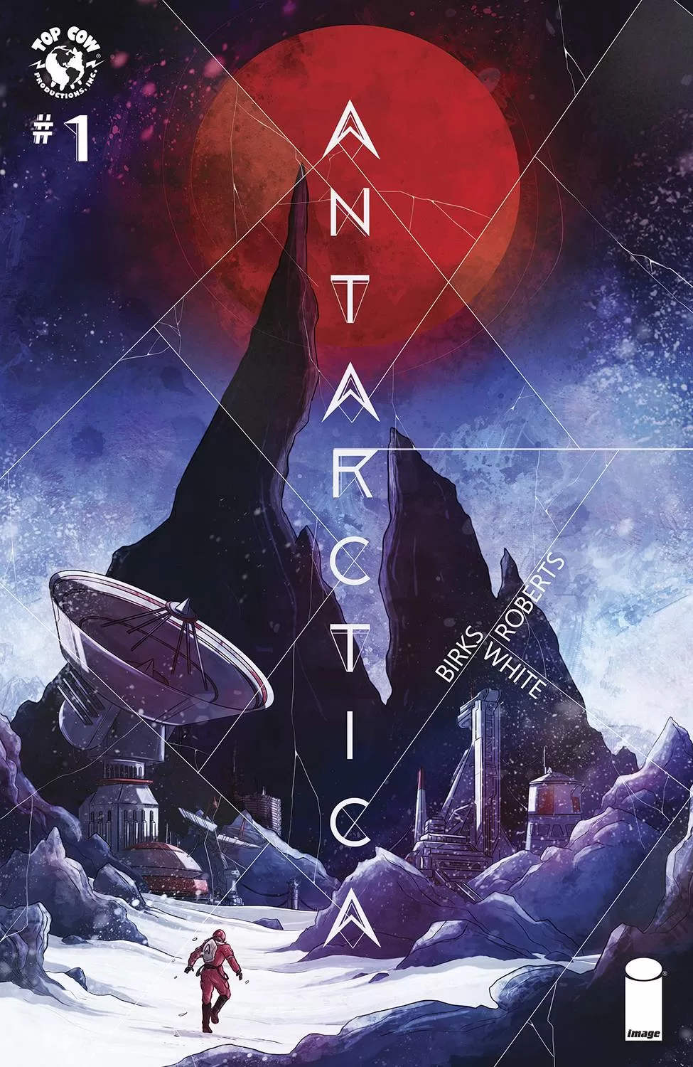
REVIEW: Antarctica #1
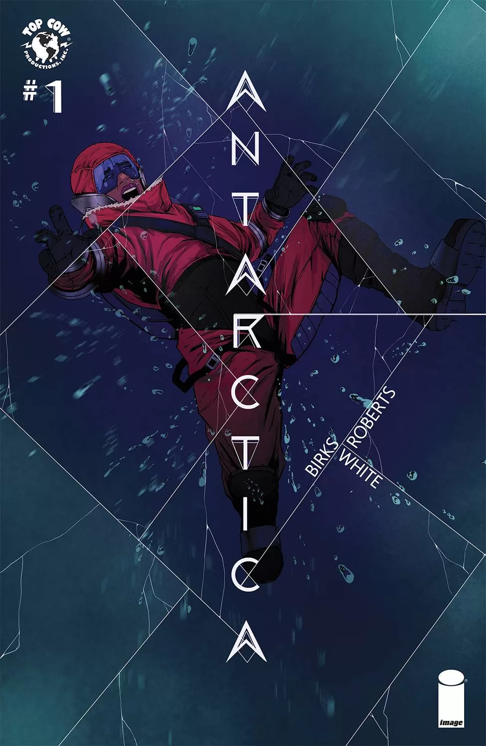 This one is interesting. It’s not entirely my cup of tea but it’s interesting. First off let’s talk about what I did like. I think the lettering on this one is very good, overall some good word balloons, a great choice of fonts, narration boxes on point, and really clear reading paths. There’s also some good sound fx text on there to accompany some important scenes, so Lyndo White did a wonderful job on that lettering. I also really liked the coloring overall in this comic, from the red color scheme at the end to the purples of the night and the vibrant colors during the joyful parts, the coloring is very good. Willi did a great job in the coloring, but man the faces are always so weird to look at. It’s also not even the character design’s fault, because they look good and distinct but literally 99% of the faces are just uncanny. I think it has to do with the way he renders lips and adds all sorts of extra wrinkles and bits of detail with 100% black lines, it just makes the faces look dirty and I don’t know that’s exactly what they are trying to do in all the panels.
The overall story is alright, it’s a bit too quick, and kinda nothing is really happening in it, right up until the end. For a first issue it could have been stronger but at the same time the second part of the story where the main character travels to Antarctica (the title of the book), the story picks up and you start seeing what the main character is really all about and even a bit of drama and mystery is thrown into the mix to get you excited for the next issue. There is something to be said about a great cliffhanger but if the walk to get to that cliff is overall boring, then can it truly be a great cliffhanger? I personally don’t think so, with that being said, I think this comic’s major loss is that it goes by too quickly. It sets up really interesting things like how the character is the child of a military man who goes missing but quickly brushes past it. Had they stayed there a tiny bit longer and explored that for a couple of panels more, or maybe one extra page there would be a chance to connect more in-depth to that part of the story. The same happens with the plot of the main character being homeless after her dad disappeared. It’s brushed off so quickly that at the end of it, you forgot she even was homeless in the first place, which minimizes the impact of her getting a career as a mechanic’s assistant. Even her journey through learning to be a mechanic’s assistant lasts for literally 1 page, there’s barely any chance to really soak in her achievements and celebrate them with her as she continues to grow as a person.
At times this comic feels like you’re reading a grocery list rather than an actual story. This isn’t a good thing, because it lacks the proper pacing we as readers need in order to properly connect to the characters and feel the story. The art is alright, the colors are spectacular and the lettering is superb, and yet the bad pacing of it really makes it a forgettable read. If it wasn’t for the second part of the book when she actually gets to Antarctica this would have been a total flop in my eyes. When she does arrive in Antarctica though we start to slow down, and we are better able to enjoy what is going on, both in the real world and inside the character’s psyche. A lot of it is told through narration boxes but the conversations she has with the chief engineer start giving you some real insight into the characters. I think the reason the first half of the book is so fast and surface level, is because it’s meant to fill you in on her background as to how she got here in the first place, and yet it would have probably been altogether better if these two parts were reversed and instead we got a flashback to her origin story interspersed with scenes from Antarctica.
Not every first issue you read is gonna be a banger right out of the gate, but they should be and as creators, we should try to tell stories that grab your attention right from the first page. I honestly think they tried to do it with the first two pages of her growing up as a military child. I personally could relate to that part of the story because I too remember those days when my dad would come back from deployment and the joy that I felt every time I would get to hug him after months and months of not seeing him. That second page with Hannah (the main character) running to hug her dad throughout the years is beautiful, but I feel that it could have perhaps been stretched to an extra page. Add in a couple of close-ups of their faces as they hugged, maybe a close-up of her dad putting the bags on the floor, little things like that will help you push that emotion of being reunited with your loved one much further and will allow the reader to truly connect with the characters. On this specific title, I would advise you to pick up issues 1 and 2 if you’re interested in it because issue 1 alone might not satisfy you completely and perhaps reading both of them together will be much better as an experience. This is not a bad comic at all, it’s just too fast-paced for a first issue that is meant to be much more emotional and dramatic than action-oriented.
Writing: 3 Stars
Art: 4 Stars
Colors: 5 Stars
Overall: 3.5 Stars
Written by; Simon Birks
Art by; Willi Roberts
Lettering by; Lyndo White
Cover art by; Simon Birks
Variant Covers by; Lyndon White, Abigail Harding, Drew Zucker
Published by Image Comics
Author Profile
Latest entries
 Comic BooksApril 30, 2024REVIEW: Rick and Morty: Kingdom Balls #1
 ReviewsApril 30, 2024PRCC2024 Recap: Fans from all over the world join together in Puerto Rico to celebrate all things comics, anime and videogame
 Comic BooksMarch 30, 2024REVIEW: Monstress #50
 Comic BooksMarch 28, 2024REVIEW: Cemetery Kids Don’t Die #2