REVIEW: Astonishing Iceman #2
 This and the preview review of X-Men Red, all fall under the “Fall of X” series that Marvel has been pushing. Seems like Prof Xavier is now dead, and mutants are trying their hardest to survive. This issue of Astonishing Iceman is good! Like good good GOOD! It has romance, it has beautiful backgrounds, incredible panel layouts, and action-packed fight sequences. The lettering work is way better on this one than on X-Men Red, and Bobby the Iceman Drake has never looked better.
To start things off, I have to applaud Marvel for deciding to confirm Iceman’s sexual orientation as bisexual. It is very interesting to read stories where in one panel Iceman is kissing Romeo, but in a flashback, he has a girlfriend. I personally love this representation of the LGBTQ+ community in popular media. I love to see stories from all walks of life, and seeing an established hero essentially live his truth in comic form, just gets my applause. When we allow characters to be who they are without having to fit them into stereotypical concepts we get real stories of real people. As an adult now, I wonder how a gay kid reading this comic would feel, knowing that it’s okay for him to like who he likes and that he can be a hero too! I think that’s beautiful, it’s very inspirational, and for that, Marvel gets my applause. Now, let’s not be ignorant of the fact that it’s all a marketing move and that the direct side effect is that we get all sorts of new stories. That is bound to happen with big corporations; they have to think of the bottom line first even if what they are ultimately doing is a good thing, it also has to make money, and I am privy to such things. That all being said, this is a great book, and having it be the second entry into the Astonishing Iceman series, I am very happy to report that from what I’ve read as I am a fan!
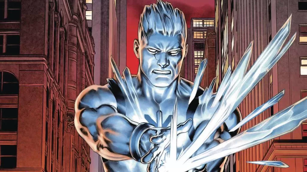
The story so far as I understand, is that Iceman was killed by a company called Orchis whose sole purpose is to get rid of mutants. An empath known as Romeo used his powers to re-form Iceman and build an Ice Palace in Antarctica where together they can protect the innocent across the globe. In this issue, we do not see that much about who Romeo is or why he’s doing what he’s doing, other than the fact that he loves Iceman. Instead, we are treated to a very sad flashback of Iceman during his teenage years being bullied, beaten, and banished from his hometown by the local community for being a mutant. Years later, Orchis has sent Elemental mercenaries to attack Iceman’s hometown in order to draw him out and get rid of him once and for all. However, it wouldn’t be an Iceman story without some really COOL ice tricks (see what I did there? Ice puns make me all chilly inside.)
In 10 pages of subzero ice-cold heroism, Iceman is able to defeat all the Elemental villains and save the town as well as his Mom. Whilst the book in general is quite astonishing, these 10 pages, in particular, are quite literally crystal clear definitions of comic book action. They employ fantastic panel layouts that tell the story with detail, provide beautiful full-page illustrations, and push the artistry of perspective to create an avalanche of excitement. There is one page out of those 10 pages, that took my breath away simply from how cool it is, and I love that so much. I do not like to stop reading because there’s an ad or having to go back because there’s a typo, but stopping because a page is so beautiful and so perfectly illustrated that it becomes a work of art, is sublime. The coloring here of course relies heavily on a wide palette of blues, whites, and purples; which is to be expected from an Iceman comic. Yet it still all feels very varied and exciting because the colors are placed in such ways that the different hues of colors make for great contrast even when it’s the same two families of colors. We also see some extra pizzazz when these rich blues and whites are placed in front of yellow panels, creating action-packed panels that grab your attention instantly.
Whilst this comic suffers from the same issue many Marvel comics suffer from in terms of lettering, where the lettering feels like a sticker on top of the heavily rendered and textured art, this comic manages to get creative with some really cool sound FX fonts, some varied word balloons, and some extra cool location texts. All in all, it is much better lettering than the one we saw in X-Men Red #15 because here a lot of the usual stops are taken away and we get to see some fun and creative lettering choices being made. One thing I did note however, is that the sound FX “Choom” is used a little too much, I’m not sure if that’s supposed to be like an Iceman thing, like the “Ka-Chow” from Lighting McQueen, but personally, I think a little variation with that sound FX could have really tied things together.
Two things I cannot get past though, are the parts where we have to read full pages of text. The same thing happened in X-Men Red and perhaps this is like a staple of the “Fall of X” series but I personally do not like it one bit. However, in this issue, these pages are at least a little more treated and feature some cool design elements that tie them better into the overall narrative of the story. Don’t get me wrong, I understand completely that they give you more lore on what’s going on with the story, but I just think if you’re gonna be making a comic you should do your very best to show us and not tell us. I would’ve much rather seen a page where a guy is writing out these pieces of paper and narrating what he’s writing, instead of having to read the whole thing. I just find that it breaks the flow of the story to have to read through these huge blocks of text. In comics, we use the word balloons for a reason. They are fast, they are easy to read and they are effective ways of communicating a plethora of concepts, ideas, heck even thoughts. Having to read a 3 paragraph page of text is not conducive to the comic medium. Present that in a different way, make it fun, please!
My final thoughts on this issue however is that it’s an amazing comic, and definitely one worth your money. I am definitely shivering from excitement at the notion of seeing what new blizzard of trouble Iceman skis into.
Can you find all the ice puns in this review? There’s a glacier-sized icicle amount of them.
Writing: 5 Stars
Art: 5 Stars
Colors: 5 Stars
Overall: 5 Stars
Written by: Steve Orlando
Art by: Vincenzo Carratú
Colors by: Java Tartaglia
Lettering by: VC’s Travis Lanham
Cover art by: Jesús Saiz
Varian Covers by: Ejiwa “Edge” Ebenebe & Junggeun Yoon
Published by Marvel Comics
Author Profile
Latest entries

 Comic BooksMarch 30, 2024REVIEW: Monstress #50
 Comic BooksMarch 28, 2024REVIEW: Cemetery Kids Don’t Die #2
 Comic BooksMarch 27, 2024REVIEW: Forgotten Runes #3 (of 10)
 Comic BooksMarch 6, 2024REVIEW: Sam and Twich- Case Files #1


