REVIEW: Batman White Knight Presents Generation Joker #6
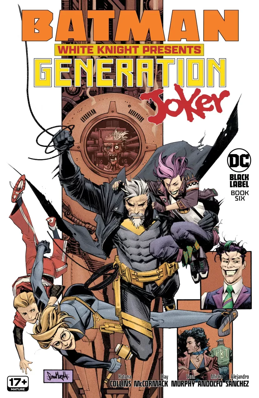 Two things I didn’t know I needed in my life; batman with a white beard and a holographic Joker. Generation Joker is not about your usual Batman fights the Joker and throws him in Arkham Asylum, these antics are long overdue. In this issue, Joker goes by the name of Jack Napier and he has a legit family, complete with two kids named Jackie and Bryce. Batman’s their uncle and Harley Quinn’s their mom, they must fight giant robots, and a woman named Marian Drews aka Neo-Joker. With beautiful character designs by Sean Murphy and Mirka Andolfo, this series is one for the ages. Also features coloring by Alejandro Sánches which is stellar and has a coloring style that is very similar to hand-painted watercolor drawings overlaid with a more cell-shaded look, and fantastic lettering by Andworld’s DC Hopkins.
I really did enjoy this book a lot. If you know me, you know that I’m not a Batman guy; I’m barely a superhero guy. However, reading through this my faith in DC Comics and what they’ve been publishing lately has really gone up. I wasn’t a big fan of the New 52 series, I found them pretty boring, but this kind of avant-garde storytelling and painterly style of comics is really up my alley. It is refreshing to see a new side of Joker that isn’t this psychopathic dude who loves to laugh. I love that he has a family and he’s a regular guy, well other than he’s not really a guy at all but a hologram (which honestly I don’t really know the reason for that because I just found out about this comic series) which is cool nonetheless and it goes very well with the overall theme of sci-fi/techno DC universe that this story has going on. The character designs in this story are crazy good! From the big orange robot to Neo-Joker, the kids, Batman, Harley, and Poison Ivy; literally everyone in this story looks really awesome. In the back pages, we get a taste of the creation process and we see that Sean Murphy and Mirka Andolfo make a really good team when it comes to redesigning characters we’ve known and loved for years. Speaking of really good teams, when you pair Mirka Andolfo Inks with Alejandro Sánchez colors, you get a beautifully vibrant, heavily textured book that gets better and better with each page turn. While there is not a true color scheme running throughout the book, the colors that Alejandro chose for this book are all very much working together to deliver a cohesive story that has its roots in traditional media. It almost seems like we’re looking at watercolor backgrounds with cell-shaded characters on top, and whilst I don’t think this is the case and instead the team is using brushes to achieve this look, I would kill for original watercolor pages of this book because some panels and pages are truly exquisite.
The story itself is fun to read, and the characters are all very distinct and interesting. The twins have unique personalities and even though there are several key elements that all the characters retain from their old-school days, these renditions of them are all very innovative. Starting with the fact that Batman now sports a crazy cool grandpa white beard, he looks dastardly with that thing. (Speaking of Batman, do you know what Batman’s favorite fruit is? Bat-nanas.) In terms of pacing this reads very quickly and it has a ton of action moments, this is due in part to the fact that the characters are trying not to be killed by Neo-Joker and the big Orange robot. I’m a sucker for action comics, so this really fun for me. I don’t think I have many bad notes to make on this issue. Perhaps the story with the kids was a little sappy, but you know it’s generally a story about family so you’re gonna get themes like “we’re all in this together”, and “as long as we have each other we’re never going to be alone.” However, even though this sort of stuff was in there, it wasn’t the main focus of the story and it was more sprinkled in here and there, with the bigger bulk of the story being about defeating the crazy robot and really measuring your craziness, both in the case of Bryce thinking he would someday become the Joker as well as Neo-Joker risking everything and going of the hinges just to save Poison Ivy.
I was a fan of the story overall. It was fun, it was action-packed and the lettering was stellar. We got some beautifully hand-drawn word balloons, a large dose of magnificent sound fxs text, and some fantastic moments with fonts breaking and molding the word balloons into new interesting shapes. This book is filled with beautiful artistry and it seems like the pairing of artists in this book, from writers to letterers, to colorists to penciler/inker was a winning combination. I am excited to read more from this team because they are all incredibly skilled in their department and each one of them is working to deliver a fantastic book at least with this issue, I feel like they have succeeded. It was also a nice little treat to see a little bit of how the sausage gets made, in the back pages we get to see some awesome concept art of the redesigned batmobile, Mr.Freeze, and the original Neo-Joker sketches as well as some Bryce and Jackie studies by Mirka Andolfo and all of it is top-tier artwork. Loved having the chance to read and review this story. The art is honestly really, really good. Even though, it is a DC-published book there is something about it that feels a little indie, perhaps it’s the amount of freedom that the artists had in order to redesign such iconic characters in ways that I personally had never seen done before.
Writing: 5 Stars
Art: 5 Stars
Colors: 5 Stars
Overall: 5 Stars
Written by: Sean Murphy, Katana Collins & Clay McCormack
Art by: Mirka Andolfo
Coloring by: Alejandro Sánchez
Lettering by: Andworld’s DC Hopkins
Cover art by: Sean Murphy & Dave Steward
Variant Covers by: Mirka Andolfo & Rose Besch
Published by DC Comics
Author Profile
Latest entries
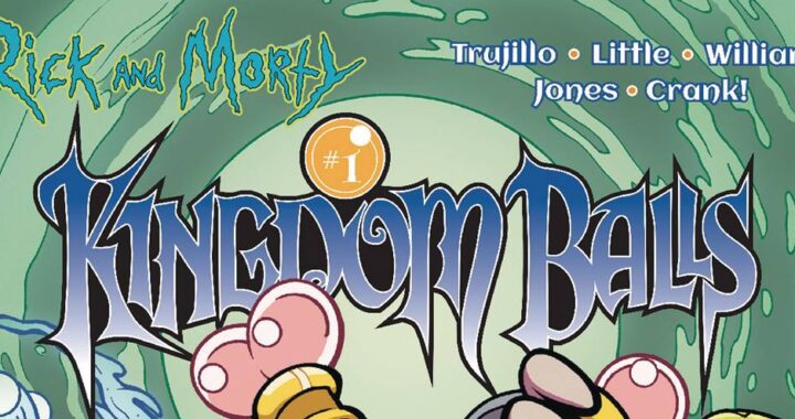
 Comic BooksApril 30, 2024REVIEW: Rick and Morty: Kingdom Balls #1
 ReviewsApril 30, 2024PRCC2024 Recap: Fans from all over the world join together in Puerto Rico to celebrate all things comics, anime and videogame
 Comic BooksMarch 30, 2024REVIEW: Monstress #50
 Comic BooksMarch 28, 2024REVIEW: Cemetery Kids Don’t Die #2