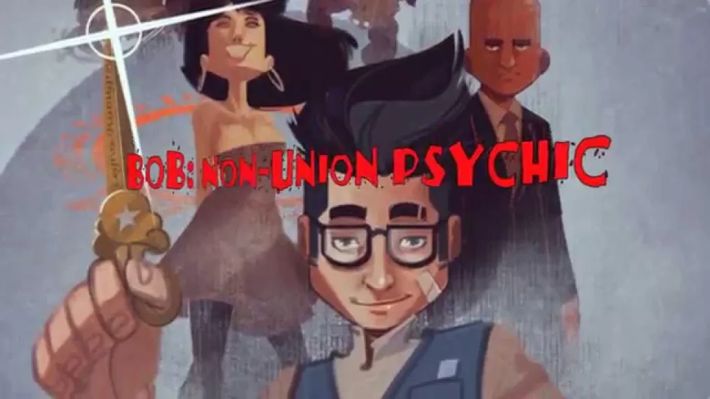
REVIEW: BOB: Non-Union Psychic #0
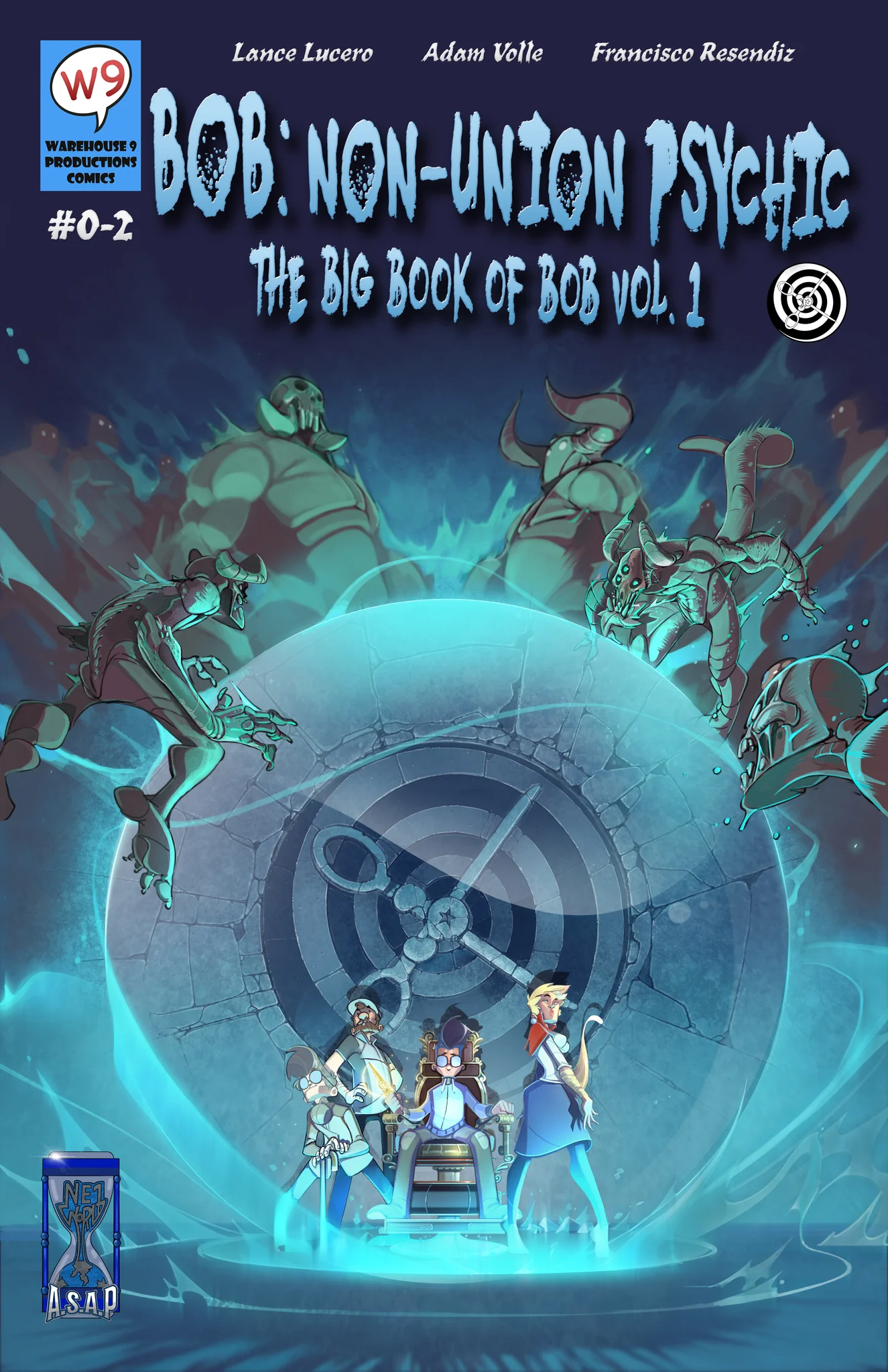 This comic is good beyond measure! Indie comics just keep getting better and better and ASAP Imaginations have landed a true winner with this one. BOB: Non-Union Psychic #0 is the set-up for the world of BOB, a world where psychic phenomena are an everyday occurrence and there’s a whole company called “The Psychic Union” that handles these sorts of occurrences. Accompanied by his great-grandpa and a golden pair of scissors BOB must battle accursed medallions and vengeful exes. The art is right up there with many of the work that is currently being published by the big 3 in comics, and the lettering is equally fantastic. No corners are cut in the production of this wonderful issue, and it shows that the team of Lance Lucero, Adam Volle, Francisco Resendiz, and J. Chill is truly a force to be reckoned with.
The writing of this issue is very well done. I was a fan of the hilarious relationship between Gramps and Bob, as well as the uptight personality of the Union representative who comes to see Bob work his magic. Overall it was a fun experience to read through and whilst the B-plot had a bit of a time/space issue with one not fully knowing what was going on where, it quickly resolved itself and propelled the A-plot fantastically forward. I did enjoy the B-plot and it was a nice touch to get you acquainted with the mystical nature of Bob’s side hustle, it was a little confusing to read because we had a major piece of the A-plot show up right in the middle of the B-plot’s fight and that killed the momentum for me. It would have perhaps been better to move that page to the end of the fight so as to not confuse the reader. It took me a second to realize what was happening and I had to read back to find my place in the story but after I did, this story just didn’t stop surprising me. The character designs are fantastic throughout the whole issue, from NPCs to the main characters; everyone is truly interesting and unique in their design. My favorite design other than BOB, Gramps, and the Medallion Devil, has to be the pink-haired punk girl. She shows up in literally just one panel, but I love how Bob sets up her appearance with the lines “Can you help me find my lucky scissors? I got a serious cut and color job first thing in the morning…” You then turn the page and there is that marvelous cut and color job he was speaking about, I love that reveal. It was simple and it wasn’t an action reveal (like a big fight or a monster) but it was just perfectly timed and it got a nice little chuckle out of me. Speaking of chuckles, this is a very funny comic. The relationship between Gramps and BOB is very much that of a wacky guy and a straight man. Gramps is clearly a pro at what they do but his lighthearted demeanor beautifully contrasts that of the more anxious and serious BOB.
I touched lightly on the art by discussing the character designs, but I must talk more in-depth about the art. It is beautiful. This is a beautifully illustrated comic. Drawn in a wonderful cartoon style and colored using soft shading and a tiny bit of texturing, it is quite clear that artist Francisco Resendiz is a pro at making comics. I adore a lot of his color choices but where he truly excels at, is his character design skills, environment designs, and action poses. I also really like what he did to portray the fact that BOB is constantly seeing ghosts wherever he goes. Using semi-transparent colors and blue outlines you can quickly see that BOB lives in a world very different than ours. Whilst you might be at the airport wondering how long the line is gonna take for you to board your flight, BOB will be starting at the ghost of a dead pirate that used to have a ship where the airport now sits, they might be having a conversation too. It is a very interesting technique to show you that there is more to this world than what meets the eye, to me it’s very reminiscent of the movie Odd Thomas and how he too can see ghosts in his normal life. To be an individual in between the living and the dead can be both a curse and a blessing but BOB has decided to use his skills for good and help anyone he can with his gift.
The coloring is quite intentional, and I love how this issue uses a prominent blue palette throughout its whole narrative. This allows for colors like red, orange, and yellow to really pop in a very interesting way. This contrast between colors leads to fantastic full-page illustrations and panel-to-panel reveals for example in the beginning when the “villain” of the B-plot is revealed she is enveloped in an orb of bright red blood that perfectly stands out against not only the background but literally all the previous pages. The same happens when we finally see the Medallion Devil aka the villain of the A-plot. His design is heavy on reds and oranges and this is an instant shock to your senses since nothing in the comic before has had such vibrant colors. It is an instant jolt of adrenaline and dopamine when this guy comes up and the whole comic goes from “funny psychic detective” to “Oh shit, BOB might get beheaded on the next page”. Speaking of shocking things is the fantastic lettering job of J.Chill. Whilst his name has the word chill on it, this lettering job is far from it. In this issue, we see a plethora of really good sound fx’s, great word balloons, information boxes, and even some ghost-specific word balloons. Truly a creative lettering job. My only qualms with it is probably the “Roar” from the Medallion Devil, whilst I feel like it was well intentioned to set a textured bold wavy font on top of an orange and red shouting word balloon, I personally think that it would have looked way better if they had turned the shouting word balloon into the text itself it would have looked a little more pleasing to the eye in my opinion. Other than that, this was fantastic through and through.
I am instantly a fan of this series. It has Hellboy vibes, Doctor Strange feels, and a Chew aesthetic. I am already a huge fan of all of that, making this the perfect read for me. I am excited to see this story evolve and I love the fact that it’s an indie title, handled by an indie publisher. This level of skill and talent is setting a precedent for the fantastic level of work that can be expected from ASAP, Warehouse9, and NE1 World.
Writing: 5 Stars
Art: 5 Stars
Colors: 5 Stars
Overall: 5 Stars
Created and Written by: Lance Lucero
Scripted and Edited by: Adam Volle
Art and Coloring by: Francisco Resendiz
Lettering by: J.Chill
Cover art by: Francisco Resendiz
Published by NE1 World (A.S.A.P. Imagination)
Author Profile
Latest entries
 Comic BooksApril 30, 2024REVIEW: Rick and Morty: Kingdom Balls #1
 ReviewsApril 30, 2024PRCC2024 Recap: Fans from all over the world join together in Puerto Rico to celebrate all things comics, anime and videogame
 Comic BooksMarch 30, 2024REVIEW: Monstress #50
 Comic BooksMarch 28, 2024REVIEW: Cemetery Kids Don’t Die #2