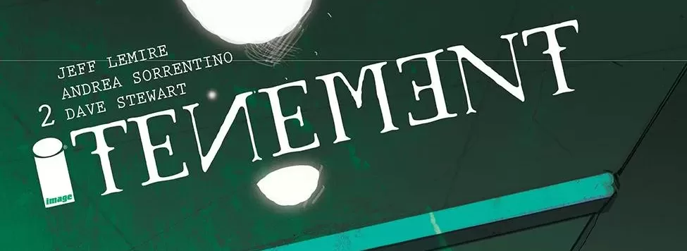
REVIEW: BONE ORCHARD TENEMENT #2 (OF 10)
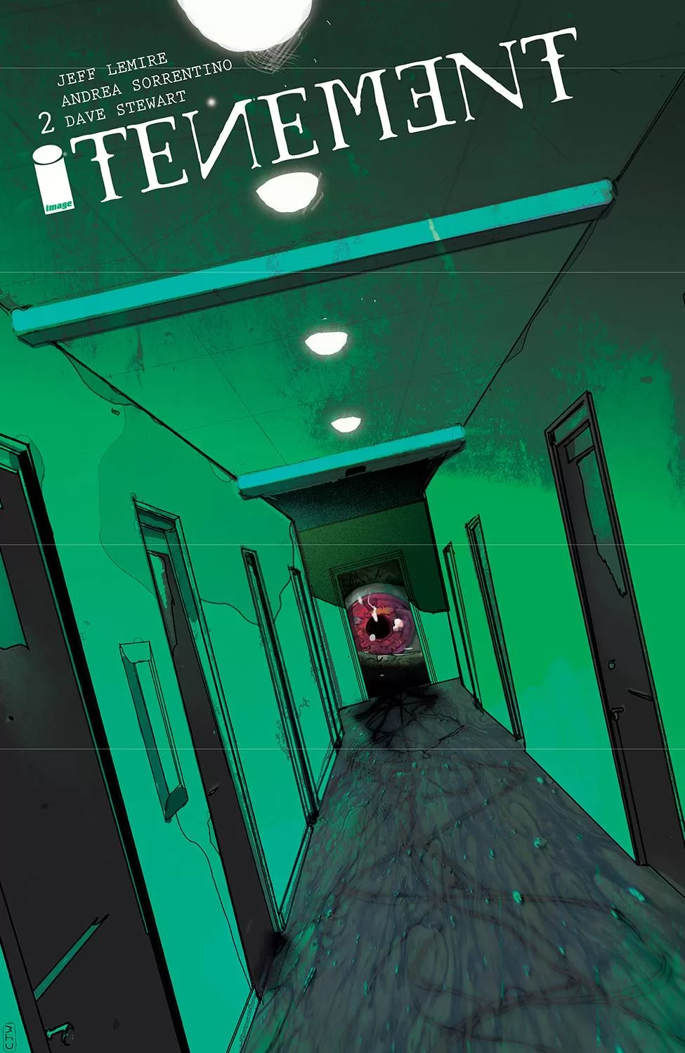 Textured photography to tell comic stories is always so weird for me. I know that in Mexico that’s how the stories were sort of told at the beginning. I might be wrong here, but a local wrestler gave us this anecdote back in the day about how that was the way comics were done in Mexico before they transitioned to the western style of drawing and painting them. I bring that up because even from such an early age I’ve always found that style of comics to be weird. I’ve never really liked it too much. This comic has a lot of that, it’s not 100% pictures but it’s looks like pictures that were run through a texturing filter in photoshop and I’m just not a huge fan of the style. I do like how the negative space is handled and the coloring is also very good, but the actual art is kinda weird, I’d venture to say it sits right on the uncanny valley. However glossing over that, I do have to say that the writing of this story is quite spectacular. It is a horror-esque story and I think the suspense builds up very well right from the beginning. The pacing is fantastic and whilst I do not like the overall look of the characters, I do appreciate that sometimes the style works very well with the buildings and many of the background elements.
The panel layout is also quite spectacular, there is a scene that happens before what looks like a power outage and it’s laid out in 4 pages using a circular composition layout that breaks the individual stories into something of a puzzle piece and then brings them all together at the last page and that was done fantastically. Seldom do you get to tell a story with the actual panels of a story and in this story I think it was done wonderful, definitely something to applaud and make note of for possible changes of us in your own story. The coloring is also pretty good, however the way things are shaded can sometimes end up looking a little muddy and that could be perhaps due to the brush being used to shade and color, in some panels it looks a little too texture. I guess it makes me question wether what is failing here is the line work or the shading, but at least in my eyes it looks a bit weird. It’s not horrible, but overall it could be better and it would go along way towards telling the amazingly written story without having the reader wonder what exactly is looking weird in this pages.
The lettering does an alright job, it marries the art and the script pretty well but I also think that it’s a basic job on the lettering front as well. There aren’t any particularly interesting bubbles, and I think I saw maybe 2 sound fxs total, and they were pretty basic. I think where this book truly excels though is the way it uses graphic design to tell a really interesting story and create an ambiance of mystery and darkness. Which is a great thing because the book opens with a monologue about darkness as a concept and a driving force for human kind and having the book be so dark kinda works in its favor. One thing I will say about the art though, if these are in fact photographs composited and drawn over to create the final panels, these are not stock images. I say this because even though I do not like the art I can appreciate that the characters are all very unique and maintain a pretty good level of consistency throughout the whole story, which is something you lose almost instantly when you’re using different stock images of different people to tell a story. Another great thing this book does, despite it’s flaws, is create a wonderful cliffhanger. Those last couple of pages are interesting, the color scheme is vibrant and completely different to the rest of the book and it legit makes you want to keep reading to see what is really going on, and I think that’s a fantastic thing to accomplish.
All in all, the art of this book is nothing to write home about but regardless the story itself is very good and I think if you like horror stories this one would go nice in your collection. This second issue was an easy read and didn’t require you to have to have read the first issue, and you can jump in and understand pretty much everything is going on without too much of a hassle and that is a telltale sign of a good periodical comic. Good to read for newcomers and great to read for long time fans of the series. My only hopes is that the overall art continues improving throughout the future issues because the story deserves to have really great art to accompany it.
Writing: 5 Stars
Art: 3 Stars
Colors: 4 Stars
Overall: 3.5 Stars
Written by; Jeff Lemire
Art by; Andrea Sorrentino
Coloring by; Dave Stewart
Lettering by; Steve Wands
Cover art by; Andrea Sorrentino
Variant Covers by; Christian Ward
Published by Image Comics
Author Profile
Latest entries

 Comic BooksMarch 30, 2024REVIEW: Monstress #50
 Comic BooksMarch 28, 2024REVIEW: Cemetery Kids Don’t Die #2
 Comic BooksMarch 27, 2024REVIEW: Forgotten Runes #3 (of 10)
 Comic BooksMarch 6, 2024REVIEW: Sam and Twich- Case Files #1


