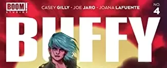
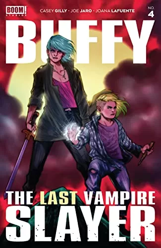
REVIEW: Buffy Last Vampire Slayer #4 (of 4)
 Buffy the Vampire Slayer has always been one of those series that you hear about everywhere in geek culture. It was created by Joss Whedon, and it’s so deeply ingrained in geek lore that I’m sure The Big Bang Theory has made a few jokes about it. I’ve never been much of a fan. I appreciate what it’s about, and I like how it has magical elements but even after reading a few issues of the original series and watching a couple of episodes, I can’t say that I was hooked as many others were. This particular issue is drawn beautifully, but I feel like the writing is a little messy. Messy in the sense that as a first-time reader of this particular new series, I have no idea who is who or even what is going on. Whilst the art is stellar in many instances, a few of the action poses could be a bit better and the overall timing feels so fast that it’s hard to understand what is happening when.
The art is honestly really good. The character designs are very interesting, and the ratio of inking and coloring is very well-balanced. At no time does it feel like one thing is carrying the other, instead you get a mix of beautiful inks with equally beautiful color palettes and great shading. This being said however, there are a couple of panels that feel off. The most notable one is the one with Buffy throwing away some of her weapons, particularly the moment where he throws away what looks to be an axe. That specific panel just feels weird it has her sort of running but also sort of not running, and also sort of throwing but her back arm looks weirdly bent, not at all what anyone would do if they were throwing an axe into the ocean. Apart from this very specific panel, everything else looks really good. I love how Buffy is older in this comic instead of the usual young adult age that she usually is. Moreover, the demon designs look cool and feel very much like creatures of the underworld. In that regard, major prompts have to be given to the writer Casey Gilly for doing her due research on the hell world and doing a nice little mention of how demons and devils ascend through ranks in the Abyss. I found that to be a nice little nod at the world of Magick, and for me, it grounded it in some sort of reality that elevated the story.
However, the writing for me felt a little too complex. The initial flashback scene explaining the origin of the devil woman was barely comprehensive and throughout the story, I just felt lost. I don’t know if this is because I am missing some key lore elements of the previous issues, or if I’m supposed to know more about the world of Buffy the Vampire Slayer but I found it hard to truly dive into the story and empathize with any of the characters. The only character I did some kind of connection with was Buffy, but this quickly ended during the car scene monologue as it talked about a bunch of things that must have happened in previous issues but didn’t give enough information for me to know what happened. The problem with this is that even though one may think “Oh, just read the previous issues”, if this issue doesn’t give enough information about the past occurrences I will have no motivation to go back and read through the archive. If you can’t grab a new reader at every issue, converting them into fans will become a really hard endeavor for you. The timing of the story also felt a little too fast for me, everything was happening so quickly that I didn’t have a moment to sort of fill in the holes and at the very least come up with a theory of what could have happened before.
Even though the action sequences were beautifully drawn, everything happened so fast that I truly couldn’t register any of it, and none of it felt as impactful as it could have felt. One moment a character turned into a demon, and the next panel he was getting stabbed, and the next panel you have to drink a bottle of something or that previous character was gonna get murdered. It didn’t even register for me that the stabbed guy held significance to this other character. Even whilst writing this, I’m not so sure if that guy was her boyfriend, her brother, or just a guy she knew. Too many scenes, too fast of a pace, and not enough time to truly digest each scene left me dazed and confused. It’s sad because the art style is very good, and the coloring is just as good. Even the lettering is fantastic. Sadly though when you have a script that is too fast to comprehend you end up with panels that are just as hard to understand.
This is all being said, the comic does have a lot of potential. I think here the problem is the scripting, it’s not that it’s bad. It’s just too fast to truly enjoy, I would suggest tidying it up and adding a bit more space to rest and fully process the events that have been happening. I can’t talk about previous issues but in this issue, instead of having 4 things happen (flashback, wrecking the amusement park, buffy side plot, final demon battle). You could have done a longer flashback, a longer wrecking of the amusement park, done away completely with the car scene part, and then spent a bit more time on the final demon battle. I say do away with the whole car scene thing, because in the end, it didn’t amount to much. The girl was mad at Buffy for being her “watcher”, but in the end she acted like nothing happened because Buffy saved her and that whole thing was resolved in literally 3-word balloons, making the whole thing superfluous.
I know I’m being hard, I want comics to grab me and keep me hooked forever and ever. With that in mind, I will applaud a few little things that I think were done well. I already spoke about the demonic levels of ascension, which was a great little magickal detail to add. I also really like the reveal of the demon tattoos on the girl. Those two panels were fantastic, my only pointer would have been to make them fully black on the tattoo instead of just the outline, just to drive the point home. The thing I liked about those two panels is that they made me connect the dots without having the character state “Your tattoos look like these demonic symbols”. Instead, it showed you the symbols on a phone, and then it shows you the tattoos and the following panel goes on with the story assuming that you understood. Which is perfect and doesn’t feel like I’m being talked down to, big applause for that. That sort of writing is what I want for the whole comic, little moments that allow me to connect dots, and tie knots without having to go back. Little dopamine hits of “Oh shit, I figured it out!”.
One extra note that I think would make this a lot easier to read, is having a completely different color scheme for the flashback. They did this for the amusement park working with lots of reds, purples, and blues. They did it again with the Buffy side plot with lots of blues and blacks, and even some rain to further contrast it from the main story but the flashback felt too in line with the rest of the book and it didn’t make the “time jump” feel obvious enough so that you could differentiate past from present.
In conclusion, there is a lot of potentials here, and I want to see it be fully tapped into.
Writing: 3.5 Stars
Art: 5 Stars
Colors: 5 Stars
Overall: 4 Stars
Written by: Casey Gilly
Illustrated by: Oriol Roig & Nicola Izzo
Coloring by: Gloria Martinelli
Lettering by: Ed Dukeshire
Cover art by: Ario Anindito
Variant Covers by: Suspiria Vilchez, Ario Anindito & Skylar Patridge
Published by: Boom! Studios
Author Profile
Latest entries
 Comic BooksApril 30, 2024REVIEW: Rick and Morty: Kingdom Balls #1
 ReviewsApril 30, 2024PRCC2024 Recap: Fans from all over the world join together in Puerto Rico to celebrate all things comics, anime and videogame
 Comic BooksMarch 30, 2024REVIEW: Monstress #50
 Comic BooksMarch 28, 2024REVIEW: Cemetery Kids Don’t Die #2