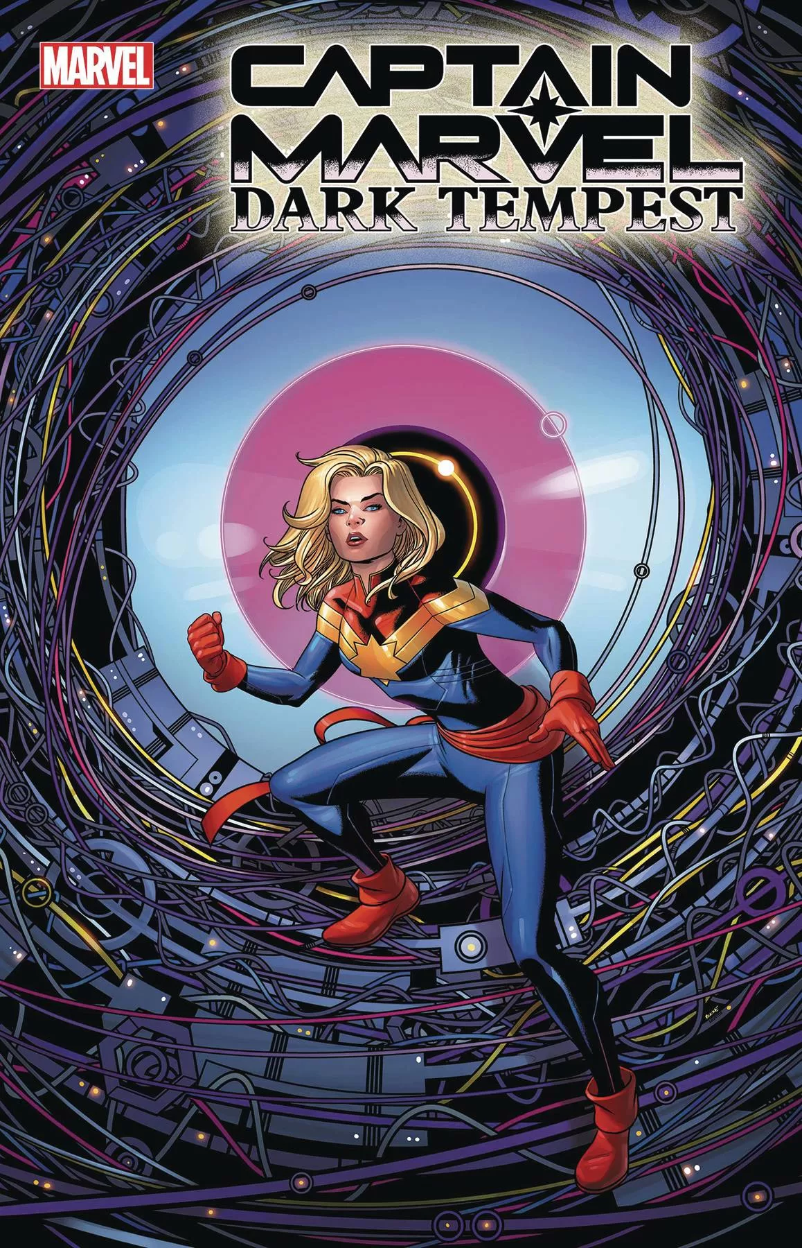
REVIEW: Captain Marvel Dark Tempest #4 (of 5)
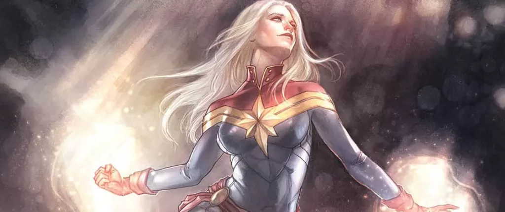
 Captain Marvel Dark Tempest #4 follows Earth’s Mightiest hero, Carol Danvers, as she battles supervillain Nitro and an alien with magnificent powers called Nada. Nada has used her mysterious abilities to power up four civilians who were inadvertently dragged along with Captain Marvel to the battle.
Let’s start with the lettering because the rest of the review will probably be just me gushing about the fantastic writing and art. The lettering by VC’s Ariana Maher, is fantastic in several ways. Word balloons are perfectly shaped, the fonts are fantastically chosen and the sound FXs are creative with a particularly unique look to them that really makes them stand out against other letterers’ work. It is top-notch lettering in many regards. However, as with many big 3 comics we’ve seen in the past (mostly Marvel/DC) ultra clean vector lettering does not pair well with stylized-textured painted art. It just looks like stickers on top of the art. I realize that this is part of the process at the big comic companies; send it off to a letterer to have them work it in Illustrator so that you can get the best quality on that text when it prints. Yet, when you put the two together to read it on a computer, or mobile screen it often falls flat.
Amazing lettering done a way by too perfect of a resolution, it’s a shame to see so many times in the comic world. Is the answer to have two versions of the lettering? Perhaps, one version of the lettering that has a bit of texture overlayed on top of it so that when it sits on the art it doesn’t look so different; keep the ultra-clean vector version for print. The reason it works so well in print is that ink tends to mix with the paper medium that it is printed on, reflecting the texture of the paper, thus it ends up unifying everything by the time it reaches the reader’s hands, but in digital mediums; whilst it does not completely destroy the wonderful lettering it does bring it down a couple of notches for me. Even though it isn’t, it makes the lettering feel like an afterthought instead of a harmonious and integral addition to a comic.
This is of course not Ariana’s wrongdoing, but it is something that I keep seeing again and again; often not talked about amongst the big companies. I think they should give the letterer the task to provide the two types of lettering so that here in the digital world we get an equally fantastic product as the readers in the physical world. Pay your letterers that extra bit of money so we can appreciate their fantastic lettering skills without losing our precious immersion in the stories.
With that out of the way, this is a really good issue. The writing is fantastically funny! Nada in particular has a wonderful voice that is often witty and snide, especially when addressing Captain Marvel. I love how she calls her Carol even though she’s clearly doing it to make her feel less, pardon the pun, marvellous as a hero. I think Nada as a villain is just fantastic. Not only is she a fantastic villain she also seems to retain her “alienity” throughout the whole of the fight. She’s watched Captain Marvel documentaries, talks about a sisterhood, and makes jokes at the expense of Carol all whilst delivering quite a punch. It’s hilarious, but at the same time, she is also sick, possibly dying. This does not take away from her greatest as a villain but instead, it serves to raise the heroic-ness of Captain Marvel as she is put in the position of beating someone while they are down, or truly being a hero and giving Nada a helping hand in her time of need. It is clever writing, it is writing that does not use the characters as plot devices to move the story forward, but instead plays to the strengths, weaknesses and most importantly, the values of the characters to tell a true story. There is even more wonderful writing in this issue in the story arc of the ferals and of the other villain Nitro. But for me, the exchanges between Nada and Carol were truly the backbone of this issue. Also, there has to be a special mention to every time the Blake-Bot talked, I think that robot pal is quite honestly a wonderful character that is being explored in fantastic ways in this issue as well as the issues that have come before.
The art is beautiful! The combination of fantastic inks, poses, faces, and colors of artists Paolo Villanelli and Java Tartaglia, create a world that you want to be a part of. The comic leans heavily on purples, reds, and pinks to show you a world that is alien to us. When you look at these pages you can quickly understand that you are not on earth. I also realize that this choice of choosing a complementary color scheme for the backgrounds to Earth’s many greens is totally purposeful. When you choose a color palette that directly contrasts what you would normally think of as a planet your mind quickly leaps to the fact that you are not on a planet that you’ve seen before. It is no doubt something I’ve seen done in the past, with other books by Marvel, especially their Star Wars books. However, it wasn’t until I read this issue that I understood why so many alien planets tend to be pink and purple. This realization feels like a small level-up in my artistic and critical mind. I am grateful to have experienced it with such an amazing book. I like the character designs in this book a lot too. While some of the feral are a little on the standard human side, it is really with Nada, the Blake-Bot, and the creatures of the alien planet where we see creativity soaring. Big weird shapes, lead the way to creatures that somehow resemble elephants or mammoths whilst still appearing totally and completely foreign to any creature on our planet. Quite inventive.
“Quite inventive” has to be the two words I use to summarize this issue. It is fun to read, it is beautiful to look at, and all in all a tremendous experience. I am excited to see this story and these artists continue developing this series.
Writing: 5 Stars
Art: 5 Stars
Colors: 5 Stars
Overall: 5 Stars
Written by: Ann Nocenti
Art by: Paolo Villanelli
Coloring by: Java Tartaglia
Lettering by: Vc’s Ariana Maher
Cover art by: Mike McKone & Jesus Aburtov
Variant Covers by; Meghan Hetrick
Published by Marvel Comics
Author Profile
Latest entries
 Comic BooksApril 30, 2024REVIEW: Rick and Morty: Kingdom Balls #1
 ReviewsApril 30, 2024PRCC2024 Recap: Fans from all over the world join together in Puerto Rico to celebrate all things comics, anime and videogame
 Comic BooksMarch 30, 2024REVIEW: Monstress #50
 Comic BooksMarch 28, 2024REVIEW: Cemetery Kids Don’t Die #2