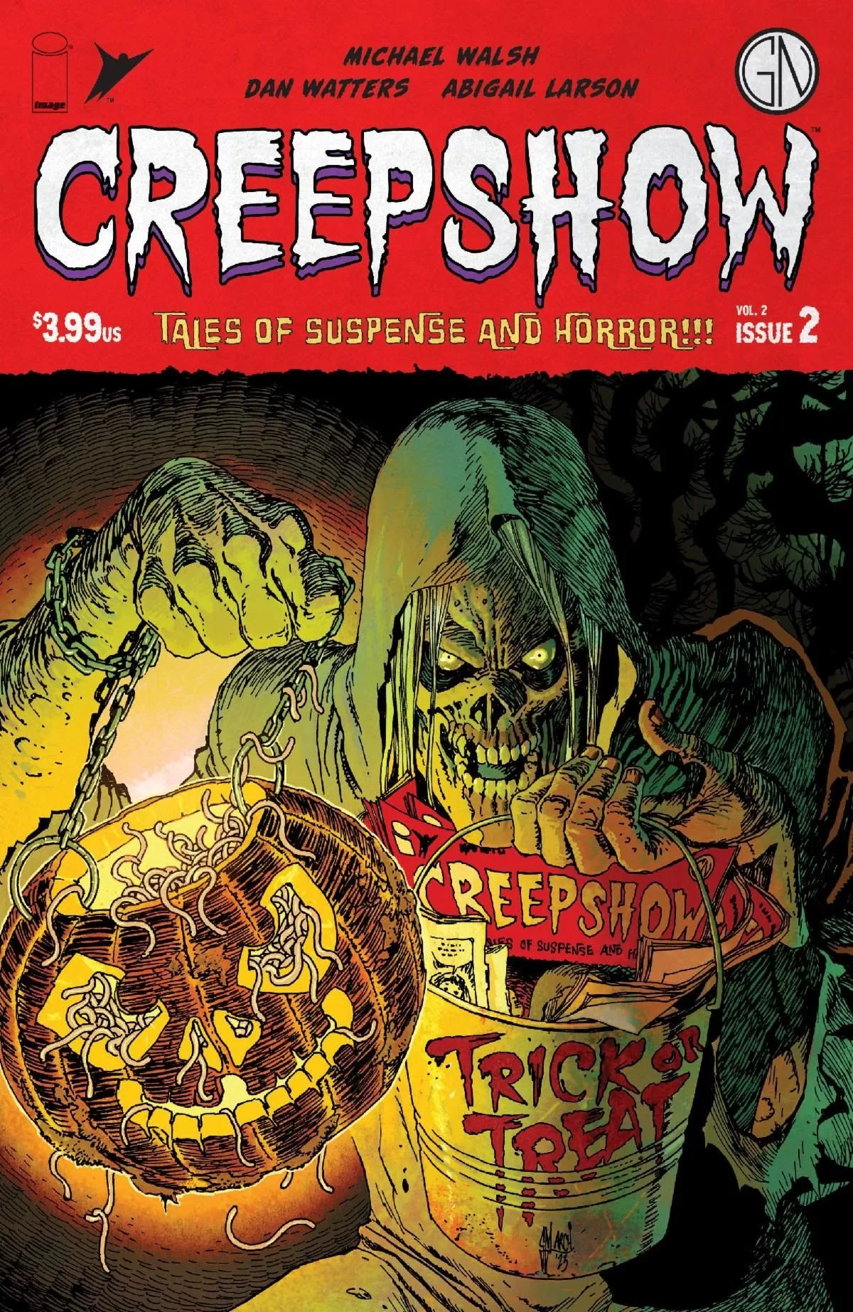
REVIEW: Creepshow Vol.2 #2
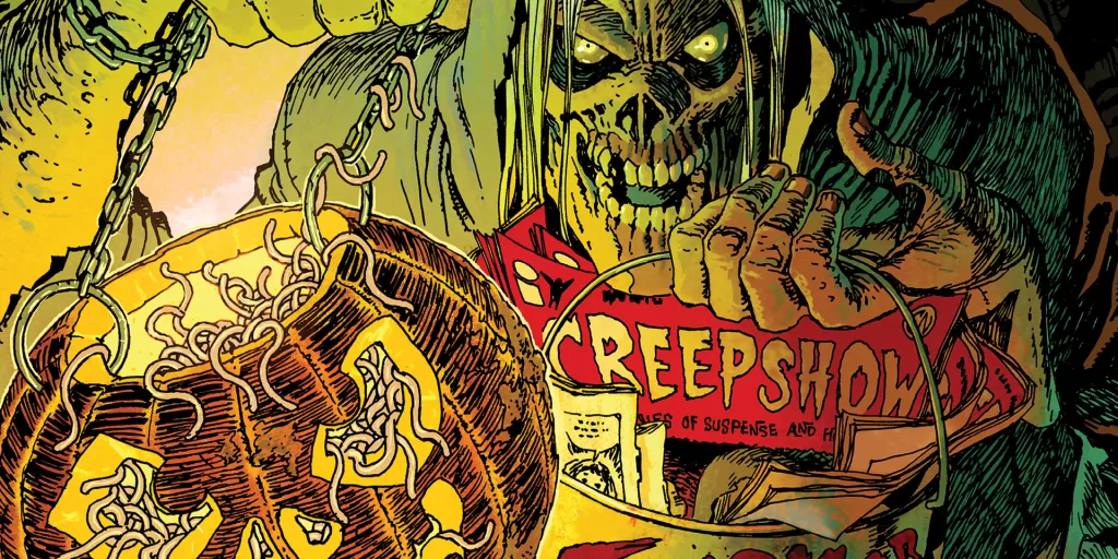
 The new Creepshow is “sure to send shivers down your spine!”. I have a few Tales from the Crypt comics in my collection, and a few Vaults of Horror; whilst they are great collector items and still fetch a pretty penny on the market (little tidbit if you ever stumble upon them in a garage sale or thrift store) they were always a drag to read. They were great stories don’t get me wrong, but they were soooo looooooong! These are of course comics from the 50’s and back then for whatever reason everyone thought that comics were supposed to be novels. It was all about packing as many words as you could into the comics. This is probably the same reason why I’m not a fan of old-school Marvel or DC stuff (more Marvel than DC though) because they would just go on and on about things, and the fonts used to be so small back then that you could fit like 5 sentences per word balloon and gosh what a hassle. While I did like the stories, once I finished reading 40 minutes of walls of texts, because they were good and the suspense was enough that you read through all that fluff just to know who killed who; I often would stop my comics reading session after a Tales of the Crypt from how long it was. Fast forward to today, and all this nonsense is done for! This new Creepshow by Image Comics is fantastic. It features of course our favorite ghoul, “The Crypt Keeper” but in a whole new revamp style and he looks worse (read “better”) than ever!
This new format of the original comic is way better-paced, with bigger art, and overall just better. This is a Tale of the Crypt/Creepshow I can really get behind. This particular issue contains two stories; “The Man with No Eyes” & “Keep It Down”, both of them drawn and written by two different artists, and both of them are very good stories to read. I like the fact that they went with two stories instead of the previous four stories per issue, this makes for a lighter reading and overall a much better experience than the older books. The art is also way better, back in the day you had tiny little chicken scratchy art that you could barely tell what everything was, and I’m sure it looked way better when it came out in the 50s but by the time I got those book 60 years later they were dusty and hard to look at, the ink had deteriorated quite a lot which didn’t help the blocks of text with small drawings. In these books, however, you get big grotesque pages of pure horror colored exceedingly well with a good balance of word balloons and art, which just works really well.
The first story “The Man with No Eyes” is about a boy who watches the TV a little too much. His dad has to work night shifts every day and he’s left alone at home to entertain himself with his only company being the television. Between cartoons, police shows, and a little bit of naughty adult entertainment he stumbles upon a channel with a magician that directly talks to him and performs tricks for him. The story is creepy, and it fits perfectly with the mood of Creepshow. It is all done by one man Michael Walsh, with lettering by Pat Brosseau (who does a wonderful job at lettering the comic) and it is truly a fantastic piece of storytelling. It uses a monochromatic color scheme of desaturated blues mixed with some yellows and a heavy dose of spot blacks for the shadows. It feels creepy, it feels isolated it feels evil. This very intentional choice of colors helps to pop the dark magician’s red colors and make him stand out quite well against the rest of the characters. He carries a little friend with him who is also red and it looks gross when he comes out. Out of the two stories, this is personally my favorite because it is genuinely scary.
The second story we have is “Keep it Down” and it’s about a girl who comes from a family of ghost whisperers, well ghost listeners to be more precise. Her grandma died and now she has to take on the mantel of ghost listeners and hear the dead complain and ask questions about TikTok. It’s funnier than the first story, but it isn’t all that scary. The art is very good though, it is written by Dan Watters and illustrated by Abigail Larson cover artist for Lady Baltimore (which by the way is a Mignola joint and definitely something I will have to go buy now). I like Abigail’s rendition of the Crypt Keeper on this one a lot, and I also like the way she drew the ghosts. They look very ectoplasmic with their blueish-green skin and even though they are not transparent they still very much look like ghosts on the page, so fantastic job on that. This story is a bit more colorful in general, and there is a violent scene where the character mutilates herself in order to stop hearing the ghosts and finally fall asleep, where the background of the page goes from stark white to a bloody red and then to a bunch of black pages right up to the horrific climax. Honestly, I say horrific but it’s a funny climax. There’s a bit about how her grandma used to say that she snored so loud that she could wake the dead, and well in this story she very much did… It’s a fun story to read, and the art is fantastic, again the lettering by Patt Brosseau is stellar with some wonderful titles for both stories, but it wasn’t scary. However, I don’t think the writer tried to go for scary on this one, there are genuine jokes here and they all landed for me. I think it’s great to have both these stories in the same issue because whilst one is definitely more disturbing than the other one, the more lighthearted, yet still grotesque story, serves as a palette cleanser from the first story and it leaves you wanting to read more which puts a nice little bow on the whole experience.
In conclusion, this is the first time I have been fond of Tales of the Crypt (or the rebranded Creepshow) comics. I use the titles interchangeably because let’s face it, all those books were the same thing with different titles, but this one, this one is a title I am excited to read more of and it’s perfect for the Halloweenies. No doubt I could see a hardcover of this being a great addition to my collection. Heck, if I had to sell all the old ones for an HC of this one, I think I would do it in an instant because if the rest of the issues are as good as this one was, I would much prefer to own this. This is the sort of series that I would crack upon every October for years to come.
Writing: 5 Stars
Art: 5 Stars
Colors: 5 Stars
Overall: 5 Stars
Written by: Michael Walsh & Dan Watters
Art & Coloring by: Abigail Larson
Lettering by: Patt Brosseau
Cover art by: Guillem March
Variant Covers by: Michael Walsh, Skinner, Rafael Albuquerque & Chad J Keith
Published by Image Comics
Author Profile
Latest entries
 Comic BooksApril 30, 2024REVIEW: Rick and Morty: Kingdom Balls #1
 ReviewsApril 30, 2024PRCC2024 Recap: Fans from all over the world join together in Puerto Rico to celebrate all things comics, anime and videogame
 Comic BooksMarch 30, 2024REVIEW: Monstress #50
 Comic BooksMarch 28, 2024REVIEW: Cemetery Kids Don’t Die #2