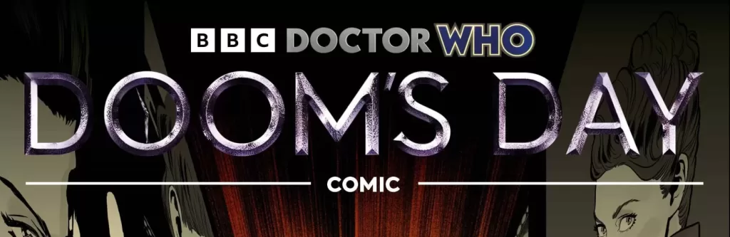
REVIEW: Doctor Who Doom’s Day #1 (of 2)
 Inside an old-timey police blue police box, a roaring engine hums its song through time and space. Doctor Who is a classic like no other, this series dates all the way back to November 23, 1963. Released first and foremost as a tv show on the BBC it follows the adventures of a timelord named “the Doctor”, a witty and charming hero who travels the universe’s when, what, and where making sure it doesn’t end. I personally love Doctor Who and all its different iterations of entertainment, from the movies to the tv shows, to the merchandise and the comics, there are a plethora of Doctor Who things that one can definitely obsess over. While I am a sucker for the merchandise (my favorite pair of socks is Tardis themed), the comics have never really garnered my attention, I have always felt that they could be so much more than they actually end up being. That being said, reading this comic I might be coming close to changing my opinion.
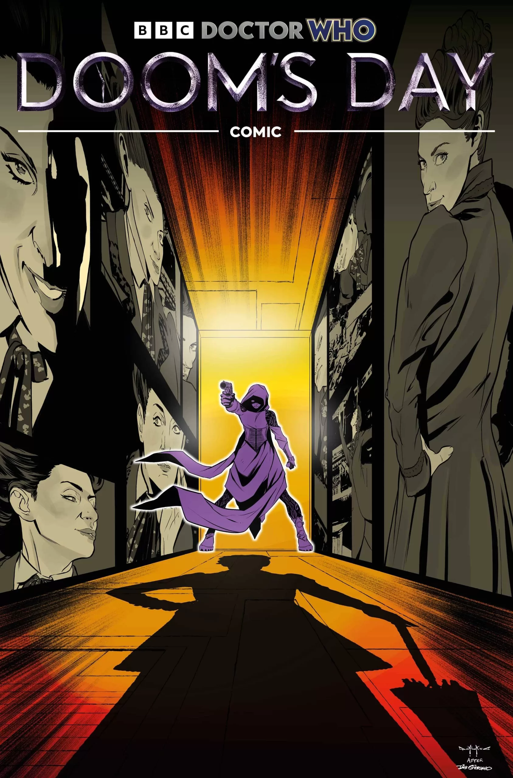
The character art in this comic is very good. I am a fan of all the designs, especially that of Misty, the woman passing herself off as Doctor. Her mad hatter-inspired attire is very fun to look at, and the purple color scheme pops very well against the different backgrounds and other characters. The art style itself is nothing too crazy, and it does its job well, I’m not a huge fan of the backgrounds as it seems they were rendered in 3d and perhaps traced over or made to look as if they were outlined, which makes them feel very rigid and fake. I might be wrong of course, as I wasn’t there during the creation of the comic, but that’s the impression I get from the few establishing shots we get to see in the comic. The pacing of the comic is a little too jumpy for my liking, but the jokes are solid and I genuinely laughed at pretty much all of them, so that’s wonderful. The coloring on the characters is pretty good, it’s not anything too crazy and I would have personally liked to have seen some more rim lighting here and there to make things tie into the background better, but overall it works. In the background though it feels pretty “meh”, at least for the first part of the story set in what looks to be a space victorian party. The second part of the story is set in a prison and here the backgrounds are more textured, more abstract in some panels, and whilst the big establishing shots are still pretty 3d rendered, the coloring really makes them look cool and I like that. Still though a little rim lighting here and there to make the characters look more like they are in front of screens, and in a sci-fi world would have gone a long way. Next, we have the lettering. The lettering itself is good, and the font used is easily readable and fits very well in the word balloons, however, the word balloons themselves could use some work. It’s not all of them of course, but the ones that are bumping into the sides and tops of the panels should have erased the panel border instead of being outlined by the panels and that just makes them look weird to me. In cases where the panels don’t sit on top of white backgrounds, it works but when they do, it just looks weird personally. The sound fx is alright, nothing too special really, it’s there and it serves its purpose but that’s about it. By now you know how I like sound fx text that flows well with the art and isn’t just another font on the panel.
Overall it’s not a bad comic. I think the writing is pretty good even if the pacing itself is a little jumpy in places, the joke themselves are phenomenal and I love the meta-commentary on the personality of the Doctor through the lens of Misty. If you’ve ever seen any episodes from the show you will definitely enjoy the witty remarks that Misty spouts through the story. The Doom character was a little less memorable and I’d dare even say forgettable, for her to be the main villain of the story and share the name of Marvel’s greatest supervillain, she’s very tame and kind of boring. For a first issue of a series, I think it’s pretty soft, there are a lot of things that could’ve been done better, but there is still something there that makes me think that maybe just maybe if they grow through the issues they will have something good on their hands and the comics will be just as fun to read as the show. There is a lot of potential here and if they are able to fine-tune that potential, they will turn me into a full-time reader. I haven’t changed my opinion on Doctor Who comics just yet, but there might be a comic from this team that turns me around, I can feel it, they are closing in on something good, just a little extra push and they’ll find it.
Writing: 4 Stars
Art: 3 Stars
Colors: 4 Stars
Overall: 4 Stars
Written by; Jody Houser
Art by; Roberta Ingranata
Coloring by; Warnia K. Sahadewa
Lettering by; Richard Starkings & Comicrafts’ Jimmy Betancourt
Cover art by; Pasquale Qualano
Published by Titan Comics
Author Profile
Latest entries

 Comic BooksMarch 30, 2024REVIEW: Monstress #50
 Comic BooksMarch 28, 2024REVIEW: Cemetery Kids Don’t Die #2
 Comic BooksMarch 27, 2024REVIEW: Forgotten Runes #3 (of 10)
 Comic BooksMarch 6, 2024REVIEW: Sam and Twich- Case Files #1


