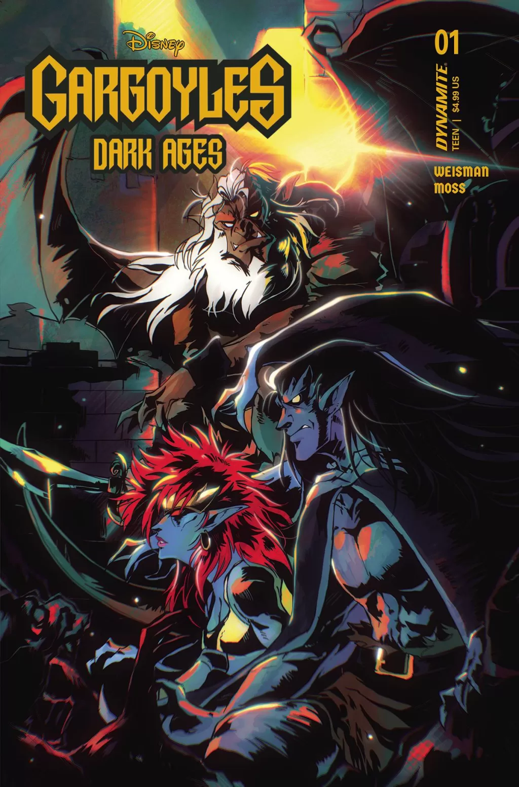
REVIEW: Gargoyles Dark Ages #1
 Way back in the 2000s, an animated version of this came out on Disney, and to my youthful mind, I remember it being the best show on TV. Still, in my adulthood, I regard it as a very good show, although I’m sure it’s not as great as I once thought. When I first received this comic for review I was excited because of all the nostalgia that it brings along with it, and whilst I am not entirely disappointed I do I was able to see it more for what it is and less for what it was.
It is not a bad story, it is just a weak first issue. Whilst the art and the coloring are very good, the writing itself is a little boring. It tries to feel like Game of Thrones but fails in that there is very little to hold on to emotionally with these characters. If it wasn’t for my deep-rooted nostalgia I don’t think I would care one bit about them, and considering that the target audience of this comic is no doubt children of today’s day and age, nostalgia will not be a factor for them. It’s a fun premise though, Gargoyles in the Dark Ages, sounds pretty awesome. However, instead of starting right with the good stuff in the middle of an epic battle, we have to read 15 pages of two dudes convincing the Gargoyles to protect them… That’s boring honestly, and whilst the gargoyles do hold to their early 2000’s tv show aesthetic they’re not cool enough to hold our attention during these 15 pages. I’m also not a huge fan of the decision the team took with having the credits appear in the second full-page illustration. I think the credits page they did design looks really awesome and they could’ve just as well put those names in there instead of on that beautiful full pager. I’m sure they did it so that it would sort of feel like you were watching a tv show and the credits come on during that first establishing shot, but we’re not watching a tv show; we’re reading a comic. I feel that leaning more into what comics do right instead of trying to keep hammering away at nostalgia would benefit this comic greatly. The pacing is good, other than the 15 pages of back and forth between the characters weighing if they will be allies or not, it reads nicely and I like that. The lettering is also nice and the fonts used are good, I do wish they went a little harder on those sound fx’s. That first thump would have looked better if instead of it being a font on top of the art was actually part of the art and had more impact than it currently does.
The designs are good, they are very reminiscent of the show designs with a bit more grit to them so that’s awesome. I do love the use of clean lines against dark heavy shadows to make the gargoyles look ominous and mysterious, that was a wonderful choice. There are also several gargoyles that I don’t think were in the show and it’s nice to see so many different ones, it gives you a nice idea that they were perhaps a thriving community at one point. I also liked the textured pages with what is supposed to be penned text, I think however that the texture on top of the text doesn’t quite work well in all the pages. The first page works well because the text is big and bold, however, the story at the end has very small typefaces and sometimes you don’t know if you’re reading an “r” or an “n” and that makes that part of the reading experience hard. Speaking of that part, at the end of this first issue is a pretty interesting story about the kings and the gargoyles, however, it’s all written in text without any images and that’s a shame. The language used in that story is very visual and I think it would’ve made for a much better prologue if instead of it being a written story they had illustrated that in maybe 2 or 3 pages of a flashback. That would have been awesome and worked way better than the “Can you help? Pretty please, help” scene.
 Overall this is a nostalgia piece, and yet it’s clearly aimed at children because there is a huge war scene at the end and we literally see no blood, and no one dying, it’s super tame for a war scene. Compare that with something like Game of Thrones or the war scenes in Lady Death Medieval and you understand what you’re reading. With that in mind, if you’re looking to introduce your children or your nephews to something you used to like back in your childhood or teenage years, then yeah pick them up one of these. I think they’d like it, but if you’re a young adult thinking this is gonna bring the same level of enjoyment that the show did, I’d give it a hard pass. If they did make Gargoyles the adult version of Game of Thrones style and we saw a Gargoyle bitting the head of a knight with no censorship that would be sick! Then again it probably wouldn’t be made by Disney comics though, so take it all with a grain of salt. Before I close off this review though, I do want to talk about one scene that I did like a lot. There is a scene where the “King” Gargoyle and the “Queen” (they don’t really have those titles) are talking and admiring a nursery of gargoyle eggs and I think this whole scene is so sweet and emotional. They truly were able to demonstrate the fear that King Gargola (not his actual name) has of his species becoming extinct and humans coming to destroy the gargoyle eggs. It’s worth mentioning it because whilst it doesn’t completely turn me around on this issue, I did enjoy that part a lot and it makes me not dislike the story all the way because of it. That was a nice addition and one that honestly felt loving and emotional. For beings that turn into pure stone during the day, it is very refreshing to see their loving and tender side.
Writing: 4 Stars
Art: 5 Stars
Colors: 5 Stars
Overall: 4 Stars
Written by; Greg Weisman
Art by; Drew Moss
Coloring by; Martina Pignedoli
Lettering by; Jeff Eckleberry
Cover art by; Clayton Crain
Variant Covers by; Alan Quah, Mirka Andolfo, Kenya Danino, Erica Henderson,
Published by Dynamite
Author Profile
Latest entries

 Comic BooksMarch 30, 2024REVIEW: Monstress #50
 Comic BooksMarch 28, 2024REVIEW: Cemetery Kids Don’t Die #2
 Comic BooksMarch 27, 2024REVIEW: Forgotten Runes #3 (of 10)
 Comic BooksMarch 6, 2024REVIEW: Sam and Twich- Case Files #1


