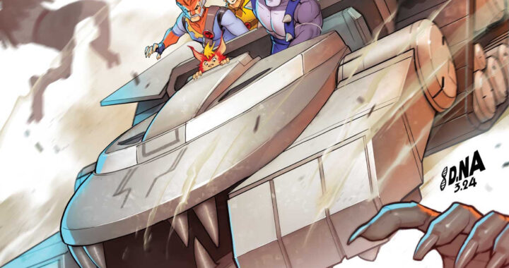
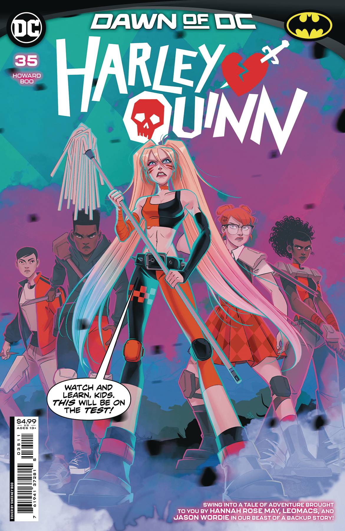
REVIEW: Harley Quinn #35
After speaking from the manipulative hold of the Joker, Harley Quinn is ready to become her own woman. With the help and love of Poison Ivy, she is ready to take over the world, however, her friend Kevin called the cop on her and now she has to teach a mandated college course and hope that her students don’t die in the process. It is a story filled with quirky visual gags, great character designs, and aesthetics reminiscent of Steven Universe and fantastic lettering. Harley Quinn #35 is a fun addition to the series.
In this issue, the Harley A.I. created by the Brothers Eye sends a mass email to her students and sets up a trap for Harley. By happenstance, Kevin receives the email as well and hoping to make up for calling the cops on Harley, he too is caught by the Brothers and must try his best not to let Harley’s students perish. Whilst the premise is a pretty good one, there are a few things that rubbed me the wrong way, in particular the comedy. It is a Harley Quinn story so we of course expect wacky antics to go down, and whilst they did happen most of it came as visual gags, whilst the actual dialogue was pretty boring in general. The jokes fell flat almost always and even felt try hardy for most of the comic. It is interesting because the visual gags are truly wonderful, but when it comes to set-up and punchline in the dialogue none of it was particularly funny. I don’t remember chuckling at any words but I did laugh at several of the visual gags, which makes you wonder if the words are hurting the overall value of this story.
The story itself is alright, and there are a few interesting characters like Lux the multi-dimensional computer guy. However, Poison Ivy’s importance in Harley’s life seems so forced, she is mentioned on every other page but only appears once in the whole story and she’s sleeping during that scene. I understand that Harley and Ivy are a couple now and that’s something I root for, but Harley comes across as a love-struck one-dimensional character in this issue, which makes me rather sad because out of all the DC Universe, she is one of my favorite characters. I did not enjoy how much of her new personality seems to be attributed to the relationship she has with Ivy, personally I believe, it should be shown rather than talked about so much. We don’t need to hear how great Ivy is for Harley, but instead, we should see it with tangible actions and if she’s not going to be in the story then perhaps we can see more of her love through little details, or flashbacks. This constant reminder that Harley and Ivy are a thing turns Harley into a one-note character that is so far off from the fun and jolly Harley we know and love. Another issue with this is how corny the villains are, they seem so dumb and overall just clumsy, that it’s hard to take them seriously as a major threat to Harley. Is this a well-made comic? Yes, but it also feels so childish and almost as if it’s talking down to the reader as if we were children and I just didn’t enjoy that at all. Personally I liked the secondary story “The One with the Dinosaurs in the Jungle” much more than the actual full story, it is much less single note and given that it’s a one-off story there is much less lore to have to figure out, and revise with “editor narration boxes.” This secondary story was written by Hannah Rose May, illustrated by Leomacs, colored by Jason Wordie, and lettered by Hassan Otsmane-Elhadu. It is an 8-page story of Harley Queen and Croc searching for an ancient artifact ala Indiana Jones. It is more unhinged than the cannon story due to the excuse that it’s a dream sequence, and yet it feels stronger than the main storyline. The plot is simple, it is easy to follow, the jokes are way better and land harder and the visual gags are more present. Perhaps it would be a cool experiment to see if Tini and Hannah teamed up on the cannon story and if they could punch up the dialogue so we can get a stronger overall comic.
There is a lot of action, and the art is pretty good even if the character designs feel like a mix between Scooby Doo and Steven Universe, it is still a rather interesting take on the usual serious and grim-dark aesthetic of the original Batman Universe. The colors are fantastic and the characters are filled with aesthetical personalities, yet Harley’s design is a little too clean for me. How come she doesn’t have any tattoos? She’s this badass punk girl in all other stories but here she’s designed almost like a grown-up little girl (if you can wrap your head around that). It works for the story because that’s how she’s pretty much written but it’s so weird to read and see for the literal number two of the most macabre villain in DC history, the Joker. It’s in the little things that this comic falls through, the large strokes are great though. Fantastic environment designs, a great color script, inventive and interesting panel layouts, and wonderful dialog paths but so much fluff. It’s like eating a cake made of 90% frosting, it takes good but it’s not healthy at all, and it’ll probably give you diabetes.
It’s a shame that for such boring writing, the lettering is stellar. A great dose of ballon shape variety, and wonderful fonts that represent the characters very well. Good narration boxes, good use of color for different character word balloons, and of course a fantastic use of custom fonts for sound fxs that add more dimension to the art.
I’m frustrated after reading this issue because when I saw the cover art, I was excited to see a Harley Quinn story with such a cool art style. However with all of this being said, there is potential here, the art is fantastic and the major plot lines are interesting enough to keep you reading till the end, but the little things like the jokes, the amount of words per page, and the corniness of the characters are a huge turn off for me. I feel like if this was tightened a couple of screws further during the writing stage we would’ve gotten a way better story. I also still stand by my suggestion of putting both writers Tini Howard and Hannah Rose together to iron out the main storyline. To have the bonus comic overshadow the main comic is a sin, that DC should know by now. It was not my cup of tea, and given the complex plotlines of dimensional travel, same-sex relationships, and betrayals of friendship I could not imagine this being written for a child. So who this is being written for, I simply do not know. Perhaps a teenager or a young adult could enjoy this, but other than that I think this needs some work.
Writing: 3 Stars Art: 5 Stars Colors: 5 Stars
Overall: 3 Stars
Written by: Tini Howard Illustrated by: Logan Faerber Coloring by: Triona Farrell Lettering by: Steve Wands
Cover art by: Sweeney Boo
Variant Covers by: Jenny Frison, Jon Sommariva, Dave McCaig, Leirix & Mateux Manhanini Published by: DC Comics
Author Profile
Latest entries
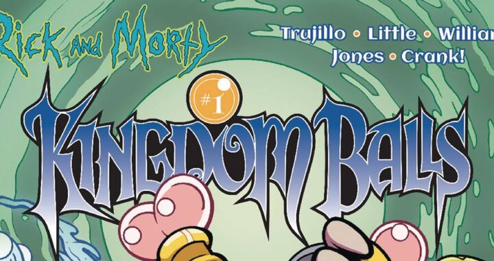
 Comic BooksApril 30, 2024REVIEW: Rick and Morty: Kingdom Balls #1
 ReviewsApril 30, 2024PRCC2024 Recap: Fans from all over the world join together in Puerto Rico to celebrate all things comics, anime and videogame
 Comic BooksMarch 30, 2024REVIEW: Monstress #50
 Comic BooksMarch 28, 2024REVIEW: Cemetery Kids Don’t Die #2