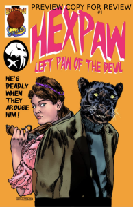
REVIEW: HexPaw #1
 This is amateur work, not going to lie. However, is it a bad comic? Not at all. This is actually an enjoyable read. It’s the first installment in the HexPaw series by solo creator Trevor Markwart “Morbid” and from what he tells us on the first page it is written, drawn, colored, and lettered by him. This is obviously a work of love and passion and whilst his skills aren’t all the way there yet, the love he has for this story and the inspirations that preceded it is noticeable on every page.
Trevor’s art is not bad. It is drawn with a lot of love and a huge emphasis on details. The more lines the better, yet the grasp on anatomy is a little off and the faces of the characters aren’t particularly well drawn either. He is however a great inker and I think that if he spend a little more time working on figure drawing this comic would improve exponentially. I say figure drawing first and foremost because the style of the story he’s making requires a lot of humanoid characters posing in all manner of ways and if they don’t get a handle on good anatomy, it doesn’t matter how good he is with an ink pen it will never be enough. Once he has a handle on that, I think the next thing would be coloring. The colors in the story are muddy and the palettes are a little all over the place. It would help him a lot to pick a general palette for the different sections in the story and from there mix in the colors he’s going to be using. For example in the prison scene, there is a heavy use of purples, which could be the main color for everything and then you can mix on top of the different hues of skin colors, and yellow highlights, and so on, and now you have a unified section in the story that is visually marked and distinct from the rest of the story.
Speaking of weird colors, the is hardly any reason to use so many different colored narration boxes. The standard yellow narration box would have worked well throughout the whole story and it wouldn’t be as distracting as it currently is when he switches from yellow to blue, to cyan, to light purple, back to cyan, and then all the way to green and pink. It’s too much noise, which coupled with all the black-inked details makes for a rather muddy reading experience. Then you have crudely drawn sound fx fonts and way too many word balloons that could be better organized, along with the dialogue that does not follow the crossbar “I” rule. Overall it is crude, it is amateur but again… It is not bad. Why is it not bad then if it’s such amateur work?
Because the writing is really good. This is a story about a guy that turns into a big black cat, very similar to a panther. However, it’s a humanoid panther and he only turns into this were-cat when he is aroused aka right after or during sex. It’s weird, isn’t it? Yet Morbid is able to tell a really good story that keeps you reading from badly placed word ballon to badly placed word ballon all the way to the end of the story. It’s such an interesting idea too, and so varied in all the right places. In 25 pages they are able to tell us the backstory of the character, all the way back to what happened to his family’s bloodline, then tell us about his time in jail and how he was reformed by a sex magick practicing witch district attorney, and then how he met his partner-in-crime/love interest and they manage to do it without rushing through anything or giving too many unnecessary details or best of all, not making it boring. The writing is so good that despite all of its flaws it still manages to be a hugely remarkable piece of comic work. It is not a classic by any means of the word, but it has so much potential!
I know I’m being hard on Morbid but I do it out of love because I see a future where this comic becomes a fantastic piece of literature, right up there with stories like Vampirella, Lady Death, and other equally remarkable cult classics. All Morbid needs is to pick one thing and really focus on it till they are able to completely master it. I personally think that they have a handle on writing and they should perhaps take some time to focus their efforts on improving their lettering technique because right now their writing is suffering in the hands of bad lettering. After he has an equally good grasp on turning his great scripts into easy-to-read and follow word balloons, sound fx, and narration boxes he can spend the rest of his time further developing his knowledge of shading, figure drawing, and good color theory.
I love that it’s all done by one person, I love it because it is so filled with love and passion and every word you read carries the love that he has for what he’s creating. I love that, I love solo creators because their vision is able to be read wholeheartedly and is not subjected to any sort of distillation that can often occur through unfit collaborations. This is why I think that Trevor should 100% continue publishing this series. However, it would be greatly beneficial to him if on every issue he tried to improve at least one thing as far as he can take it. If issue #2 fixes all the lettering issues, it will make me even more invested in his story, and it will be well on its way to making me a fan of Hexpaw. Then to think that Issue #3 could be focused on refining his character designs and pushing the action poses even further I will be even more excited. Keep going Morbid! You have something really cool in your hands that you can definitely turn into something awesome if you take your time with things and instead of trying to learn everything all at once, just focus on eating the elephant one bite at a time.
One extra piece of feedback, I think the cover art and the back cover should be flipped. The minimal orange with the two characters and the silhouettes is not as interesting as the two girls with the full background and the cat man sitting in a car. Anatomically it is not good, but DA Beers looks messed up, but the composition is much more interesting than what you have on the front.
This comic is worth a read, but it’s even more worth a follow because if Morbid continues growing and learning from each issue, by issue #10 this is gonna be stellar!
Writing: 5 Stars
Art: 3 Stars
Colors: 3 Stars
Overall: 3.5 Stars
Created by: Trevor Markwart “Morbid”
Cover art by: Trevor Markwart “Morbid”
Published by BloodMoon Comics
Author Profile
Latest entries
 Comic BooksMay 14, 2024REVIEW: DeadWeights #2 (of 6)
 Comic BooksMay 14, 2024REVIEW: THE AMORY WARS: GOOD APOLLO, I’M BURNING STAR IV (VOL. II)—NO WORLD FOR TOMORROW #1 (0f 12)
 Comic BooksMay 13, 2024REVIEW: Teenage Mutant Ninja Turtles: Black White and Green #1
 Comic BooksMay 13, 2024REVIEW: Labyrinth #2 (of 3)