Review: Reyu #1 (of 6)
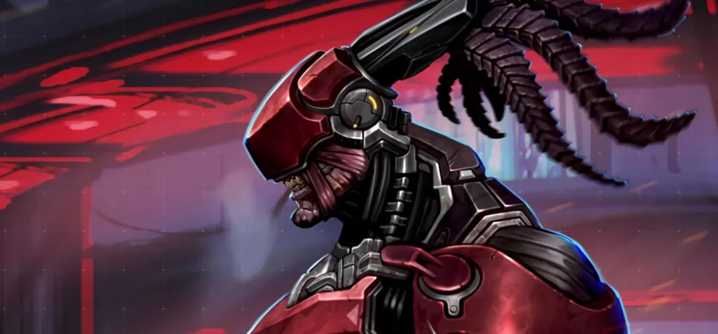
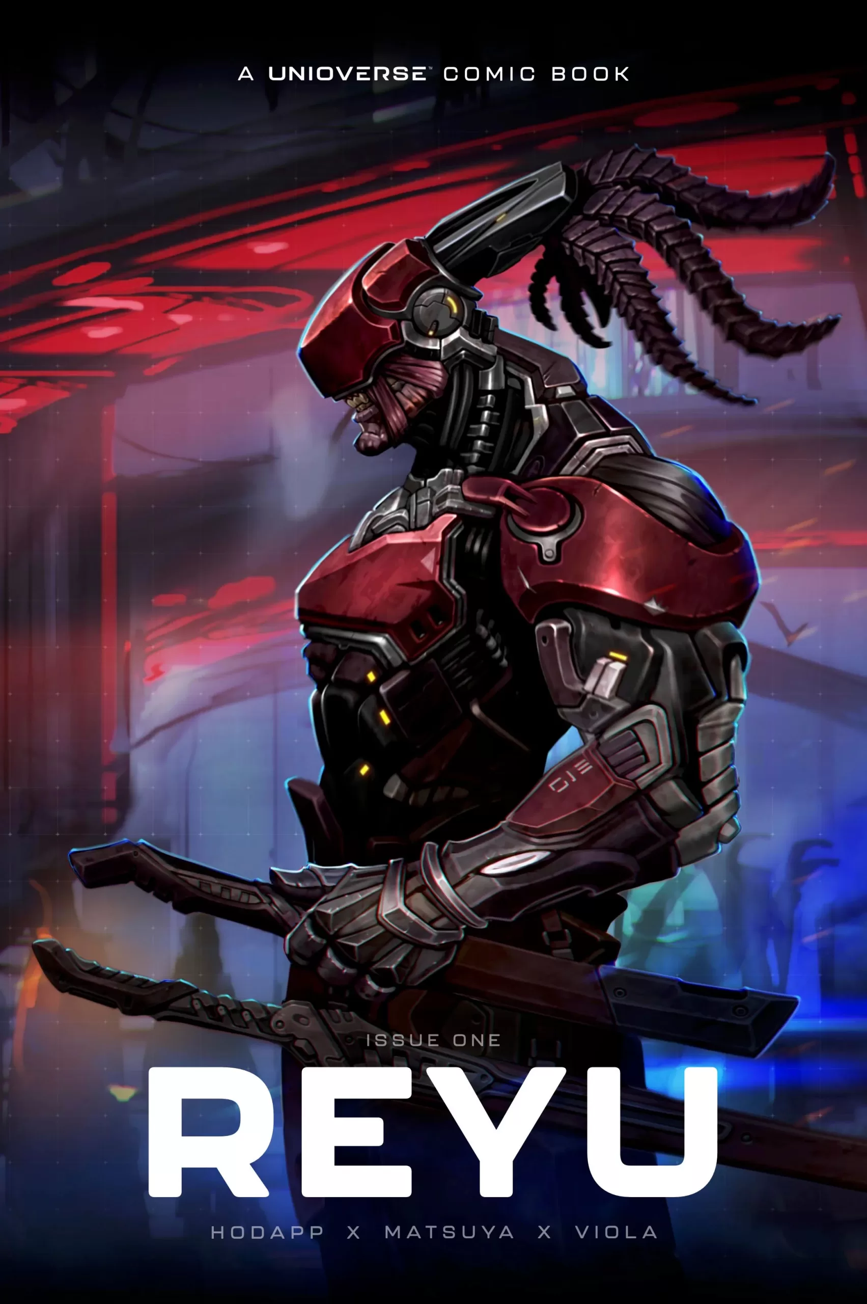 Reyu the Reaper is an alien bounty hunter working for “The Merge”. He is a swordsman, quick on his feet, and seems to be 6 feet tall. He is a beast by all measures of the word. In comparison Olen Gray, one of the appointed leaders of the Merge is four feet tall, stout, and looks to be wise and old, perhaps hundreds of years old. Reyu is part of the Unioverse, “a massive new game-first franchise”, I’m not exactly sure what that means but what I do know is that the art in this book is awesome.
Ben Matsuya does a wonderful job of putting together illustrations of a sci-fi world filled with all sorts of secrets, mysteries, and delights that we all love to see. Matsuya’s style is very indie in its use of bold outlines and cell-shaded colors and carries with it some amazing character designs. From the main character Reyu to the NPCs and the main villain, each one of them looks just as awesome as the last. Reyu himself is a mix between Predator and a samurai and I am all for it. Olen Gray is more dwarf meets Master Splinter from TMNT. The story is a bit convoluted and not a lot is explained in this issue, but with some digging online I managed to find that this is part of a bigger world that will eventually be playable.
They already have a test called the Proving Grounds and they’ve even minted some NFTs featuring Reyu that give you access to their Unioverse game. It’s very cool honestly and I love the idea of mixing comics to promote and market games, and new technologies like NFTs. In regards to the story, I just wish the story was a bit easier to understand in this first issue, maybe try to touch fewer topics all at once when you’re starting out your series and instead focus on the really important stuff to get the story going and then go further in-depth as the series progresses. There was also a bit of technobabble, which if you don’t know what that is, it’s literally just weird words that sound technological but in reality, mean very little and are just there to give you the feeling that you’re in a sci-fi world. Pretty much every sci-fi story has technobabble, from Star Wars’ Midi-chlorians to pretty much all the technological nonsense in Star Trek. They even have their own type of technobabble called Treknobabble (oy vey). An example of technobabble was plucked from this very funny Start Trek Technobabble Generator.
“Computer what’s wrong?”
“Heisenberg magnaspanners are behaving abnormally.”
What are they even saying here right? Well, this Reyu book has some of that. They have something called the Mass-o which by reading this book I literally have no idea what it is or what it does, and the whole “Merge” incident is explained so lightly that I still have no idea of what happened. Also for some reason they measure time in Helicas and yet we are not even sure if that’s one year, 10 years, or 10,000 years, which makes the timeline blurry, to say the least. I know, I know; this is the first issue so we’re not gonna go in-depth into all the nuances of the world-building of Reyu, but I just wished that they used their 8 pages of story content a bit more wisely. Yes, the first issue is a mini-comic… So you understand my frustration when I have to read more than 2-word balloons of words that make absolutely no sense when the art is so beautiful.
Aside from this issue, I think this has a lot of potential, and I’m hoping that we get to see more from these characters, this artist, and this world because it is very interesting. The action scenes were fun, the overall dialogue (aside from the “Reyubabble”) was pretty cool, and there is a bit of character building with Reyu having amnesia and getting glimpses of his memory back when he jumps from planet to planet through what looks like a sitting teleporter (comfy!). I like all of that, there is something here and I hope they don’t just use this comic as a marketing for their game but instead use it as an opportunity to further flesh out their world and the characters that inhabit it.
The lettering is good, it’s done by Ben as well and whilst it doesn’t stand out as much as their art does, it works. I do wish they went a little harder with sound fxs, and added a couple of extra ones in there, because I think that’s where the art form of lettering really has a chance to glisten. One thing that I did not like about this comic was the cover art. Like I get it, it’s a comic to promote a game so it makes sense to go with realism on the cover art so that it mimics the art of the actual game, and yet I don’t think that was a good idea for this one. The art inside has a ton of personality, and creativity and is just fun to look at, and yet the cover art is so bland…
It’s good art, don’t get me wrong. AJ Nazzaro is an amazing artist and his portfolio is filled to the brim with awesome stuff but this cover is just not it. I’m sure AJ did several sketches with more action and cooler poses but higher-ups chose this one because of its intense level of realism, and yet it would have been a much better cover if it had been stylized instead of realistic.
Whilst I still think they are maybe being a little bit restrained by the higher-ups I think slowly they will be allowed to paint to their fullest abilities. Again, it’s not bad art and AJ you did wonderful work, but for a comic book like the one inside this page, something more stylised would’ve been better. A realistic cover would work awesome for like the cover of the box the game comes in, but for this comic, the two art styles of Ben Matsuya and AJ Navarro feel too distant for me to enjoy them in conjunction.
The credits page is painted a bit more stylistically and I think it tries to bridge the gap between both art styles, whilst it doesn’t work completely well because it’s still a little too close to game concept art than the actual comic pages are, it does look nice and the layout of the text and the painting’s composition is refreshing. Looking at it now, and because I honestly respect AJ and I don’t think this is their fault at all, perhaps the transition between cover art to inside illustrations could have been further smoothened if the first page was laid on top of a similar background the credits page, something other than the stark white we all know to be a comic page. Just to glue everything together and make the transition from one style to the other a little more seamless.
Overall this is a good first issue. It’s a light read, albeit a bit short, and the art is really good. Looking at Hex Publisher’s other books it seems like this is the style of cover art they like for their books, so yeah I guess that’s alright you know. For a $5 mini comic, this is worth the buy.
Writing- 4 Stars
Art – 5 Stars
Colors – 5 Stars
Overall – 4.5 Stars
Writing by; Angie Hodapp & Joshua Viola
Art and Colors by; Ben Matsuya
Lettering by; Ben Matsuya
CoverArt by; AJ Nazzaro
Published by; Random Games & Hex
Reviewed by Antonio “Mabs”
Author Profile
Latest entries
 Comic BooksApril 30, 2024REVIEW: Rick and Morty: Kingdom Balls #1
 ReviewsApril 30, 2024PRCC2024 Recap: Fans from all over the world join together in Puerto Rico to celebrate all things comics, anime and videogame
 Comic BooksMarch 30, 2024REVIEW: Monstress #50
 Comic BooksMarch 28, 2024REVIEW: Cemetery Kids Don’t Die #2
