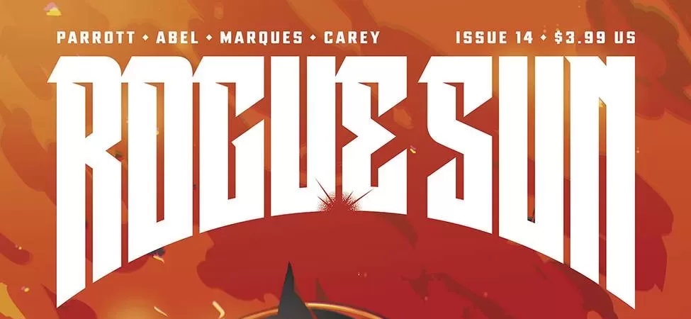
REVIEW: Rogue Sun #14
 After the events of Rogue Sun #13, our hero is sent inside the sunstone to reunite with his father. While they are not particularly happy to see each other they must work together to get out of the Sunstone and recover the body from a Rogue Sun turned Rogue. This is an excellent issue to read. I had fun reading it honestly. The writing is fast-paced, easy to digest even if you’ve only read a few of the previous issues, and very easy to understand. It’s easy to understand because even though there is some lore in regards to the Rogue Sun hero that is being explored, most of it is easy to follow. Guy gets thrown inside himself and now he has to fight his ancestors, a pretty simple plot. However when you add to that the fact that they can travel from fragmented memory to fragmented memory of each previous Rogue Sun and most of them want to kill you, you got yourself a thrilling ride.
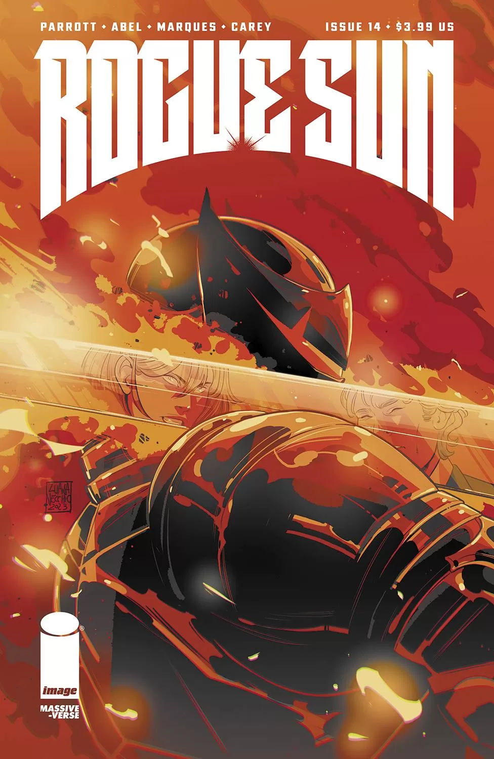
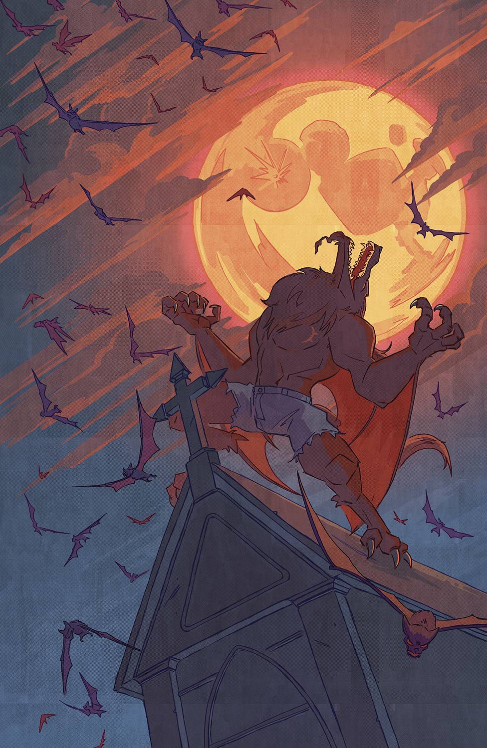
The art much like the previous issues is very good and artist Abel Marco Renna does a wonderful job at creating dynamic poses that read well and pack a punch. I like the coloring a lot too, particularly in the desert fragment world, whilst it’s not crazily detailed or particularly complex, the color scheme and simple spacious backgrounds do a great job at framing a part of the story that is mostly about a father and a son trying to get past their differences in order to achieve a common goal. The character design in this story keep being stellar, from the Viking Rogue Sun with his horned helmet and his hulk-like body to the clan of werewolves, I think these character designs look fantastic and are wonderful renditions of motifs we’ve seen in the past. Here they are done quite well and have their own unique spin that makes them stand out against other similar character designs. I also really like that even though we are looking at a pack of werewolves all with related characteristics they all manage to portray different personalities, whether it’s their unique color schemes, choice of clothes, or the amount of hair they have and how muscular or not muscular they are, they each look like different creatures of the same race and that makes me think that the artists in this story really did their homework and no doubt has several sketches of these and many more characters they were experimenting with before they finally landed on the final designs.
 To go back to the coloring, I think that Natália Marques is very talented and has done a fantastic job at coloring this comic. There are many sections of the comic that take part in different environments and each one feels distinct and quite unique, especially inside the Sun Stone itself, from a green hill to the desert landscape we talked about, to a swamp environment each one has its own color scheme and all of them look fantastic. Then you have the actual real world and these too are colored quite splendidly. I am a huge fan of how they decided to color what would otherwise be silhouetted characters with a blueish tint that makes them recede into the background or even in some cases recede into the foreground so as to show that whilst they are there at that particular moment they are not the people we should put our attention on. I think this was a masterful choice by Natália. I also really enjoyed the deep reds and oranges we get from the bar scene, that too was a wonderful choice by Nat, as we get a contrasting hue of colors from the “volatile”, “invading” Rogue Sun with the rest of the cool blues and grey tints that really make the character feel out of place in this reality. I love that because it mixes great color choices with narrative elements and ties everything together very well.
Speaking of mixing the art and the narrative, I also really enjoyed the lettering work by Becca Carey especially the sound fxs work. I think this time around because the comic was filled with a lot more action they were able to really pack this issue with a lot of cool lettering effects that ultimately add a lot to the whole issue. I was also a big fan of the brush they used for the word balloons as it looks almost hand-drawn and actually, it could in fact be hand-drawn balloons and I love that. My only criticism would be one specific word balloon where the letters weren’t quite spaced right and one of the words is almost butting up to the panel border and that looks a little weird, but other than that the lettering is spectacular. I was also a huge fan of the choice of font for the werewolves characters, it looks monster enough and yet similar enough to the rest of the fonts that it looks great together.
This was a great issue overall and I think I liked this a lot more than the previous issue. A definite read through and through.
Writing: 5 Stars
Art: 5 Stars
Colors: 5 Stars
Overall: 5 Stars
Written by; Ryan Parrott
Art by; Abel Marco Renna
Coloring by; Natália Marques
Lettering by; Becca Carey
Cover art by; Luana Vecchio
Variant Covers by; Alex Moore
Published by Image Comics
Author Profile
Latest entries
 Comic BooksApril 30, 2024REVIEW: Rick and Morty: Kingdom Balls #1
 ReviewsApril 30, 2024PRCC2024 Recap: Fans from all over the world join together in Puerto Rico to celebrate all things comics, anime and videogame
 Comic BooksMarch 30, 2024REVIEW: Monstress #50
 Comic BooksMarch 28, 2024REVIEW: Cemetery Kids Don’t Die #2